The network for creativity
Join 1.25M professional creatives like you
Connect with clients, get discovered, and run your business 100% commission-free
Creatives on Contra have earned over $150M and we are just getting started
Back to feedPost

AI Lifestyle Brand Campaign



The network for creativity
Join 1.25M professional creatives like you
Connect with clients, get discovered, and run your business 100% commission-free
Creatives on Contra have earned over $150M and we are just getting started











Related posts


Can't believe this brand is 3years now.
Check out the full project here: https://behance.net/gallery/182972929/SAGAH-Branding-project


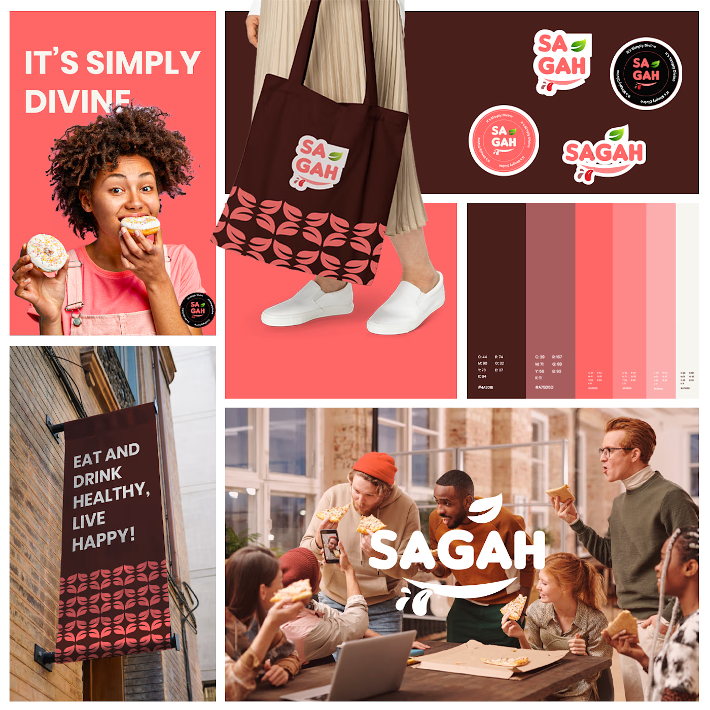

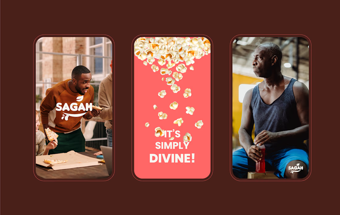
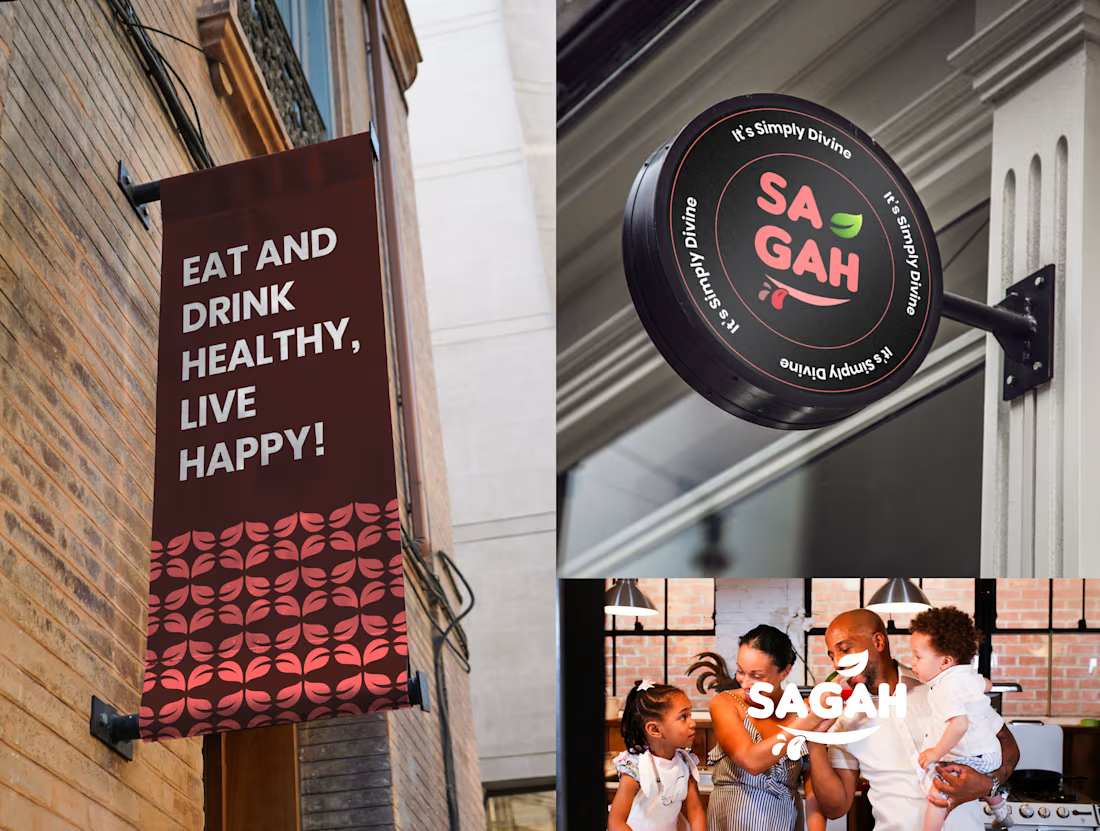

Really love this SAGAH branding! The color palette and the tote bag mockup look super clean and consistent. Great work on the overall identity 👏

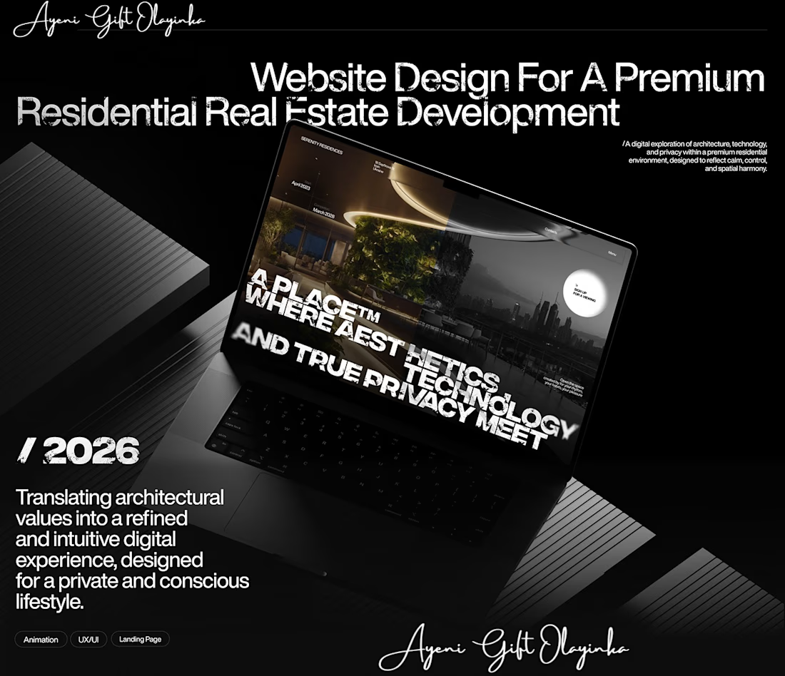
What makes someone stop scrolling and imagine themselves living in a property?
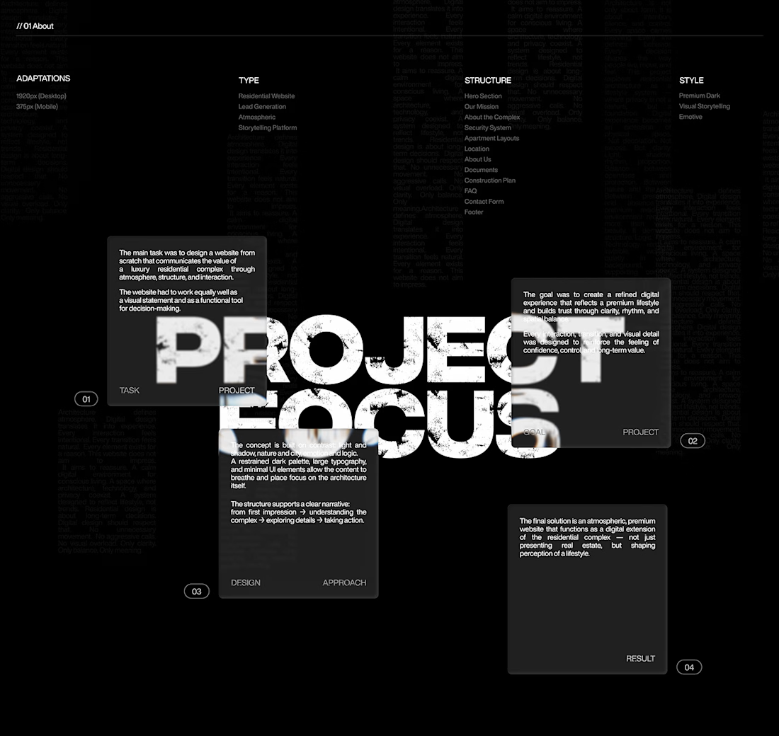
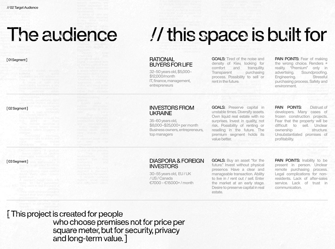
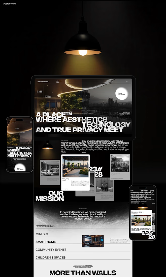
That's something I kept in mind while working on this luxury real estate website concept.
I wanted the design to feel premium without making the experience complicated. The focus was on strong visuals, clean layouts, and a clear structure that lets the properties speak for themselves.
I also paid attention to how visitors move through the website, from their first impression to exploring the properties and taking the next step.
Because when someone is looking for a home, the experience matters just as much as the presentation.
I couldn't fit every screen into this post, so I'll share more of the design in the comments. 👇
I'm curious: when you visit a real estate website, what makes you want to explore further?
#WebDesign #Architecture #LuxuryRealEstate #UIUXDesign #RealEstate #Figma



nice work

The right platform can make a real difference in how you connect with clients and grow your creative career. Excited to be part of the Contra community! ✨

When I moved from Upwork to Contra, I wasn’t sure whether I was making the right decision.
Now? I’m never going back.
Contra has given me more than a place to find work. It has connected me with clients who value my professional perspective, trust my expertise, and invest...