The network for creativity
Join 1.25M professional creatives like you
Connect with clients, get discovered, and run your business 100% commission-free
Creatives on Contra have earned over $150M and we are just getting started
Back to feedPost
Taste Test
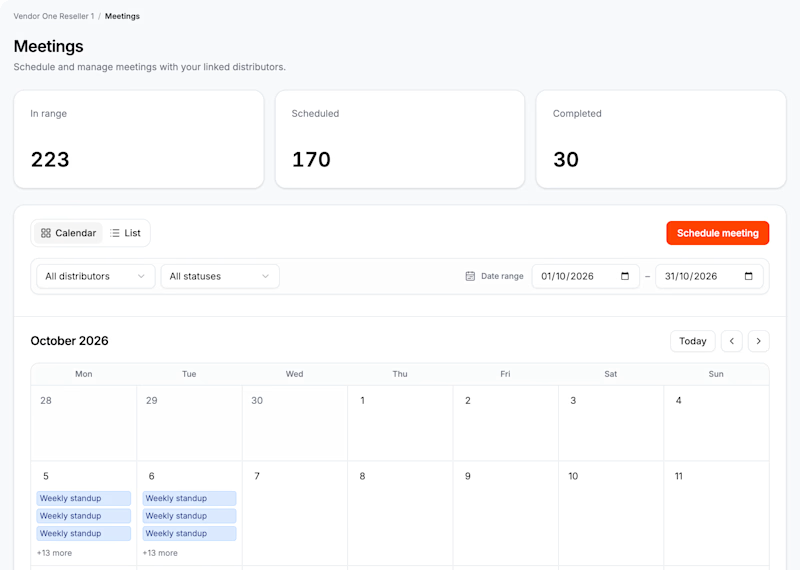
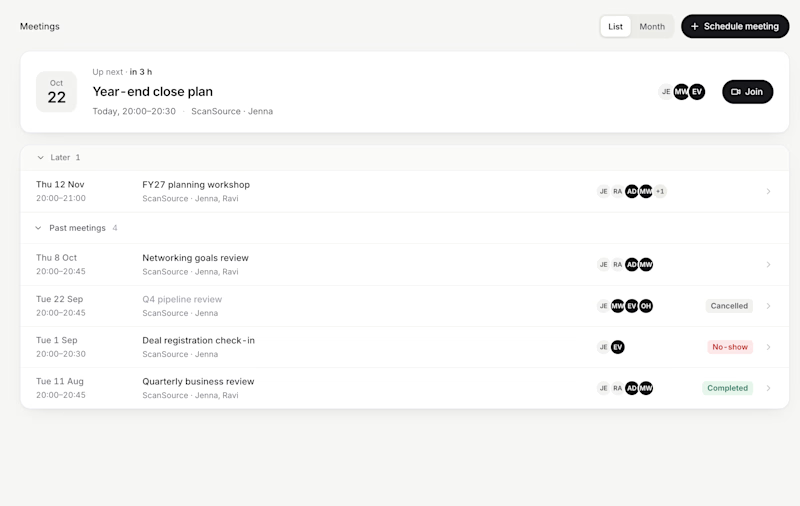
I have spent the last two months redesigning a dashboard for a multi-tenant company.
They were relying heavily on generic AI-generated content, which I am now replacing.
While I am working on several other pages, I can share this one.
2 voted
67%
1 voted
33%
3 votes
Closed

Voted Manual. Which one tested better with the users?

They testing this new Manual interface with real user

I voted for AI, analytics are more clear
Interesting choice
The network for creativity
Join 1.25M professional creatives like you
Connect with clients, get discovered, and run your business 100% commission-free
Creatives on Contra have earned over $150M and we are just getting started




Related posts

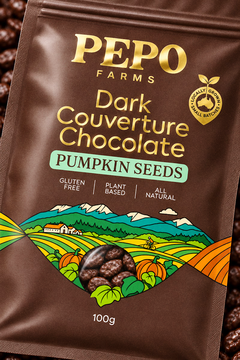
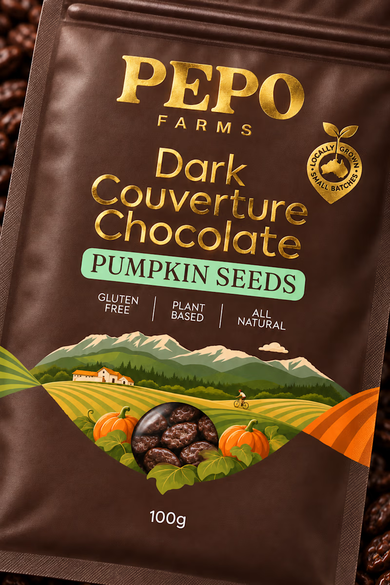
I need another set of eyes to check which version works better with this design. The main thought behind this design is the illustration created in the shape of a DNA strand to showcase the brand and how it originated.
Since this is a chocolate product, I personally felt that a more expressive and bold illustration with outlines would be better suited. I would love to hear what you think as a fellow creative.
4 voted
67%
2 voted
33%
6 votes
Closed


Exploring hero backgrounds for an AI assistant landing page. Which one feels more trustworthy?

9 voted
100%
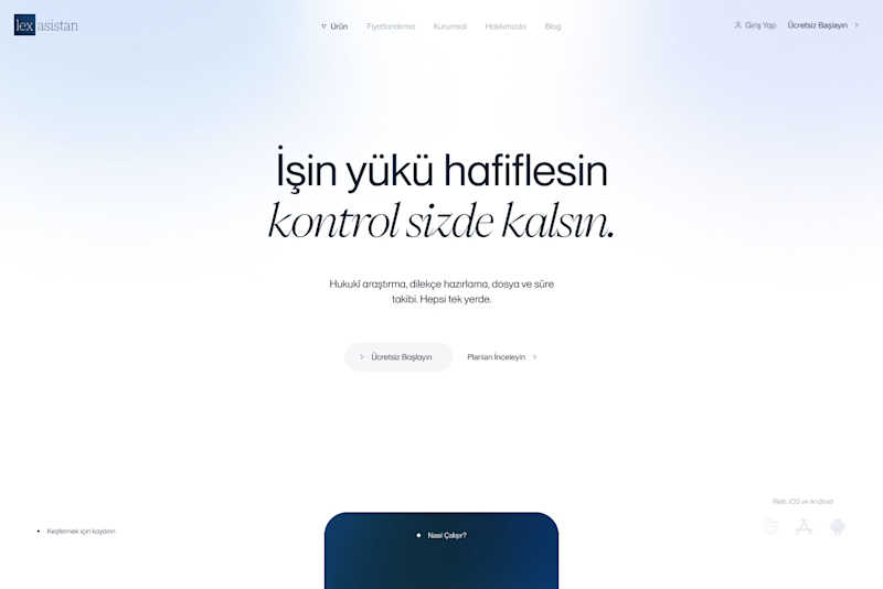
0 voted
0%
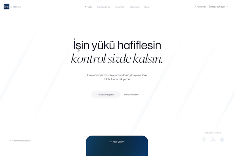
9 votes
Closed

Aura feels more trustworthy and calm.

Another category comparison, and this one's going to make you look twice.
The fashion category needed a fresh point of view. Most established players relied on functional wordmarks and relatively restrained visual identities.
With Ru’asā, we took a different route. We challenged those conventions and built an identity designed to stand apart, be remembered and give the brand a world of its own.
Distinctive by design. Unconventional by nature.
Which would you choose?
Familiar category conventions
A fresh point of view
1 voted
11%
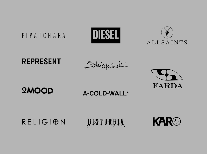
8 voted
89%
9 votes
Closed