The network for creativity
Join 1.25M professional creatives like you
Connect with clients, get discovered, and run your business 100% commission-free
Creatives on Contra have earned over $150M and we are just getting started
Back to feedPost


The network for creativity
Join 1.25M professional creatives like you
Connect with clients, get discovered, and run your business 100% commission-free
Creatives on Contra have earned over $150M and we are just getting started



Related posts

Thousands of searches. Almost no clients.
That's where Richard Reid's website was when we started working together. Richard is a psychology-led leadership coach for founders, CEOs and senior leaders, and his site was ranking. Just not for the right people.
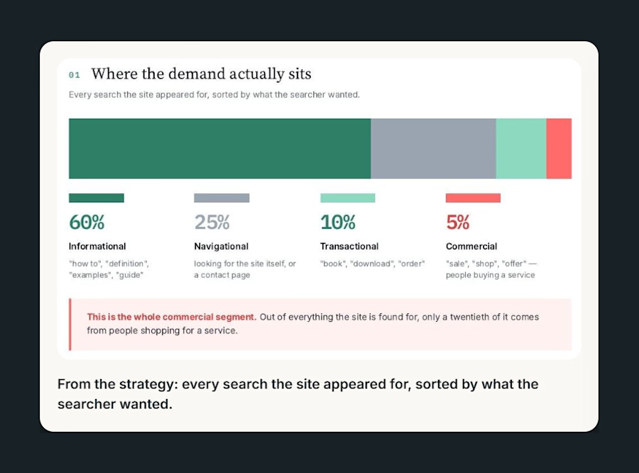
When I sorted every search the site appeared for by intent, 60% were people researching psychology topics. Only 5% were people actually shopping for a coach.
So instead of chasing more traffic, I rebuilt the strategy around that 5%:
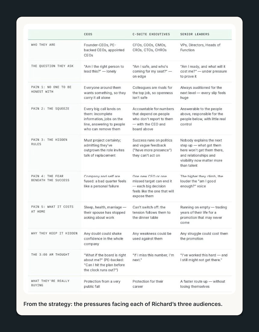
Mapped the private pressures each of his three audiences carries, from the 3am thought to what they're really buying
Separated his two sites so they stopped competing for the same searches
Restructured the service hubs
Rewrote the homepage and about page to lead with who he helps and what he solves, with one clear route to a consultation
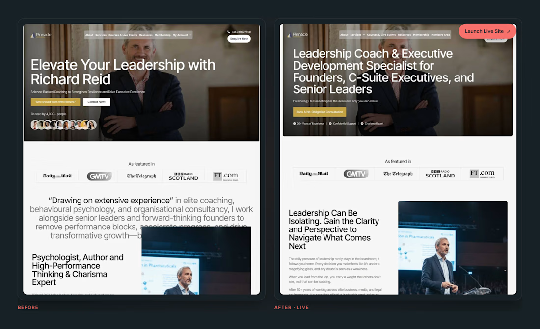
The old homepage said "Elevate Your Leadership with Richard Reid". The new one tells a founder or C-suite leader, in the first line, that this is for them.
Both pages are live. Full case study on my profile.
If your site gets traffic but not enquiries, the fix usually isn't more traffic. It's knowing which visitors matter and writing for them.

So cool! It’s a great reminder that more traffic doesn’t always mean better results. Understanding search intent and speaking directly to the right audience really can make all the difference. I especially like how the strategy focused on turning the existing traffic into...

BRF - Sadia
Designed an email marketing package to optimize engagement and conversions. Focused on clear messaging, strategic automation, and a seamless user experience.


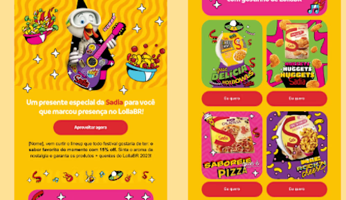

The bold yellow and pink with the illustrated character is impossible to skim past, and the product cards keep the offer clear. How do you keep such a loud style readable on mobile?

What if sending money felt a little more like giving a gift?
For Nova, I explored a banking app that brings payments, cards, and a bit of personality together. You can check your balance, browse recent transactions, send or request money, top up, and pay bills.
My favorite part is the digital postcard feature. Before sending a transfer, you can add a little illustrated card—a heart, a birthday greeting, or a playful character. A simple way to make birthday money or a thank-you feel more personal.
I carried that same 3D character into onboarding, pairing it with bold red gradients and large, clear payment details. There’s room for play, while the recipient and amount stay easy to check.
Would you add a postcard to a transfer? I’d love to know what occasion you’d use it for.




