The network for creativity
Join 1.25M professional creatives like you
Connect with clients, get discovered, and run your business 100% commission-free
Creatives on Contra have earned over $150M and we are just getting started
Back to feedPost

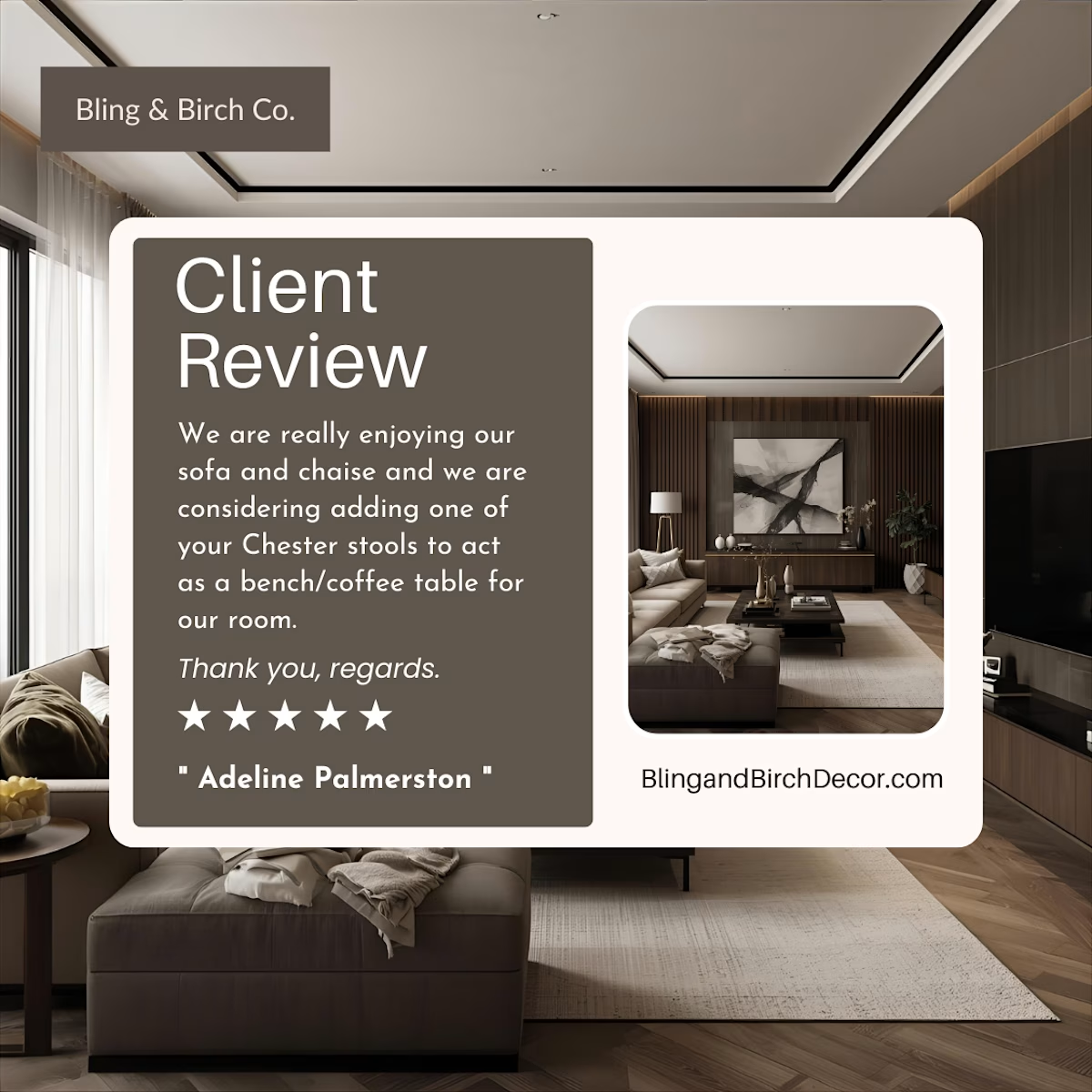
Campaign Launch: Bling & Birch Co.
Designed and executed a high-conversion social media advertisement for this luxury home decor brand. By blending elegant visual storytelling with strategic CTA placement, this campaign achieved a 4.1x Return on Ad Spend (ROAS) and a 3.8% Conversion Rate, significantly outperforming industry benchmarks.
The Goal: Drive seasonal sales for a curated range of premium furniture.
The Strategy: Paired high-end lifestyle imagery with bold, "scroll-stopping" typography.
The Result: Delivered data-backed creative that directly scaled brand revenue.


The network for creativity
Join 1.25M professional creatives like you
Connect with clients, get discovered, and run your business 100% commission-free
Creatives on Contra have earned over $150M and we are just getting started





Related posts


Twenty-five years of credits, finally on a website that looks the part.
Just take a look at what kind of web we create ✨👇
Reflection of the brand history with taste, precision, and premium branding.
Scroll responsibly: https://productionportugal.com 😉🔥


Wow! Nice setup 🎥

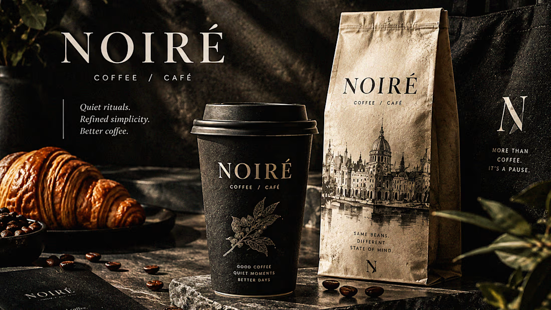
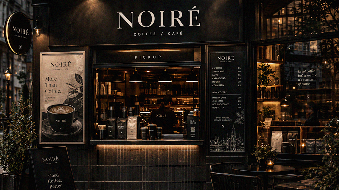
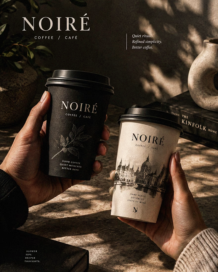
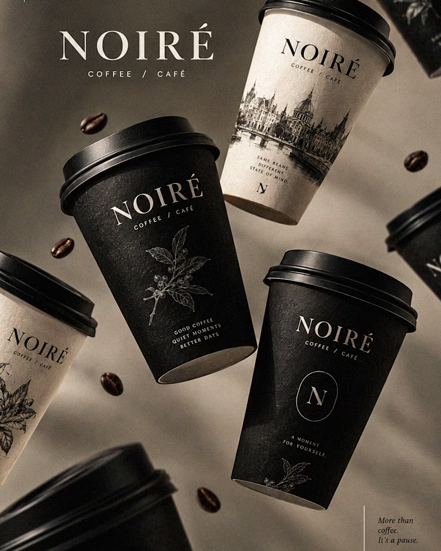
I Just Created NOIRÉ 🔥
A Coffee Brand Built Around the Pause.
NOIRÉ is a premium café brand built around a simple idea:
Great coffee should feel like a moment of pause, not another part of the
routine.
The project explores a complete visual identity, packaging
system, takeaway cups, coffee bags, tote bags, menu design, café applications and lifestyle campaign direction.
Instead of relying on the usual loud coffee aesthetics, I
built NOIRÉ around deep charcoal, warm ivory, soft graphite, refined
typography, subtle botanical illustrations and quiet editorial compositions.
The visual language is intentionally dark, tactile, and understated - giving every touchpoint the feeling of a slow morning, a quiet table, and coffee worth taking your time with.
From the cup in your hand to the café around you, every detail was designed to make the brand feel like a ritual.
Waiting for your thoughts in the comments 🙌🔥
branddesignertastetestBrand DesignGraphic DesignPackaging DesignAdobe IllustratorAdobe InDesignAdobe Photoshop




Okay, I finally joined the typography trend too. 👀
Had to try one myself - so here’s a little typography experiment I’ve been playing with.
Sometimes you just see a trend everywhere and think, okay… my turn. 😂
What do you think - should I make more of these?
Graphic DesignMotion DesignTypographyAdobe After EffectsAdobe Illustratortypographykinetictypographymotiongraphics

TOP!!