The network for creativity
Join 1.25M professional creatives like you
Connect with clients, get discovered, and run your business 100% commission-free
Creatives on Contra have earned over $150M and we are just getting started
Back to feedPost

Different brands. Different goals. One approach.
This video shows a collection of websites built with the same focus
clarity first, design second.
Each layout is shaped around what the user needs to do, not just how things look. Whether it’s exploring services, understanding an offer, or taking action, every screen is structured to keep people moving without confusion.
No unnecessary elements. No noise. Just clean hierarchy, strong direction, and a clear path forward.
Because when the experience makes sense, users don’t hesitate.
And that’s where results start.
When you visit a website, what keeps you engaged longer
clear structure or visual styling

The network for creativity
Join 1.25M professional creatives like you
Connect with clients, get discovered, and run your business 100% commission-free
Creatives on Contra have earned over $150M and we are just getting started

Challenges
View all


Related posts


In recent days I’ve been practicing designing around an image.
Sometimes an image can have great potential and reinforce the message we want to convey. I’m not saying this is the correct way to prepare a strategy, it’s simply an exercise. As a result, I created these three hero section designs, which I’ve published in the Figma community where they can be freely used for experimentation.
If you use them, I’d love to see the outcome, so make sure to tag me!

So beautiful


Product first or brand first? 🤔
We're cutting the promo reel for our case study and can't agree on its start. ✨
Which product ad opening would make you stay past the first 3 seconds?
Vote and tell why! 👇
Product DesignSoftware DevelopmentAdobe After EffectsCinema 4DFigmaBrand DesigncreativeaiworkflowUX Design


15 voted
25%
46 voted
75%
61 votes
Closed

I think both is important, but good product first.


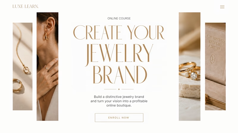
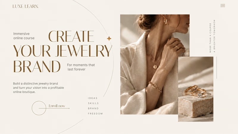
Same course. Same content. But two completely different feelings ✨
Which version would you choose?
27 voted
59%
19 voted
41%
46 votes
Closed

Option 2 is more practical ❤️❤️