The network for creativity
Join 1.25M professional creatives like you
Connect with clients, get discovered, and run your business 100% commission-free
Creatives on Contra have earned over $150M and we are just getting started
Back to feedPost

Primal Monkey
I got a brief for a bold and energetic fitness brand.
The brief?
Create a powerful identity that communicates strength, discipline, confidence, and raw performance while positioning the brand as a motivating choice for athletes, gym-goers, and people committed to pushing beyond their limits.
Here's how I brought Primal Monkey to life:
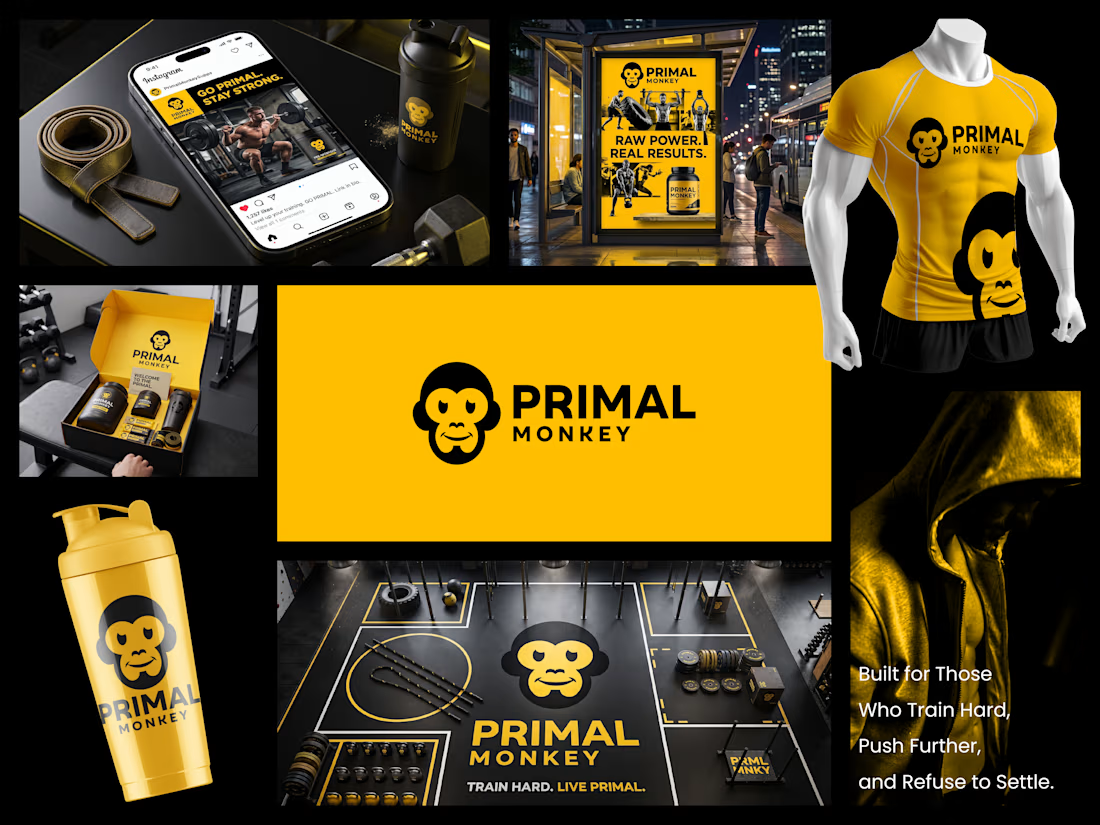
• I explored the idea of primal strength through the monkey as the central visual symbol, creating a personality that feels powerful, energetic, fearless, and instantly recognizable.
• We established a mission: Build a fitness brand that motivates people to train harder, perform better, and embrace the discipline required to become stronger.
• Shaped a vision: To become a recognizable fitness and performance brand associated with determination, raw energy, and a relentless approach to personal progress.
• Designed a bold monkey emblem with simplified facial features and strong geometric forms, giving the symbol an aggressive yet approachable character that works across apparel, packaging, digital platforms, and fitness environments.
• Developed a high-impact visual identity around black and vibrant yellow, creating a strong contrast that communicates energy, intensity, confidence, and athletic performance.
• Extended the identity across social media, gym environments, apparel, shaker bottles, promotional packaging, advertising, and branded merchandise, creating a consistent visual language across every touchpoint.
The result?
A powerful and energetic brand identity that gives Primal Monkey a distinctive presence in the competitive fitness market. The combination of the bold monkey symbol, high-contrast color palette, strong typography, and performance-focused applications creates a brand that feels modern, confident, and built for people who refuse to settle.
The client's reaction?
"The identity feels exactly like the energy we wanted for Primal Monkey. It is bold, memorable, and powerful, and the yellow and black combination gives the brand an immediate presence across everything from gym apparel to social media."


The network for creativity
Join 1.25M professional creatives like you
Connect with clients, get discovered, and run your business 100% commission-free
Creatives on Contra have earned over $150M and we are just getting started

Related posts

Everyone wants their brand to look "premium" but almost nobody can define what that actually means.
In crowded industries like digital marketing, premium is the absence of noise. Every unnecessary element is removed until what's left earns trust on sight and can be immediately recognized.
Designing Nyxora meant understanding that trade-off and building for legacy.
The identity needed to feel current enough to compete with the top agencies out there, but grounded enough that a client would hand over a real budget without hesitation.
The result is an identity built on purpose, one designed to earn trust before it earns attention.
Case study: https://rb.gy/hy6hs1



Nice

I just joined Contra and I’m still figuring out how things work around here, so I thought I’d introduce myself instead of quietly lurking.
I’m Mariya, founder, strategist and lead designer behind Mariya Design. I’ve worked internationally since 2015, and today I run a boutique branding studio focused on brand identity systems for premium and luxury-led brands.
Most of my work sits somewhere between identity, packaging and the wider system around them. I’m particularly interested in what happens after the logo: how typography, color, packaging, digital applications and brand rules actually hold together as the business grows.
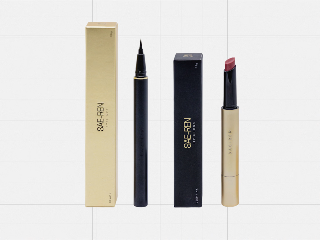
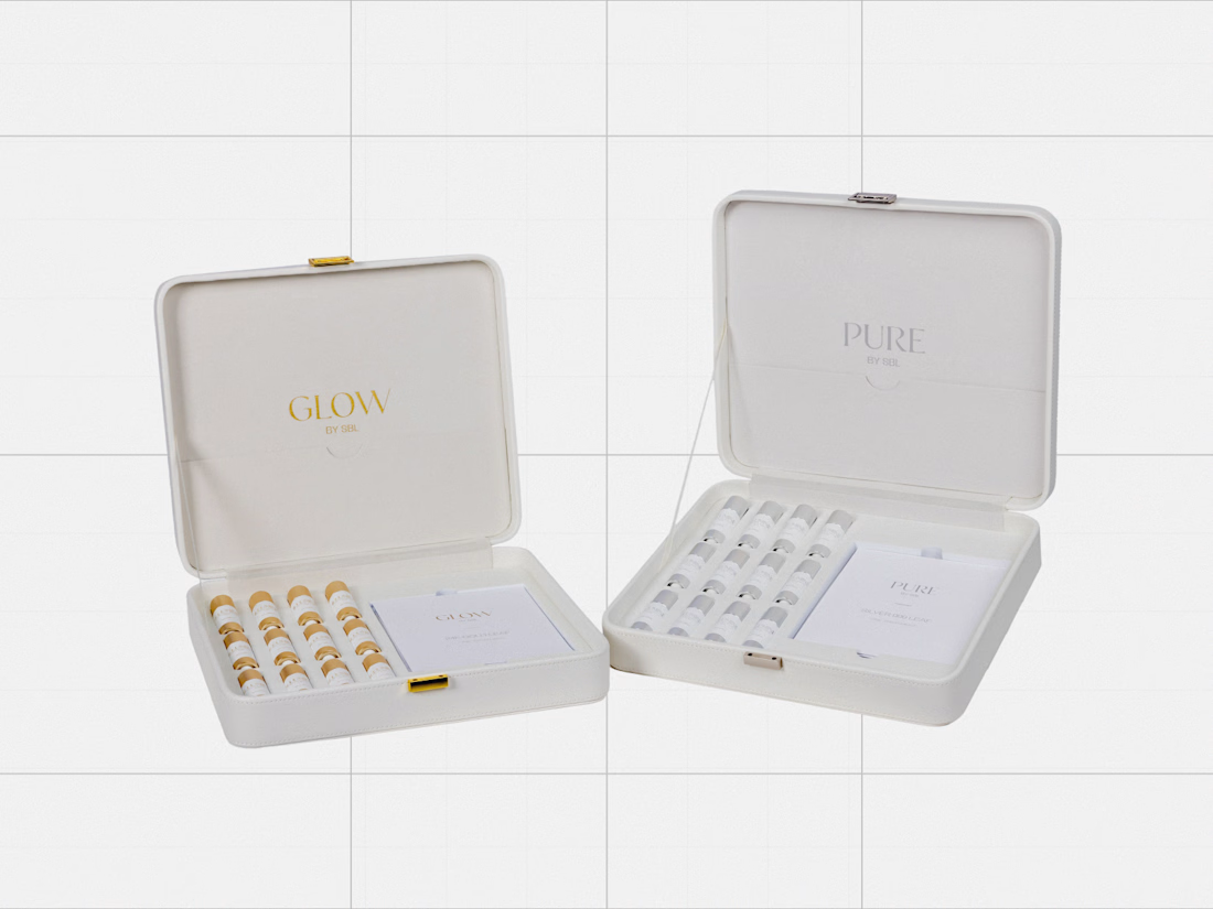
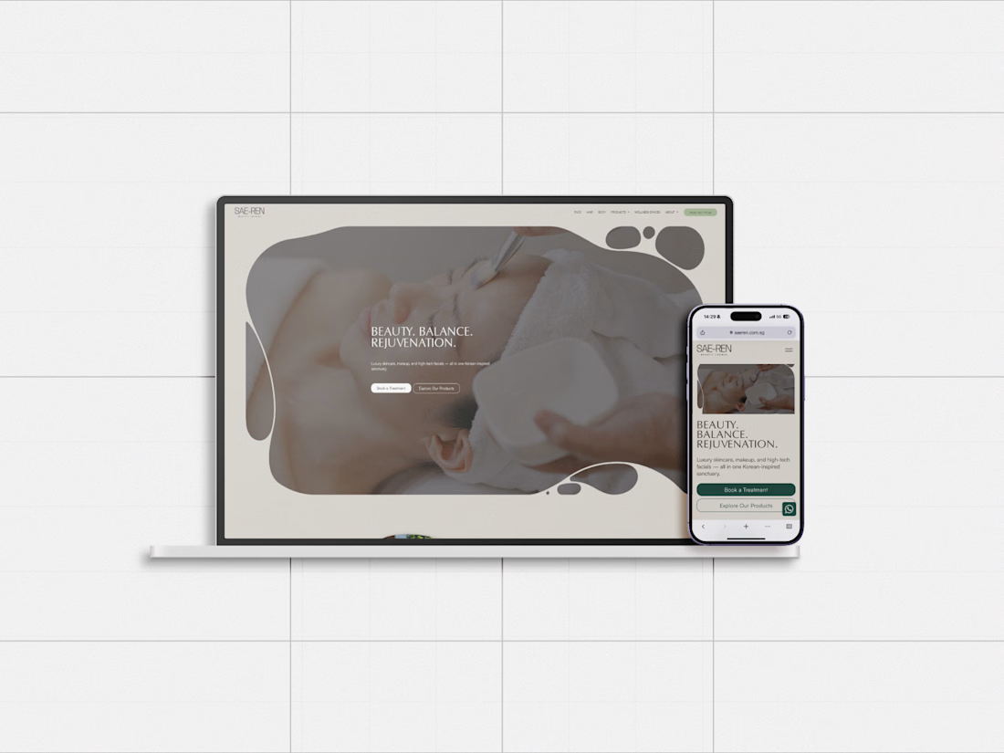
One project I’ve been revisiting recently is SAE-REN, a premium beauty and wellness identity system. I’m currently rebuilding some of my case-study presentation system, so it felt like a good one to share here first.
And since I’m genuinely new to Contra, I’d love to hear from people who have been active here for a while:
What actually helped you become part of the community here?
Was it sharing work regularly, joining conversations, applying to opportunities, or something else entirely?
Any early mistakes worth avoiding are welcome too.


great designs..


A look at the identity I’ve been working on for Sync, a car rental platform in Greece.
You pick the car you want and a local provider brings it to you. Pretty good starting point.
The goal was to give them a brand that could sit comfortably next to the big rental companies and still feel like people you’d actually want to rent from.
I kept their pink and built the layouts around a shape inspired by a car’s side mirror with real cars and Greek scenery inside it.
Big Greek headlines, plenty of space and a system their team can keep easily.

Impressive work, colors are great in use.
Challenges
View all


