The network for creativity
Join 1.25M professional creatives like you
Connect with clients, get discovered, and run your business 100% commission-free
Creatives on Contra have earned over $150M and we are just getting started
Back to feedPost

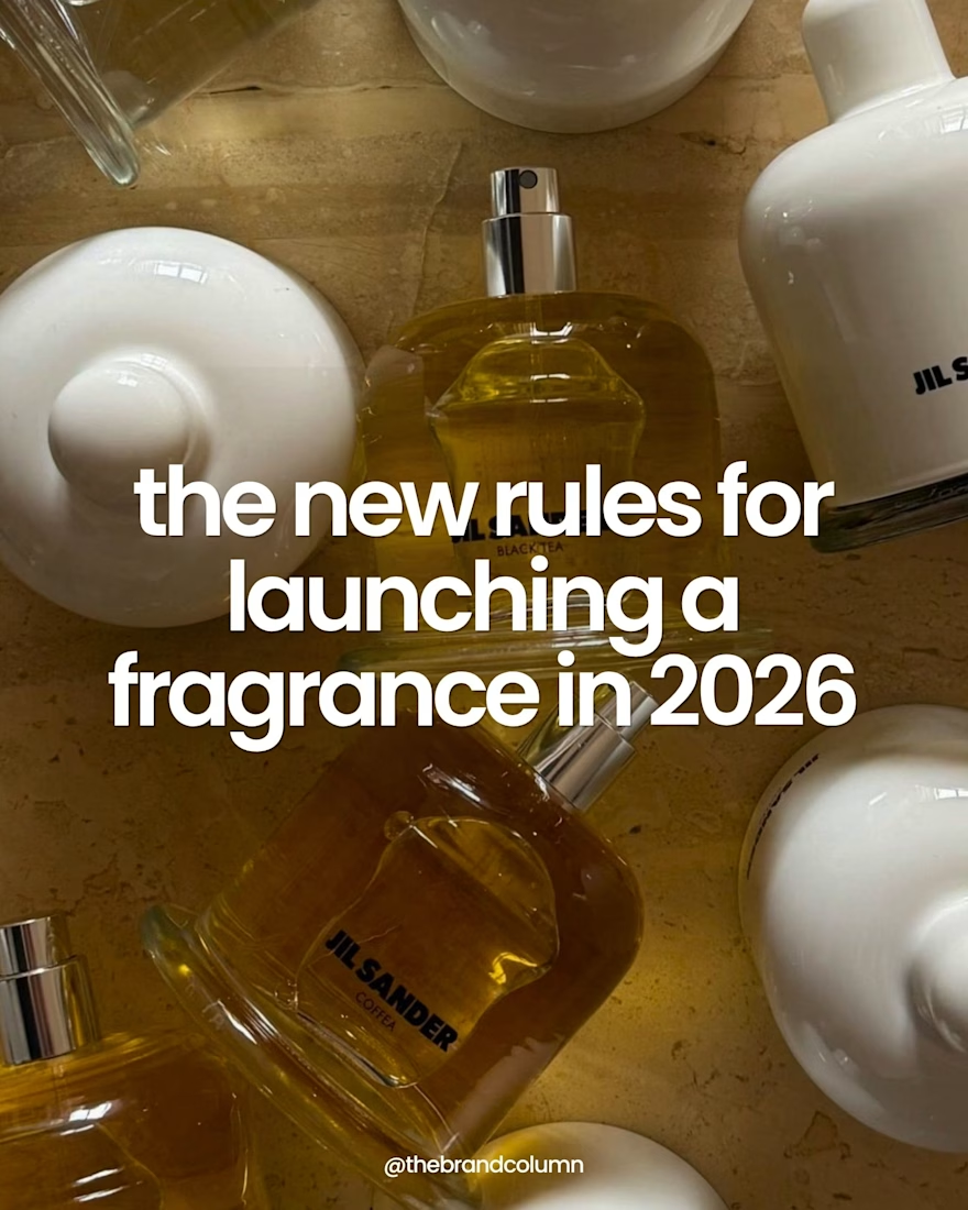
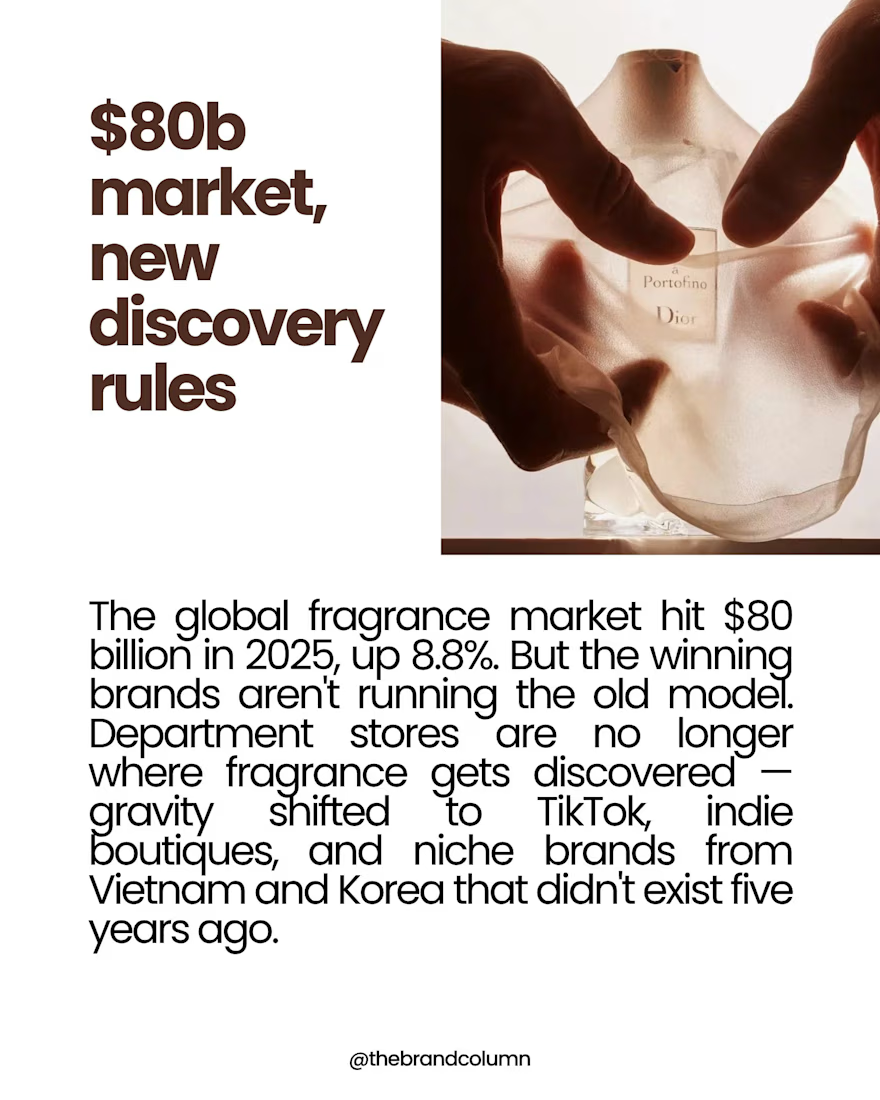
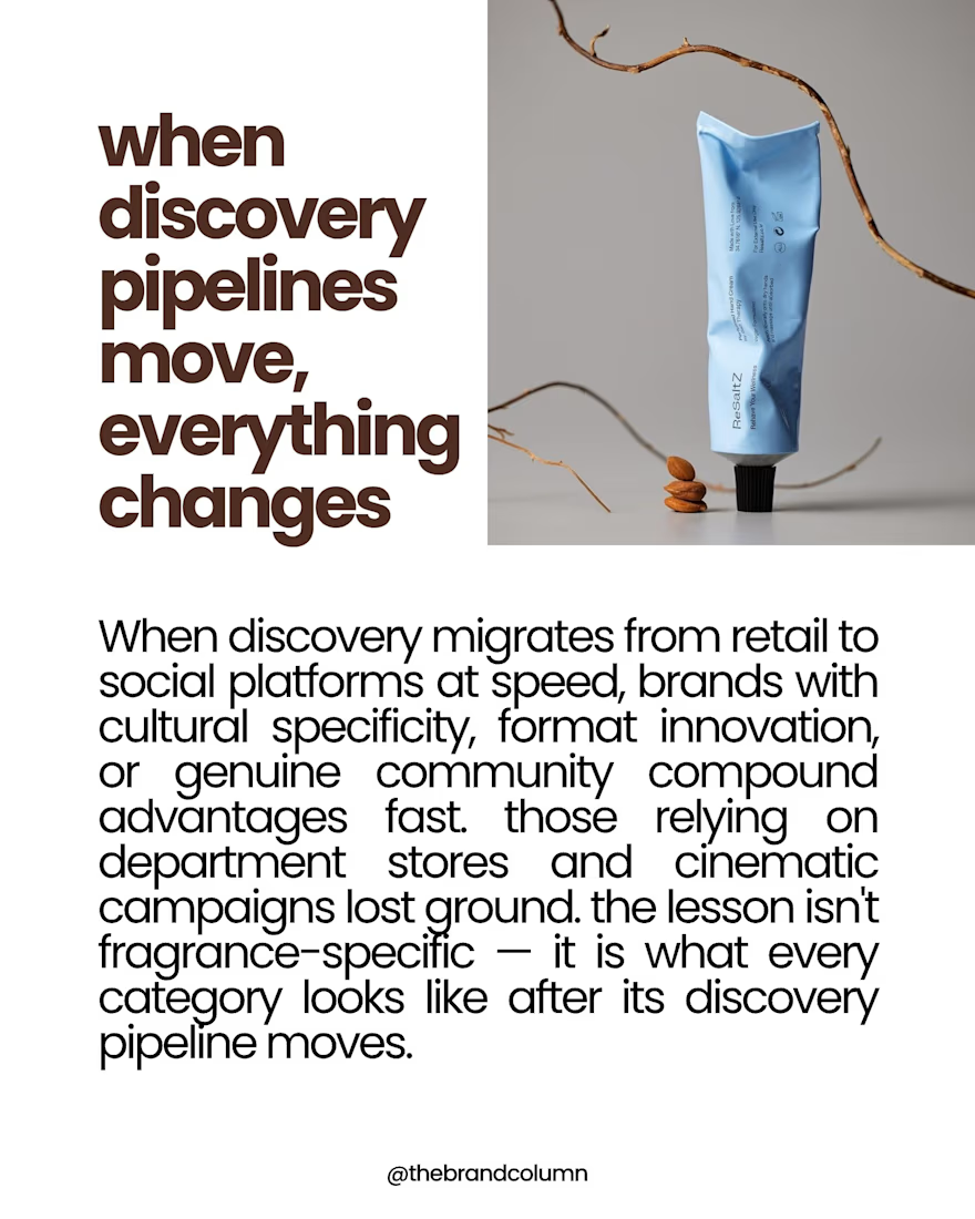
A recent piece of research exploring how fragrance discovery is changing.
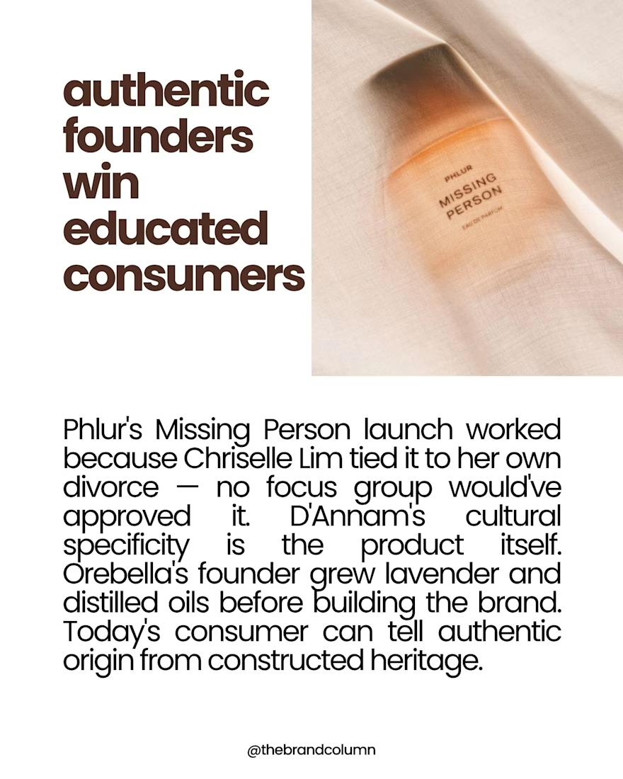
The most interesting fragrance brands today aren't necessarily winning through distribution. They're winning through discovery. Creator ecosystems, cultural positioning, founder narratives, and social platforms are increasingly shaping consumer decisions before a fragrance is ever smelled.
This breakdown looks at brands like Phlur, Orebella, and D'Annam, and what their growth reveals about the future of beauty, branding, and consumer behavior.
Full post below:
https://www.instagram.com/p/DZ9DFzuCZBP/?img_index=1
More work on brand strategy, consumer psychology, cultural analysis, and emerging consumer trends on my profile.



Outstanding
The network for creativity
Join 1.25M professional creatives like you
Connect with clients, get discovered, and run your business 100% commission-free
Creatives on Contra have earned over $150M and we are just getting started







Related posts



Great design the visual effects is unique 🎉🎉

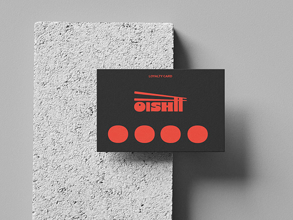
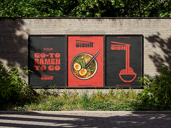
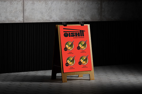
Ramen Brand Identity
Oishii is a self-initiated branding project exploring the visual identity of a modern ramen brand. The concept combines Japanese-inspired aesthetics with a contemporary visual approach, creating a distinctive and cohesive identity across brand applications.
The project explores visual direction, typography, colour, and brand elements to build a memorable identity for a food brand.


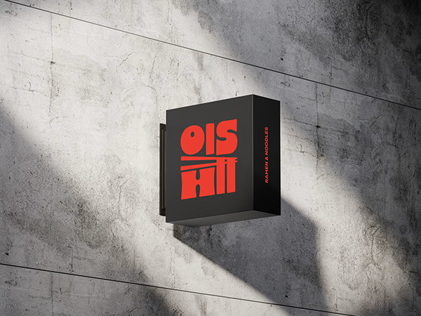


Love the mix of Japanese-inspired style and modern branding. The identity feels cohesive and memorable.

I took the face off the brand.
A square block on a shoulder bar. One arch for legs. No eyes, no smile, no pose.
Then I cut the wordmark down to EDICAT and let a single hard light do the rest.
Discipline isn’t a performance. It’s a stance.

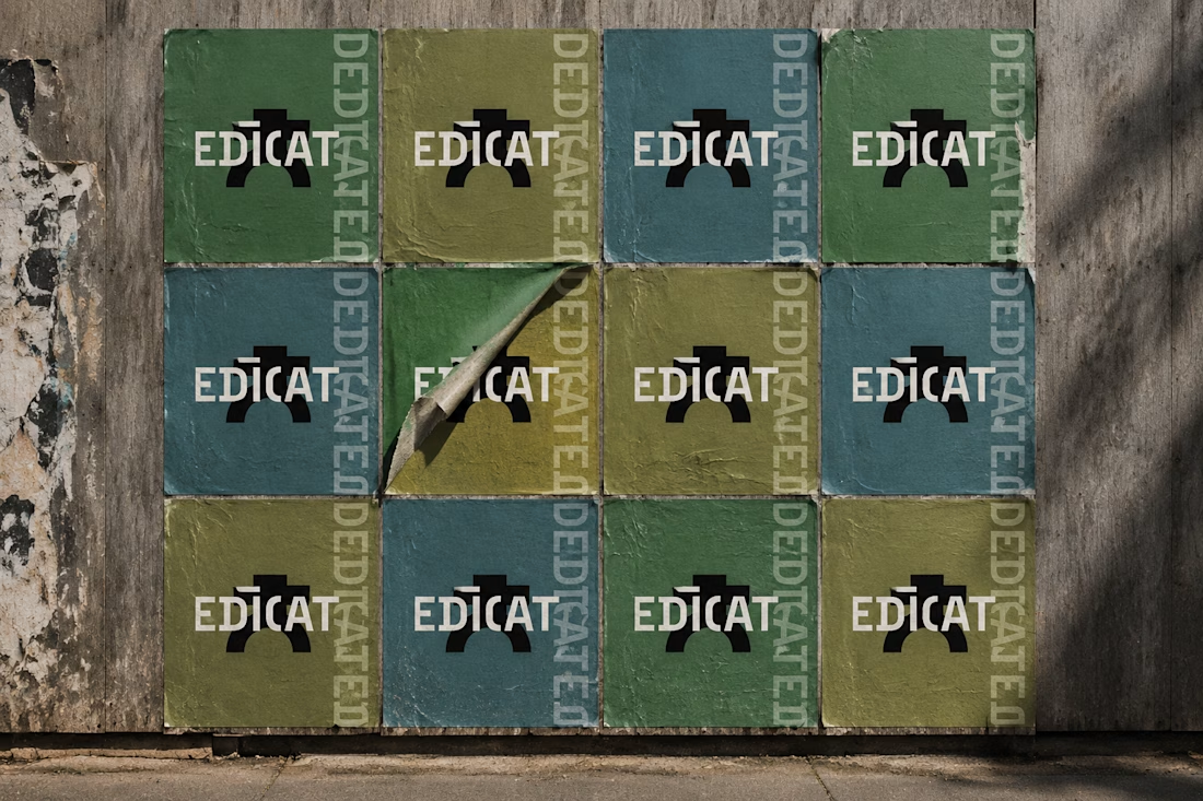

this is such strong work & a brilliant concept to build, kudos to you!