The network for creativity
Join 1.25M professional creatives like you
Connect with clients, get discovered, and run your business 100% commission-free
Creatives on Contra have earned over $150M and we are just getting started
Back to feedPost


Helina Lux @Wix Studio Website


The Helina Lux direction feels polished and premium across the Wix Studio presentation. Which interaction or section was the hardest to make feel as refined as the visuals?
The network for creativity
Join 1.25M professional creatives like you
Connect with clients, get discovered, and run your business 100% commission-free
Creatives on Contra have earned over $150M and we are just getting started
Related posts


Rug Pad Wizard: a Figma design for a premium rug pad brand.
One site for two buyers, trade dealers and homeowners.

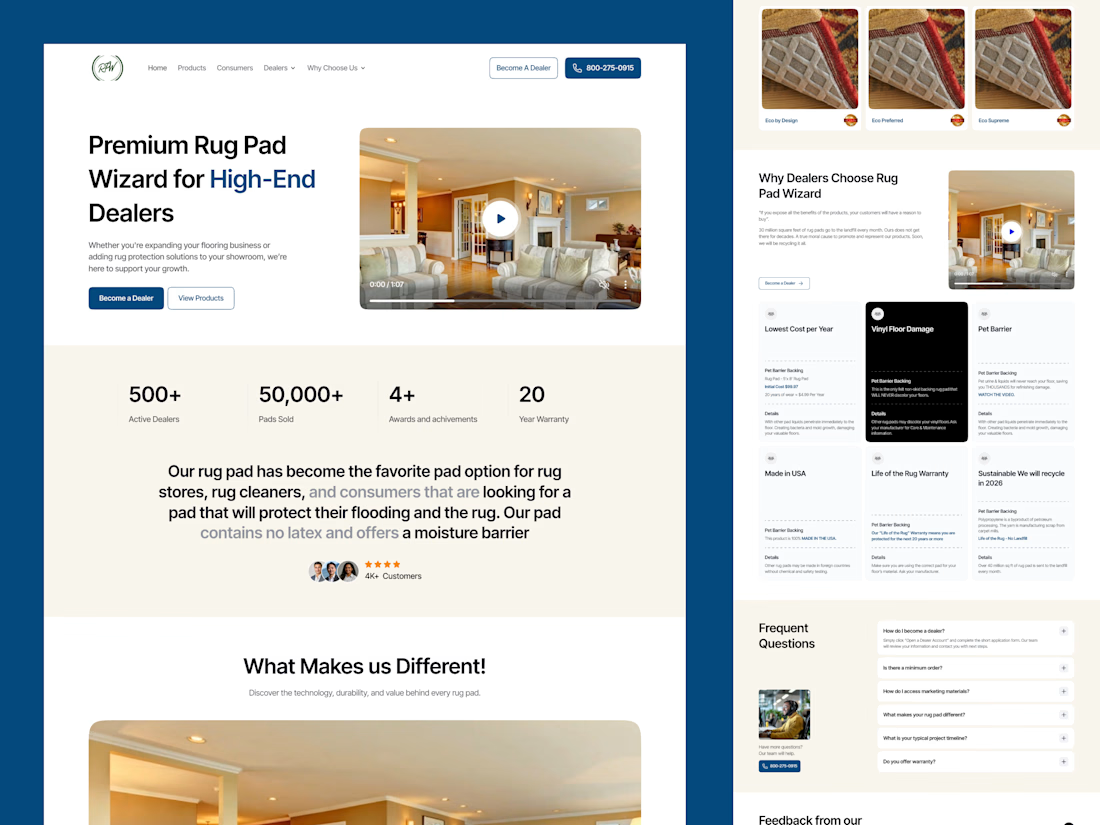

Smart to split dealers and homeowners on one site. The stats row under the hero is clean.

Don't just make Ecommerce 2d boring site. Make something that your users remembers😎
built by nextJS, Framer Motion, Lenis, Gsap, TailwimdCSS
Framer Website DesignwebdesignsaaswebsiteNext.jsInteractive DesignWeb DesignFramerVisual Studio Code


AI Freight landing page design completed for 5U AI.
They raised $3.2M recently.
I'm open for the new projects. 🤝

this is amazing website. smooth animation love the visual


