The network for creativity
Join 1.25M professional creatives like you
Connect with clients, get discovered, and run your business 100% commission-free
Creatives on Contra have earned over $150M and we are just getting started
Back to feedPost
A brand identity and website for a two-partner private client law firm. The identity came first — wordmark, monogram, palette, type system — and the site was built from it, so the two are one piece of work rather than a design handed to someone else to build. The layout borrows from print: a narrow text measure with headnotes in the margin, section marks, and a clause set as the hero rather than a stock photograph of a courthouse.


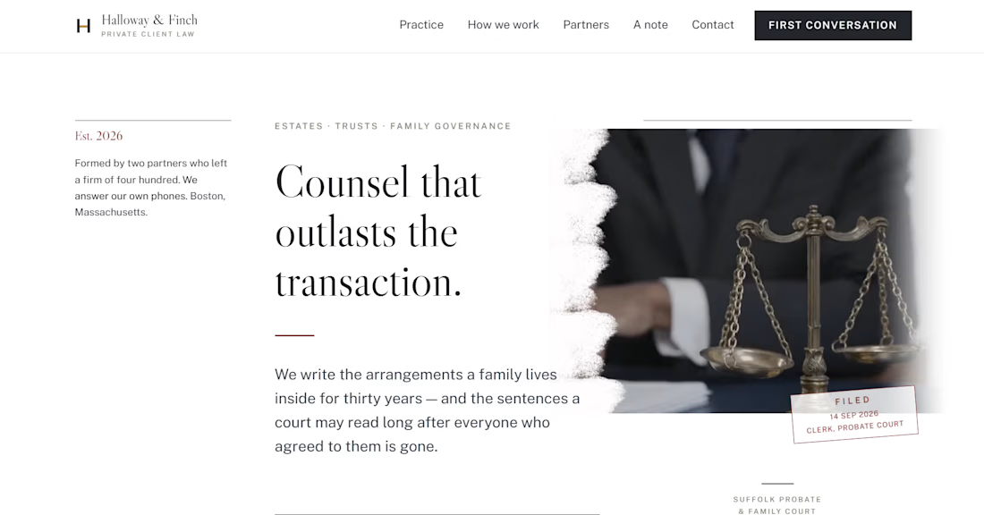

Setting an actual clause as the hero is the sharpest move in this one - law firms reach for the courthouse photo by default, and you swapped it for the thing clients are actually paying for. Do the margin headnotes survive the collapse to mobile, or does that layer fold away?

They stay. Below 880px the headnote leaves the margin and sits inline above its section, still under its own rule — so it reads as the abstract at the head of a report rather than as something that got dropped. The clause was the easy call. A firm like this sells one thing: a...
The network for creativity
Join 1.25M professional creatives like you
Connect with clients, get discovered, and run your business 100% commission-free
Creatives on Contra have earned over $150M and we are just getting started











Related posts

FOCUS — Creative Portfolio & Digital Art Website 🌸✨
A visually expressive website concept for a creative portfolio, built around digital art, bold imagery, and visual storytelling
The design combines vibrant pink tones, soft gradients, experimental typography, and immersive photography to create a distinctive editorial experience
Special attention was given to:
• Bold editorial hero composition
• Vibrant pink and dark color palette
• Experimental typography and visual details
• Immersive photography and digital artwork
• Creative project gallery and navigation
• Responsive mobile experience
• Clean layouts with a strong visual identity
The result is an expressive digital experience that puts creativity, emotion, and visual storytelling at the center of every screen 💗
Looking to create a standout portfolio or website for a creative brand? Let’s connect 🚀






Design Exploration: Hero Section of Architecture Website. Which one do you think much better?


12 voted
43%
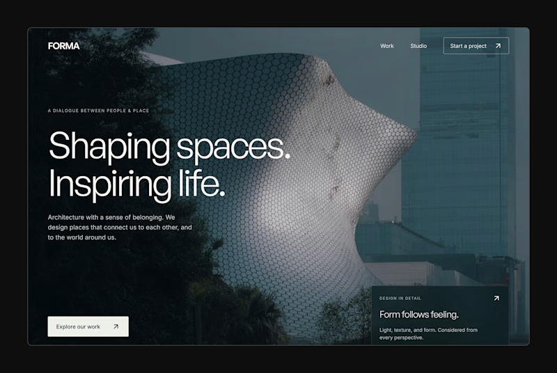
16 voted
57%
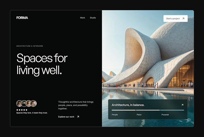
28 votes
Closed


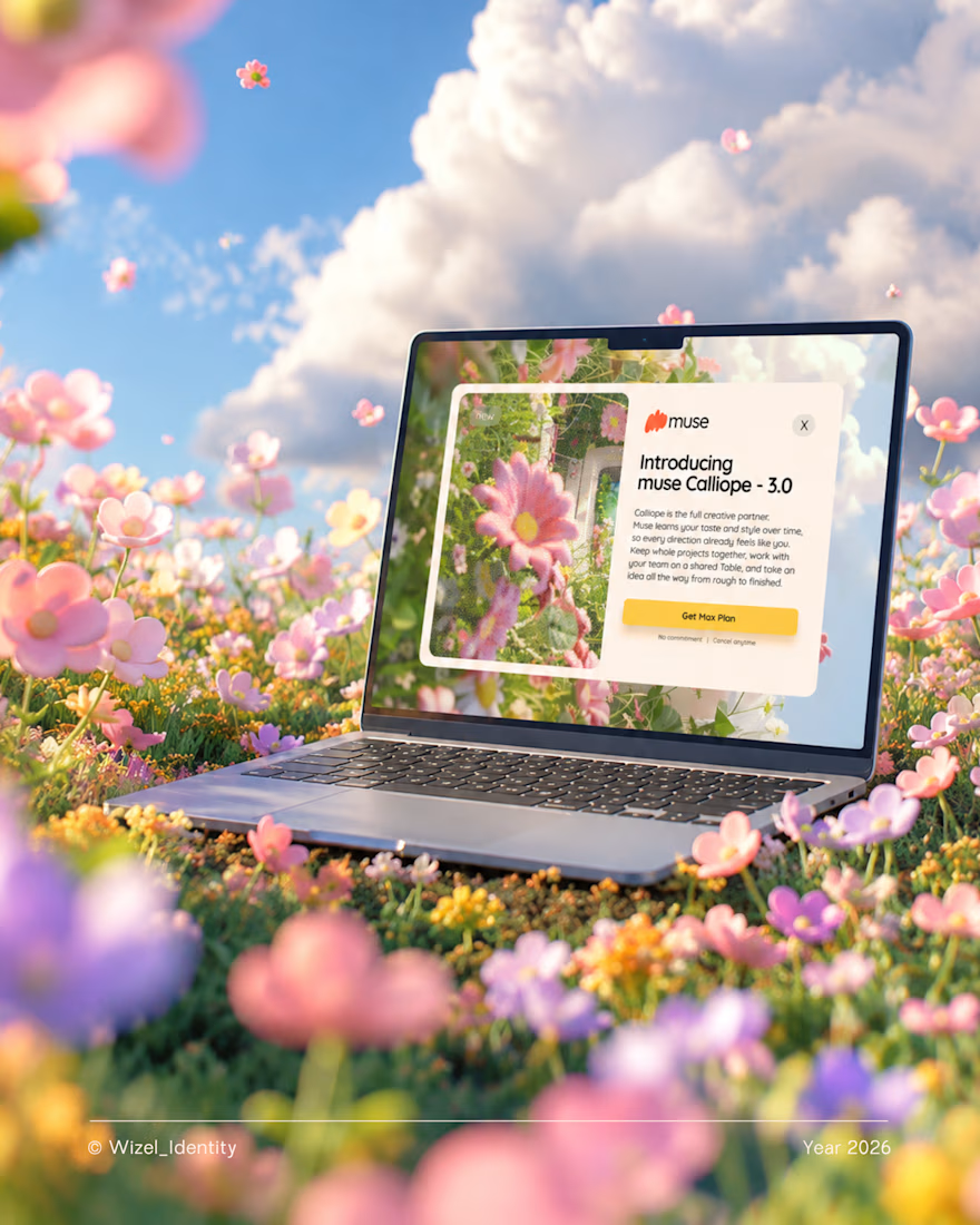
What if creating felt more natural? 🌼
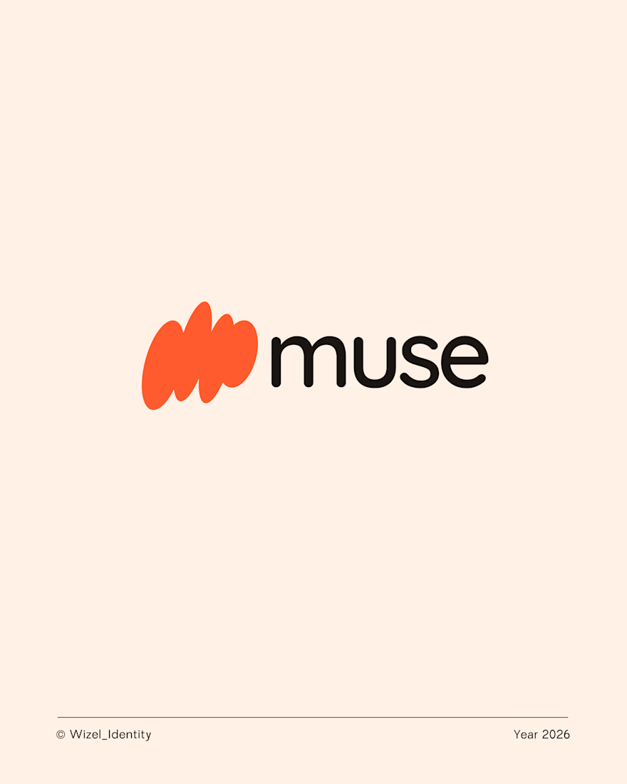
Meet Muse, an AI creative companion that helps turn rough ideas into clear concepts.
The thought you can't quite explain. The idea that's still taking shape. The concept you're trying to bring to life.
Muse meets you right there.
For this identity, I explored a visual direction that feels playful, expressive, and full of possibility, a reflection of what creativity can feel like when you have room to explore.
Brand identity design for Muse.
Designed by Wizel_Identity. © 2026
#BrandIdentity #VisualIdentity #BrandDesign #CreativeTechnology #AI



T O P!