The network for creativity
Join 1.25M professional creatives like you
Connect with clients, get discovered, and run your business 100% commission-free
Creatives on Contra have earned over $150M and we are just getting started
Back to feedPost

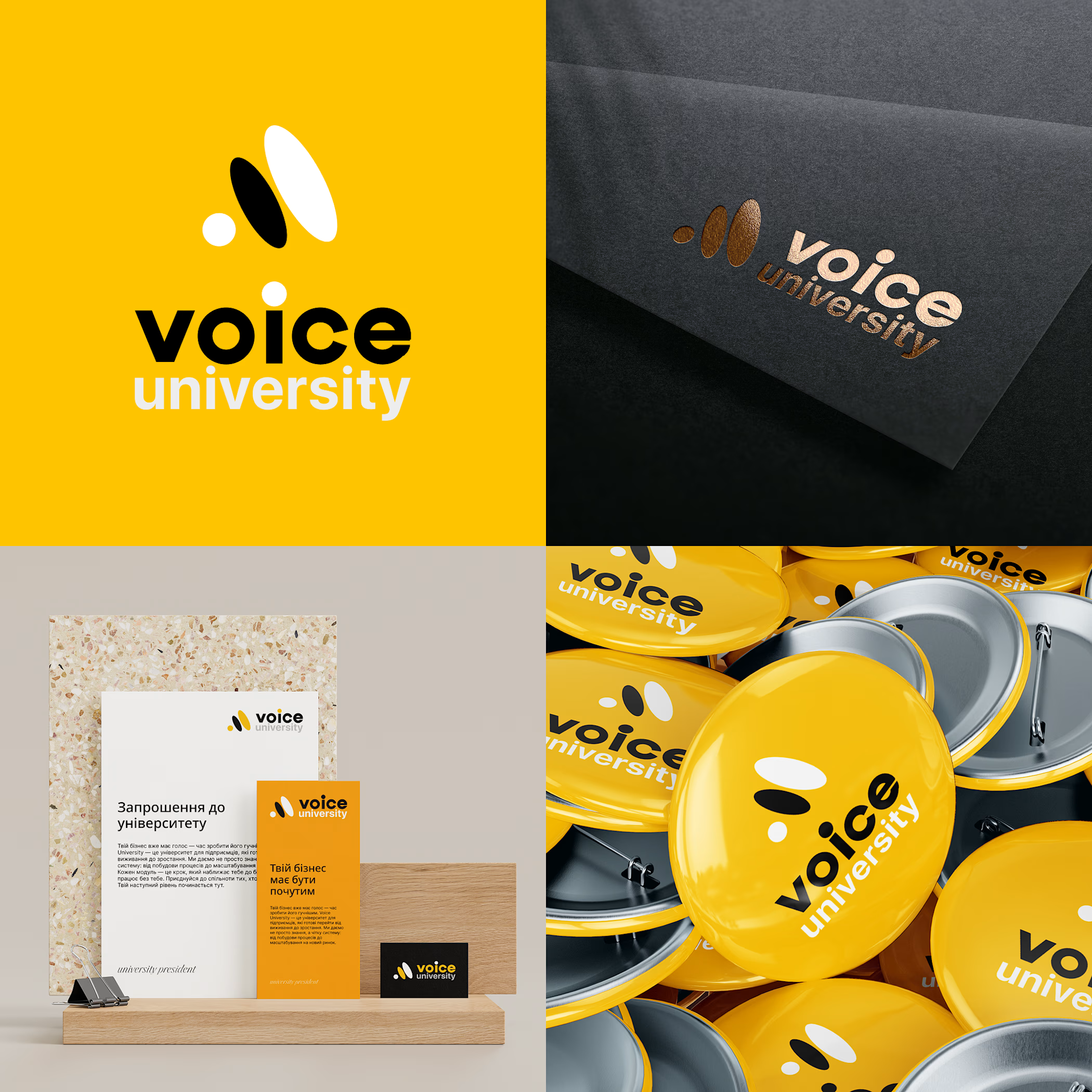
Logo design for Voice University—an educational brand for entrepreneurs seeking to scale their businesses and make a strong impact in the market. The challenge was to create a logo that conveys the dynamics of growth and the power of transformation through learning.
Check it out
The logo is built around three dynamic spheres that symbolize a business’s journey: from a local enterprise to a system-level company. Each element represents a stage of development, and together they form an image of movement and breakthrough. The black-and-yellow color palette emphasizes the brand’s energy, boldness, and recognizability across any medium—from a badge to a banner. The result is a logo that speaks to growth even before the first word is spoken.


The network for creativity
Join 1.25M professional creatives like you
Connect with clients, get discovered, and run your business 100% commission-free
Creatives on Contra have earned over $150M and we are just getting started











Related posts

Here we go, check the full case study, I think you will love it! 🎃


Love this! 🎃 The pumpkin concept for Renesia is super creative - perfectly matches the Pumpkin Seed Oil story. Clean work in Illustrator & Figma!

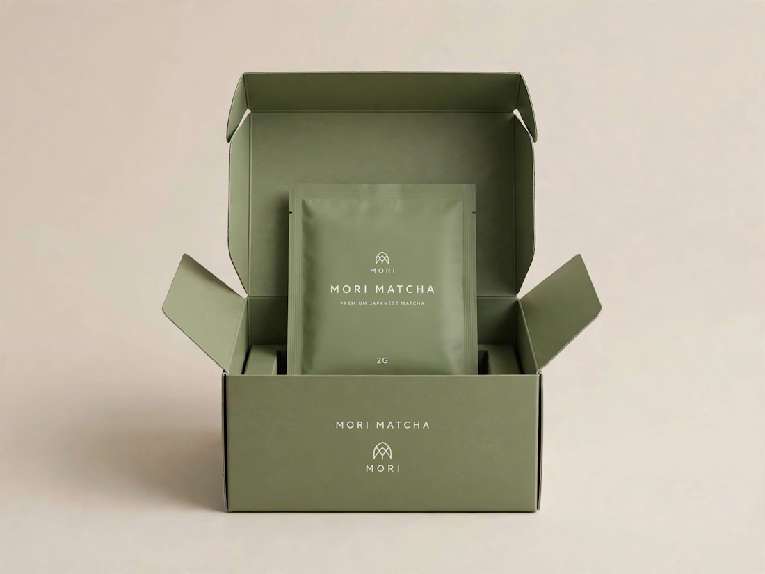
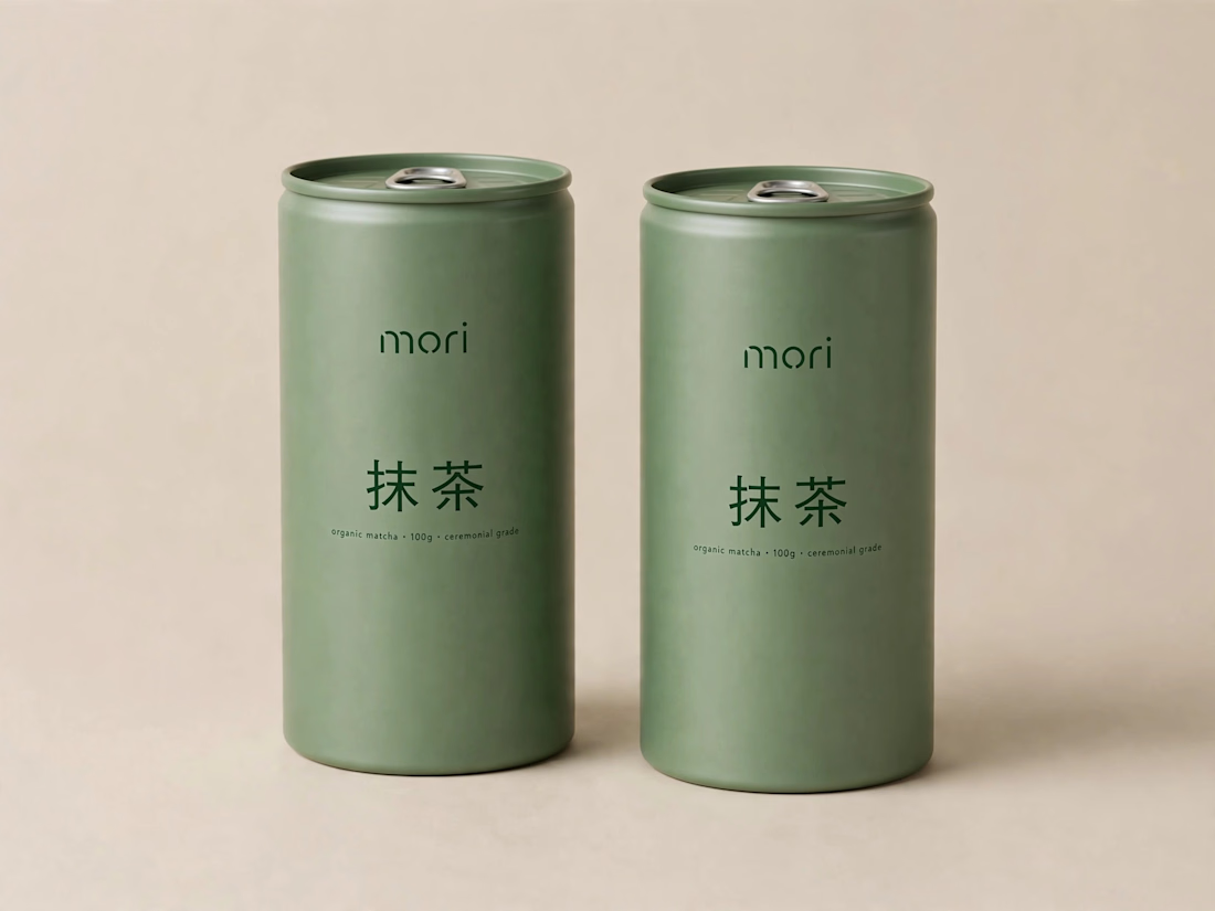
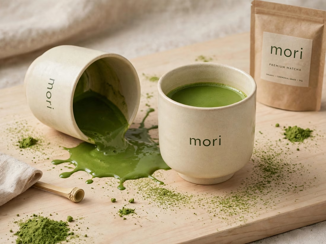
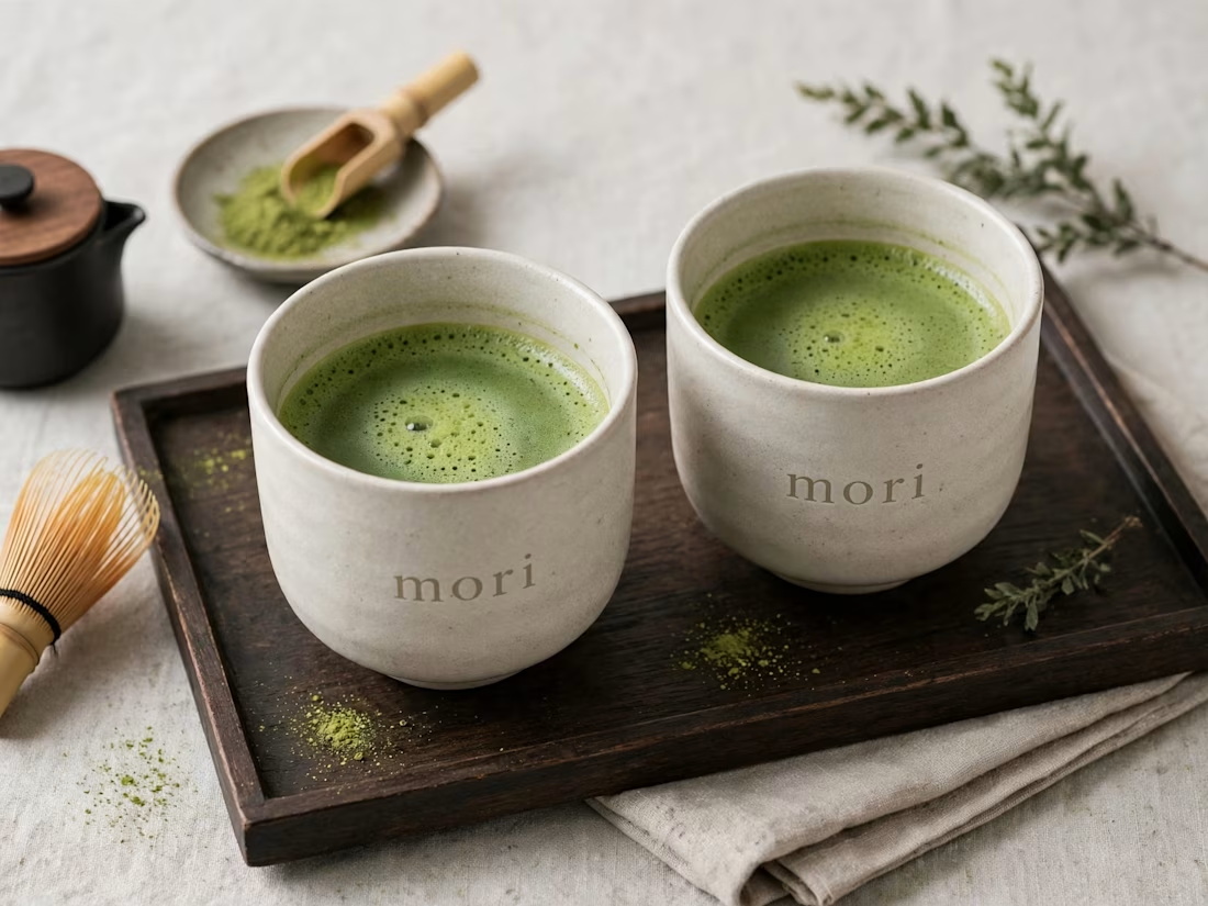
more visuals from my latest project — mori matcha 🍵
explored minimal Japanese packaging with earthy greens and calm typography.
focusing on premium ceramic cups and clean can design.
#branddesign #packagingdesign #visualidentity #brandstrategy #matcha #minimaldesign #japanesedesign #figma #mockup #branding



Have you ever designed packaging for a brand that never launched? 👀
Surprisingly, it’s happened to me more times than I expected.
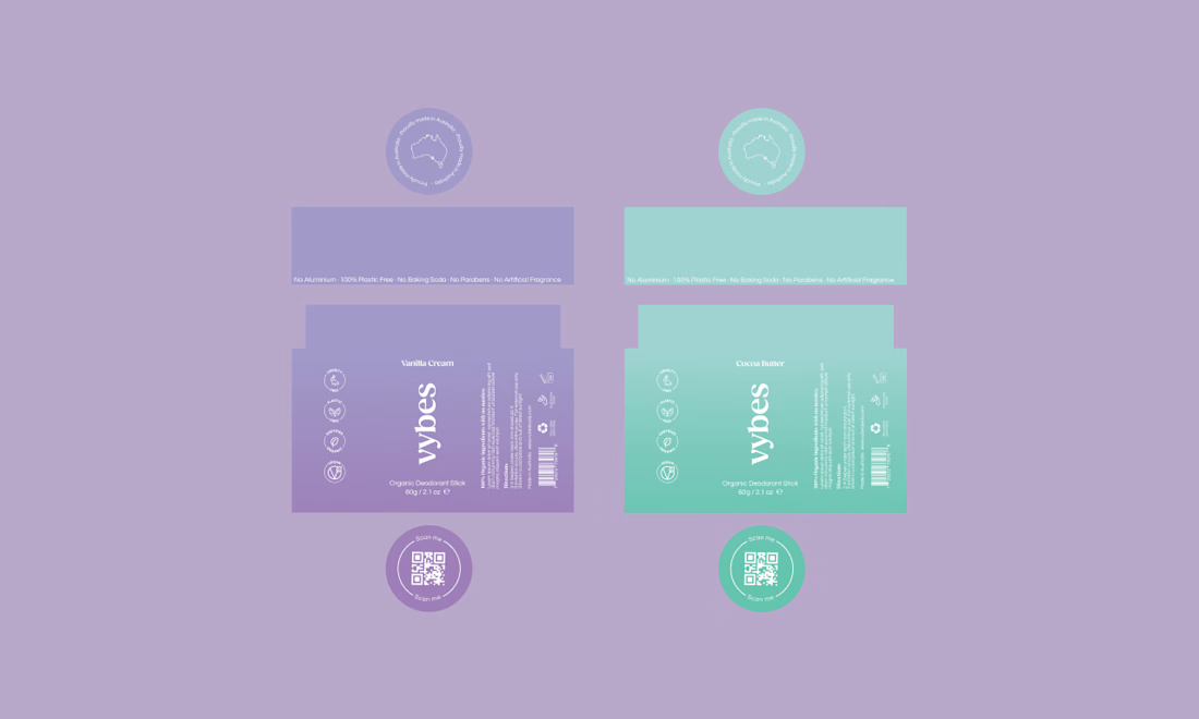
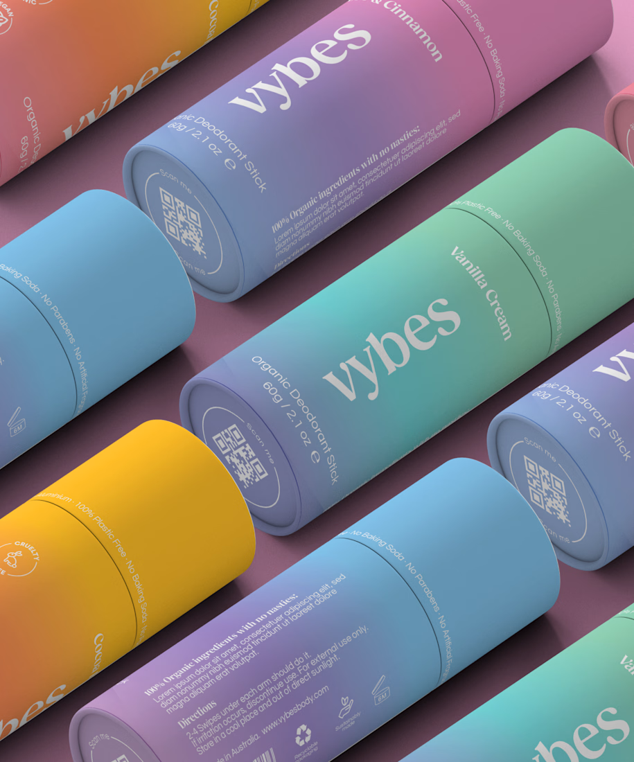
Vybes was an organic deodorant brand from Australia I worked on, designing packaging for a product that, in the end, never made it to market.
It’s a weird feeling putting so much thought into packaging for a product that people will never see on a shelf.
How many unreleased projects are hiding in your folders? 😂