The network for creativity
Join 1.25M professional creatives like you
Connect with clients, get discovered, and run your business 100% commission-free
Creatives on Contra have earned over $150M and we are just getting started
Back to feedPost

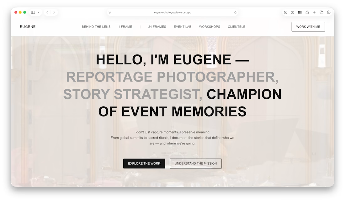
Eugene Photography – Portfolio Photography Website
Developed a modern and visually engaging photography portfolio website for Eugene using Next.js, focused on showcasing photography work with a clean, elegant, and responsive design. The website was built to deliver a smooth browsing experience while highlighting high-quality visual content and professional branding.
Key highlights of the project include:
• Responsive and premium portfolio design
• Optimized image loading and performance
• Modern UI/UX for photography presentation
• SEO-friendly Next.js architecture
• Fast and scalable deployment on Vercel
• Smooth navigation and mobile-friendly experience
The project was successfully deployed on Vercel with performance optimization and scalable frontend architecture.
Live URL: https://eugene-photography.vercel.app


The network for creativity
Join 1.25M professional creatives like you
Connect with clients, get discovered, and run your business 100% commission-free
Creatives on Contra have earned over $150M and we are just getting started







Related posts

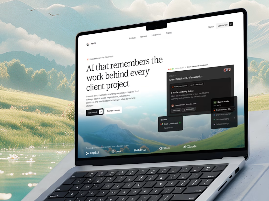
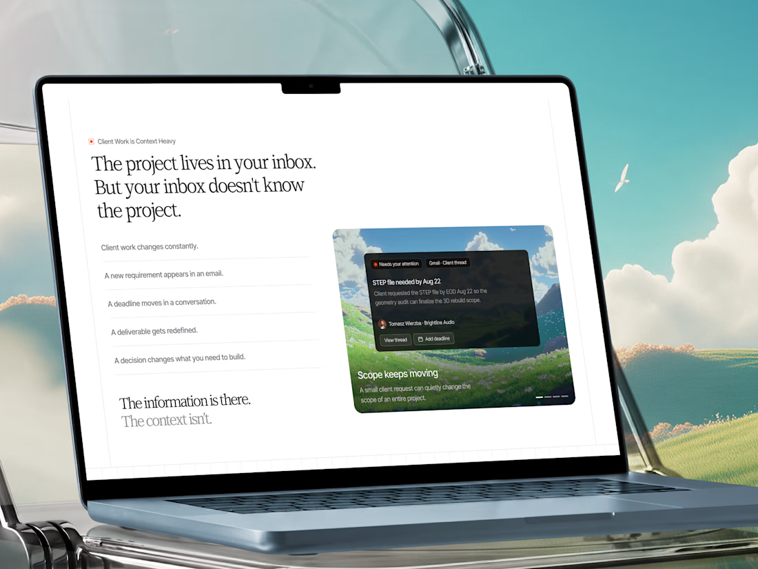
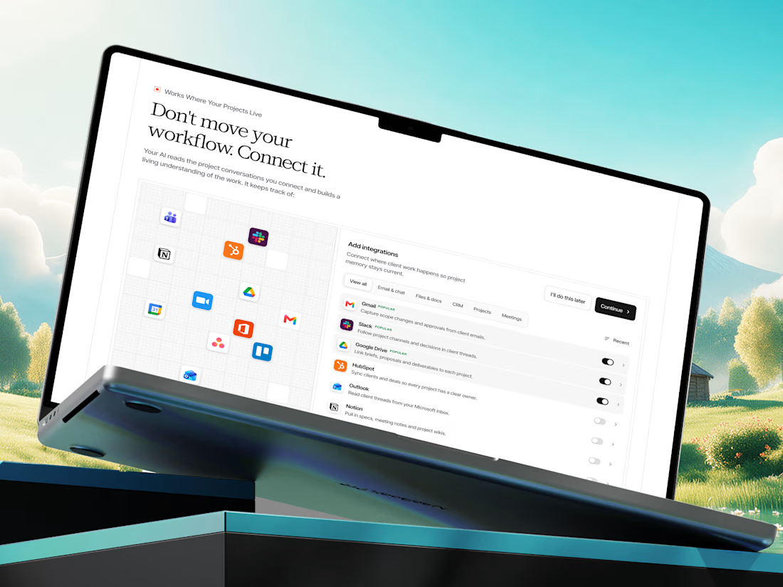
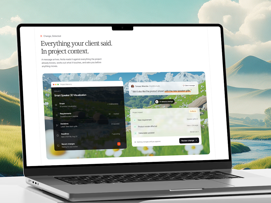
A few shots from our recent web design project for an AI Project Memory Platform.
Check it out
This project is a website and product experience for an AI-powered project memory platform built for freelancers, agencies, consultants, and client-service teams.

That's interesting project great job Fawaz🎉

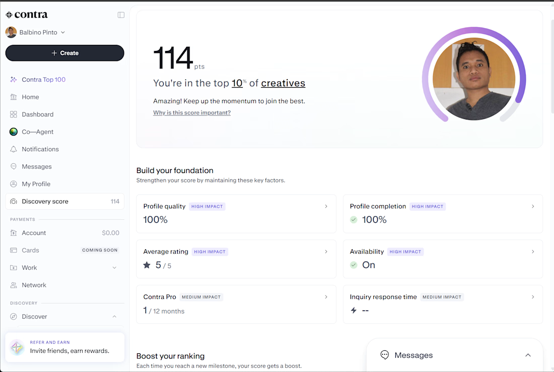
My Contra Discovery Score has reached 114 points, placing me in the top 10% of creatives on the platform. My profile quality and profile completion are both at 100%, with a 5/5 average rating and availability turned on.
As a software engineer specializing in React, .NET, API development, and SAP Business One, I'm continuing to strengthen my Contra presence, showcase my portfolio, and connect with potential clients for new freelance opportunities.



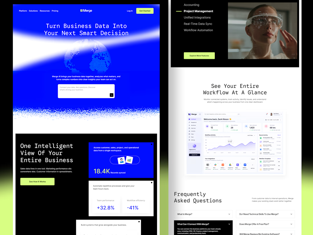
Merge — AI-Powered Business Intelligence SaaS Landing Page Design
Businesses often struggle with disconnected tools, scattered data, and complicated workflows. When important information lives across multiple platforms, teams waste time switching between tools instead of focusing on growth.
For Merge, I designed a modern SaaS landing page concept that presents business intelligence, unified integrations, and workflow automation through a clear and engaging user experience.
The goal: Create a landing page that communicates product value quickly, builds trust, and helps potential customers understand how the platform fits into their workflow.
Design focus
Clear value proposition and messaging
Strong visual hierarchy and conversion-focused CTAs
Dashboard UI to demonstrate product capabilities
Feature sections that simplify complex functionality
Consistent design language across the entire page
A SaaS website should do more than look attractive. It should help the right customers understand the product, recognize its value, and feel confident taking action.



Outstanding work