The network for creativity
Join 1.25M professional creatives like you
Connect with clients, get discovered, and run your business 100% commission-free
Creatives on Contra have earned over $150M and we are just getting started
Back to feedPost

ilk, after dark 🥛🖤
Spent the past week designing MOOOD, a milk brand for people who don’t think of milk as a drink. Matte black cans, white patterns, and four moods: slow waves for calm, warm spirals for cozy, sharp lines for wired, dots and stars for giddy.
No cartons, no cows, no green fields. Just three stretched O’s, one tiny face that changes with the mood, and a pull tab. 🖤
Sometimes the best twist is putting something soft in something dark.
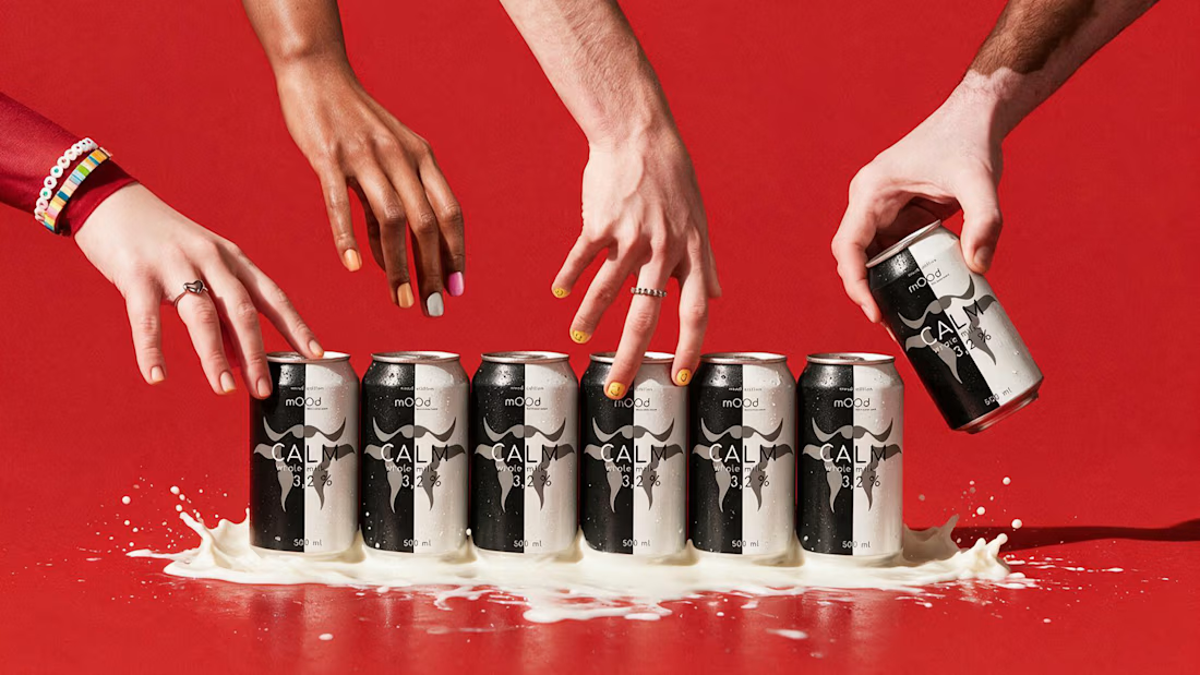
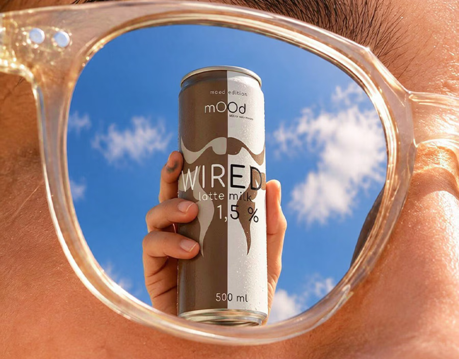
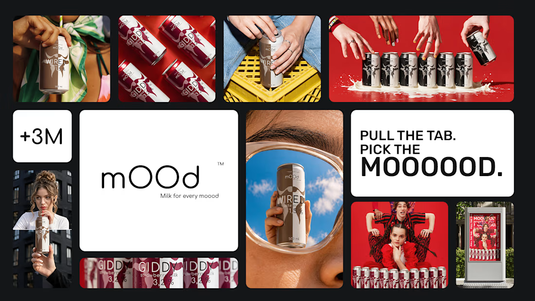

I love that the stretched O's leak into the copy too, "PICK THE MOOOOOD" reads like the can itself is yawning. Which of the four moods was hardest to turn into a pattern?
The network for creativity
Join 1.25M professional creatives like you
Connect with clients, get discovered, and run your business 100% commission-free
Creatives on Contra have earned over $150M and we are just getting started



Related posts

I recently worked on a branding concept for OUT OF ORDER (OOO), a streetwear brand inspired by hip-hop, urban culture and retro aesthetics.
The identity explores the contrast between expressive graffiti-inspired typography and a more refined, high-fashion visual direction.


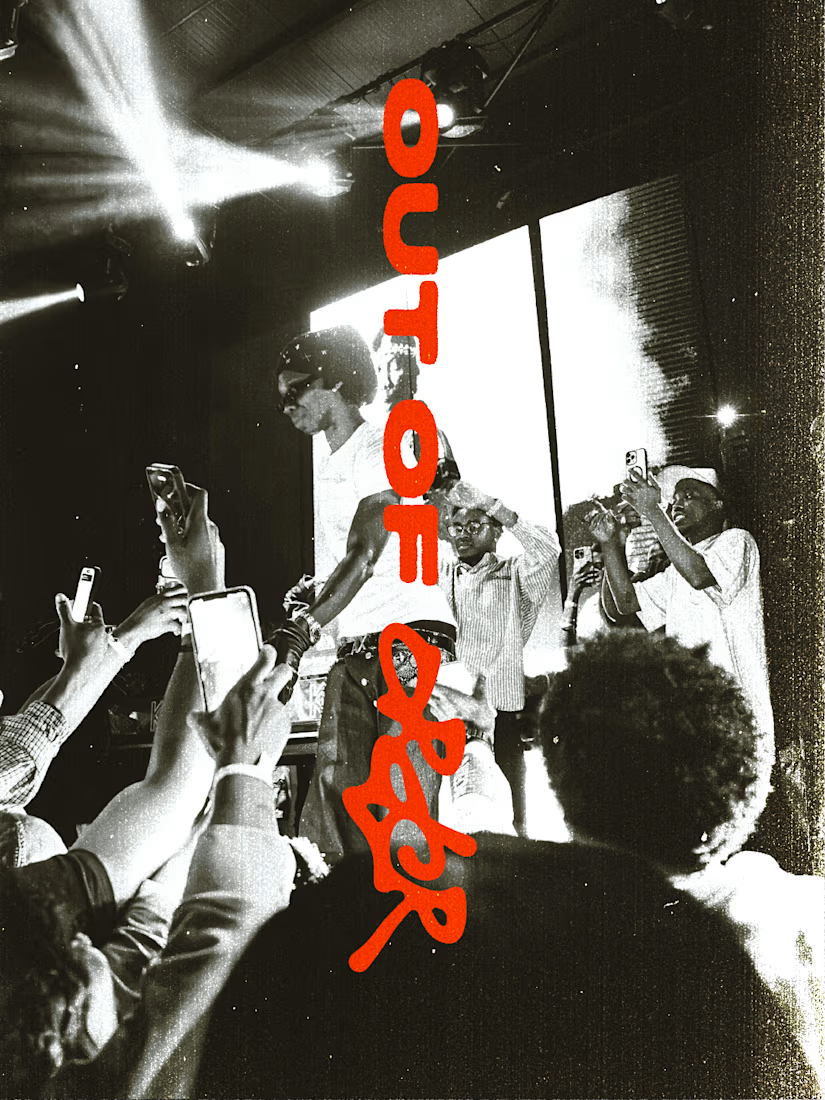
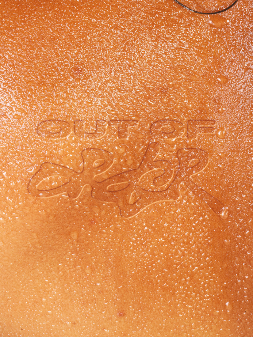
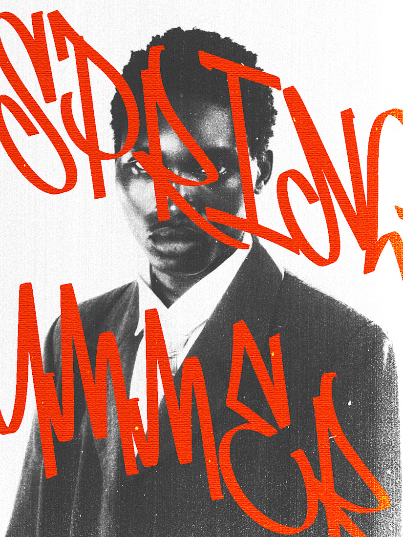
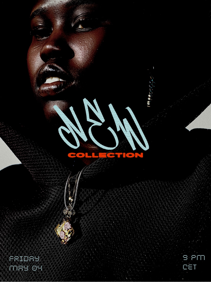


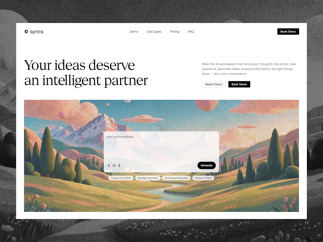

Love all but 1st one stands out so much

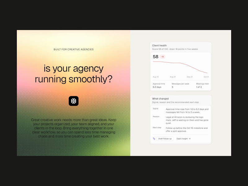
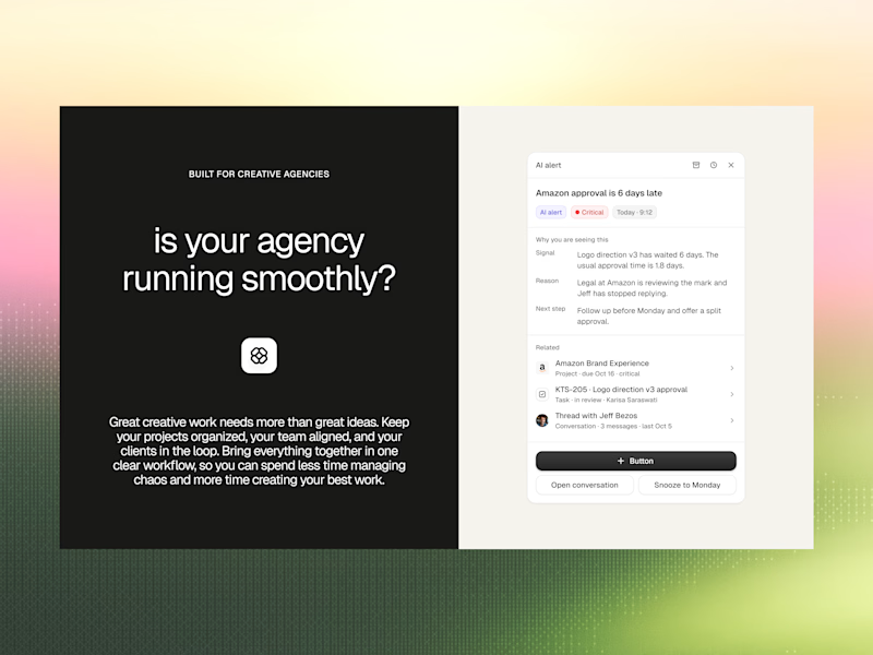
Is your agency running smoothly? 🤔
We explored two moods for this product visual, each with the same Client Health and AI Alert cards. One glows like sunrise, the other settles into dusk. Both look good, but only one can win.
Which one gets your vote: Dusk 🌙 or Dawn ☀️?
Drop your pick below! 💬👇
#UIDesign #ProductDesign #SaaSDesign #DashboardDesign #DesignPoll
2 votes
Ends in 19h