The network for creativity
Join 1.25M professional creatives like you
Connect with clients, get discovered, and run your business 100% commission-free
Creatives on Contra have earned over $150M and we are just getting started
Back to feedPost

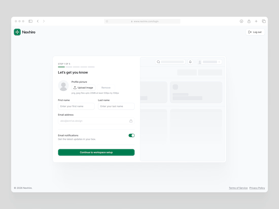
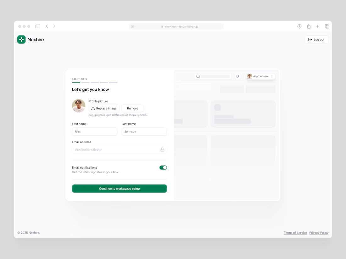
Recruitment SaaS Onboarding Flow Step 1 UI Design
The network for creativity
Join 1.25M professional creatives like you
Connect with clients, get discovered, and run your business 100% commission-free
Creatives on Contra have earned over $150M and we are just getting started





Related posts


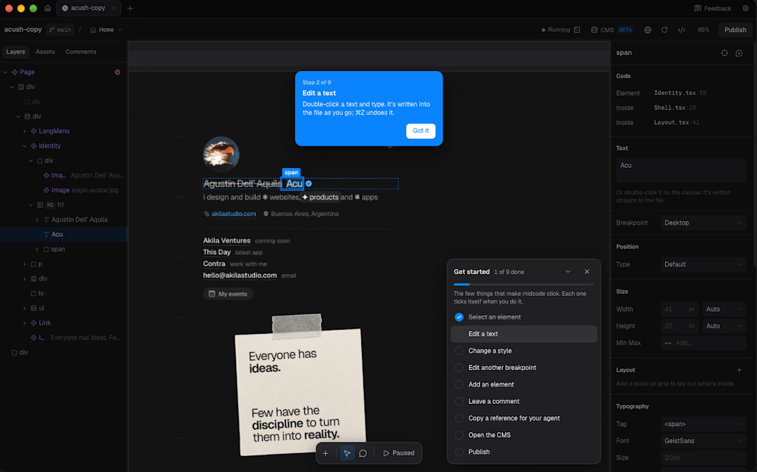
Onboarding flow for midcode.app

Just finished building a Salon Booking Management System!
The goal was simple: make appointment management easier for salon owners and reduce the manual work involved in handling bookings and reminders.
The system connects the complete workflow in one place:
1 Customer makes a booking
2 Booking gets confirmed
3 Owner sees it on the dashboard
4 Upcoming appointments are organized clearly
5 Reminders help the owner stay on top of appointments
One of the key things I focused on was making the experience simple, clean, and easy to understand, while keeping the workflow practical for a real business.
This project helped me think beyond just building screens — and focus more on the actual business problem, user flow, and overall product experience.
Excited to keep improving it and turn it into an even more polished product.
#BuildInPublic #SaaS #WebApp #BookingSystem #SalonManagement #ProductDesign #MVP #NoCode #Entrepreneurship


Good work


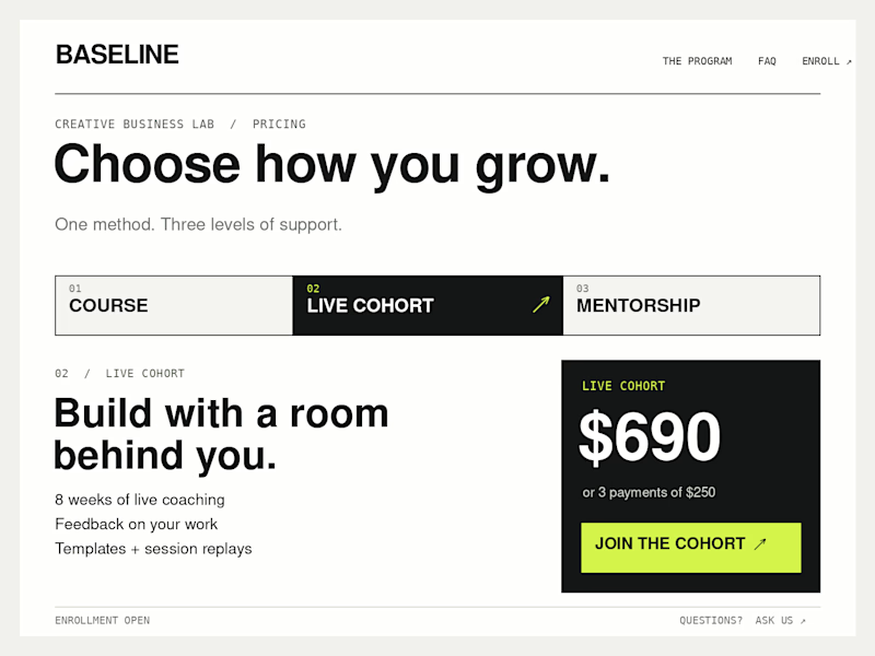
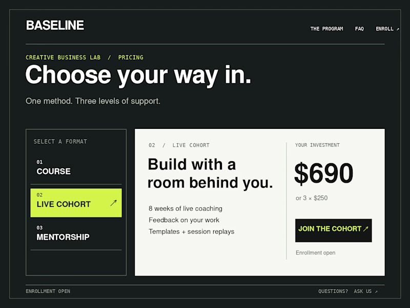
Which Kajabi pricing section would you ship?
Creative Business Lab has three paths: Course, Live Cohort, and Mentorship. Both designs show the same $690 Live Cohort with the same benefits. Only the presentation changes.
Vote Horizontal tabs or Side tabs, then tell me the one thing you’d improve before launch. Have a stronger third approach? Show it in the replies.

21 voted
50%
21 voted
50%
42 votes
Closed

Horizontal. side tabs read as nav, people skip them. though the stronger third option is no tabs at all, three cards side by side. both of these hide two prices behind a click and comparison is the one job a pricing section has.