The network for creativity
Join 1.25M professional creatives like you
Connect with clients, get discovered, and run your business 100% commission-free
Creatives on Contra have earned over $150M and we are just getting started
Back to feedPost
Most Shopify stores fail at the homepage. Too much text. Too many buttons. No clear path to purchase. This concept strips everything back to what matters: the product, the value, and the buy button. Sometimes less really is more.


Transformed a basic Shopify default theme into a premium, conversion-focused fashion storefront. The before: no brand identity, flat layout, weak CTAs, and zero trust signals. The after: bold hero section with clear value proposition, custom color palette, product cards with...
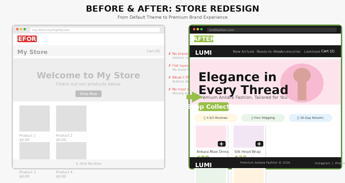

Worth naming the exception though: stripping back works once a visitor already trusts the brand. For a first-timer the trust signals are the conversion, and your own after-frame makes the case, the reviews / free shipping / returns strip is something you added rather than...

Solid point, you're absolutely right. The 'less' in the layout is actually supported by more trust signals (reviews, guarantees, shipping transparency) because exactly like you said, a first-time visitor needs credibility before they convert. The minimalism is visual; the reassurance is strategic. Appreciate the nuance!
The network for creativity
Join 1.25M professional creatives like you
Connect with clients, get discovered, and run your business 100% commission-free
Creatives on Contra have earned over $150M and we are just getting started











Related posts

Brand Expressions -- Olivir




Thats so crazy!!!!!! Seeing this I feel we humans are still far better than AI

A little peek at the brand work we did for Elio Mortgage.
A warm, approachable identity full of warm vibrant colors paired with soft sun rising inspired gradients, inner glows and custom illustrations & more. Loved this direction!
Full case study coming soon, from process to final identity.
Plenty of logo explorations to share too!


That color palette takes the whole identity to a different level!! I loove it.

FOCUS — Creative Portfolio & Digital Art Website 🌸✨
A visually expressive website concept for a creative portfolio, built around digital art, bold imagery, and visual storytelling
The design combines vibrant pink tones, soft gradients, experimental typography, and immersive photography to create a distinctive editorial experience
Special attention was given to:
• Bold editorial hero composition
• Vibrant pink and dark color palette
• Experimental typography and visual details
• Immersive photography and digital artwork
• Creative project gallery and navigation
• Responsive mobile experience
• Clean layouts with a strong visual identity
The result is an expressive digital experience that puts creativity, emotion, and visual storytelling at the center of every screen 💗
Looking to create a standout portfolio or website for a creative brand? Let’s connect 🚀





The vibrant pink against the dark palette gives this such a bold editorial feel. The experimental typography is the star here.