The network for creativity
Join 1.25M professional creatives like you
Connect with clients, get discovered, and run your business 100% commission-free
Creatives on Contra have earned over $150M and we are just getting started
Back to feedPost
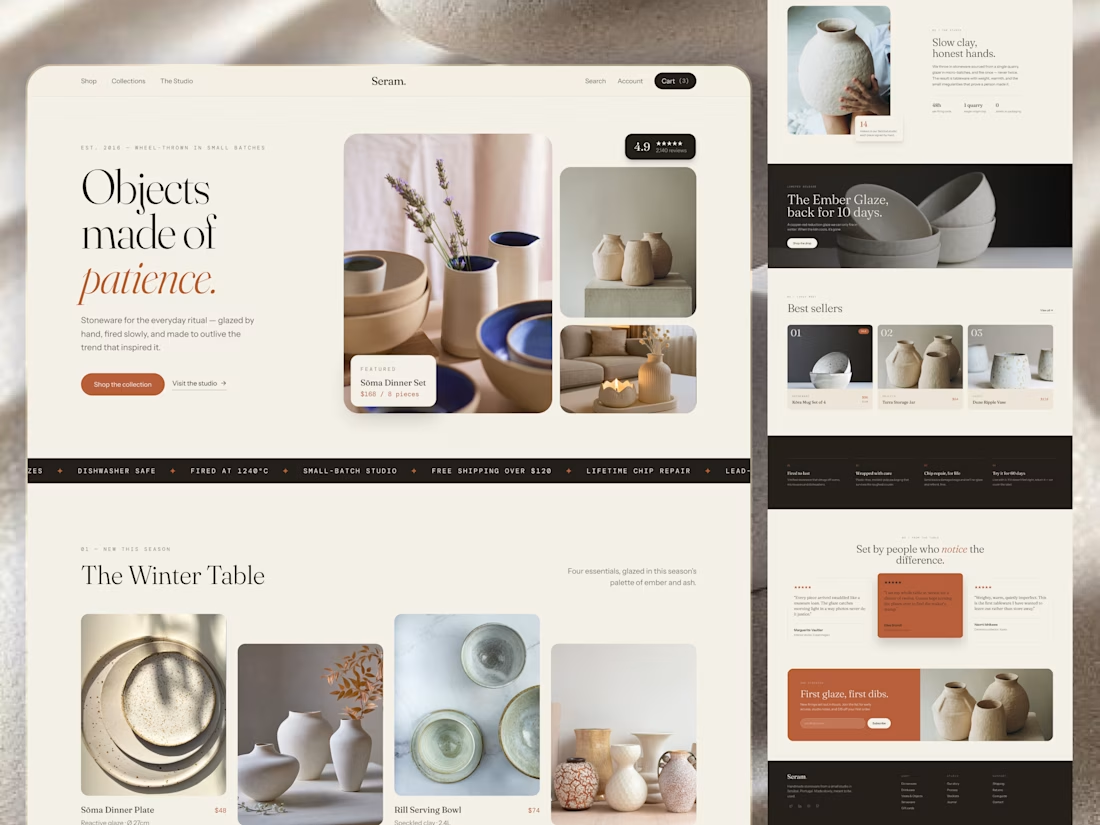
A ceramics store doesn't need to feel like a warehouse. It can feel like a studio.
For Seram., the experience was designed around the story behind the objects, not just the objects themselves.
The flow moves naturally through:
Discover → Explore → Understand → Appreciate → Choose
From seasonal collections to craft stories, product details, customer reviews, and form-based browsing, every section helps the customer make a more informed choice.
Warm photography and editorial typography create a calm atmosphere, while the responsive layout keeps the same feeling across screens.
Because good e-commerce UX doesn't always mean helping people buy faster. Sometimes, it means helping them value the product more.
🏀 Full Design Showcase – Better View on Dribbble.
✅https://dribbble.com/shots/27764216-Stoneware-E-commerce-Product-Website-UI-UX



Really nice

Grateful for your words! 🙌
Your welcome Mr

"Sometimes it means helping them value the product more" is such a good line, especially for handmade goods. Did you show the maker or process on the PDP itself? For craft products, a single process shot near the price often justifies it better than any copy.
The network for creativity
Join 1.25M professional creatives like you
Connect with clients, get discovered, and run your business 100% commission-free
Creatives on Contra have earned over $150M and we are just getting started








Related posts

AI can build the UI in minutes.
Bringing it up to a good standard, still needs a designer. Agree or disagree?

I see some of your work and honestly your work is really premium 🎉🎉
Great job Alex🎉🎉🔥🔥


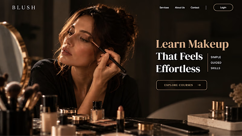
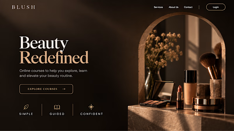
Your Hero Section Has One Job: Be Clear.
You don’t need huge headlines or long explanations. You need the right image + short headline + clear offer.
For the first version, we worked on the branding, the image and the copy together, so at first glance it’s clear: this is a makeup course, and here’s what you’ll get.
The second version is still beautiful and still feels like beauty. But what are you actually getting? A makeup course? Products? A store? That’s the problem with a Hero that looks good but isn’t thought through.
Your first screen doesn’t need to say everything. It just needs to say the right thing.

22 voted
61%
14 voted
39%
36 votes
Closed


✈️ What if booking a flight was actually fun?
I wanted to make the whole experience feel less like filling out a form and more like playing with an interface.
Turn your sound ON and give it a watch 🎧🔊.

THIS IS GREAT