The network for creativity
Join 1.25M professional creatives like you
Connect with clients, get discovered, and run your business 100% commission-free
Creatives on Contra have earned over $150M and we are just getting started
Back to feedPost

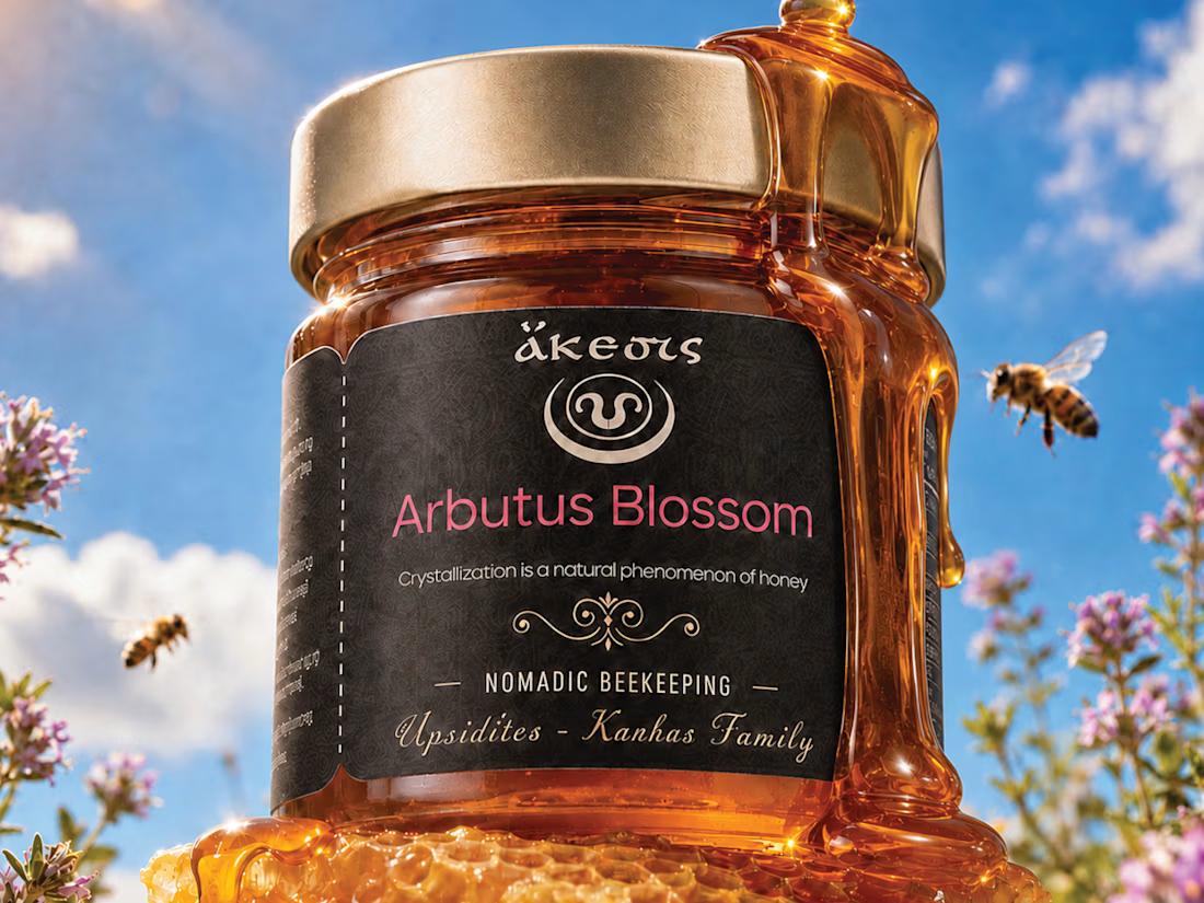
Premium honey can taste exceptional and still look forgettable on the shelf.
That was the problem this packaging needed to avoid.
For this Arbutus Blossom honey, the direction was built around one idea:
Make the product feel as rich and distinctive as the honey inside.
The visual system combines:
🍯 Deep amber tones that let the product itself do part of the branding
⚫ A dark label for contrast and premium shelf presence
🌸 Soft pink accents to connect back to the blossom source
✨ Ornamental detailing that adds heritage without making the design feel dated
🐝 Natural imagery that reinforces origin, craft, and authenticity
The goal was not to make the jar look “luxury” for the sake of it.
It was to make the product feel:
Natural
Crafted
Trustworthy
Gift-worthy
Easy to remember
Because with food packaging, the first purchase often happens before the first taste.
The label has to create enough trust and curiosity to get the product picked up.
That is the real job of the design.
What gives this packaging the strongest presence?
A. The dark label
B. The amber glass and honey color
C. The typography and ornamentation
D. The overall premium-natural feel
Drop A, B, C or D below.
If you are building a food, beverage, honey, wellness, or premium product brand and the product is stronger than the packaging looks, send me a message.
I help brands turn good products into packaging people notice, trust, and remember.
#PackagingDesign #FoodBranding #HoneyPackaging #BrandIdentity #LabelDesign #CPGBranding #VisualIdentity #CreativeDirection


The network for creativity
Join 1.25M professional creatives like you
Connect with clients, get discovered, and run your business 100% commission-free
Creatives on Contra have earned over $150M and we are just getting started



Related posts

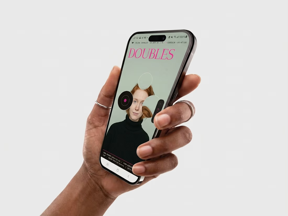
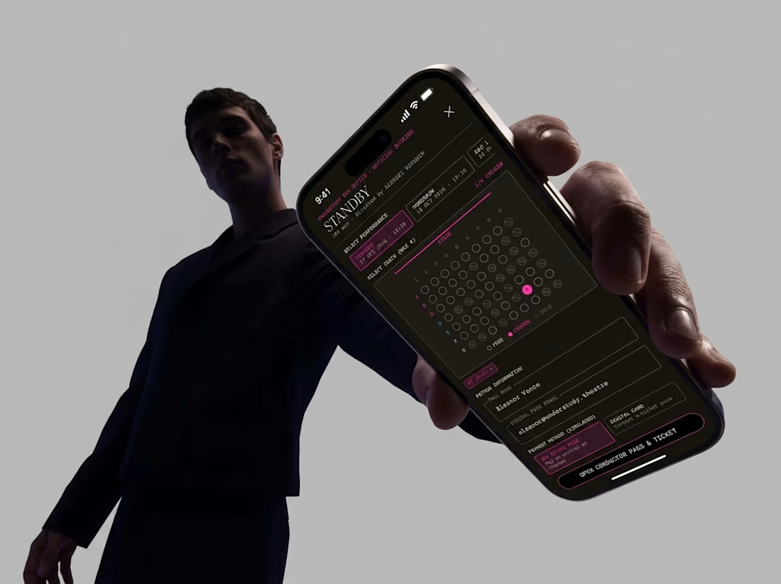
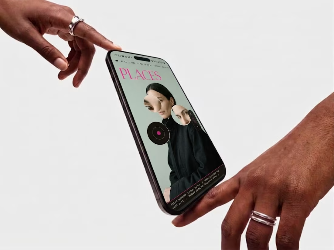
Friday app: Understudy
What if an app’s menu was a hole in a face?
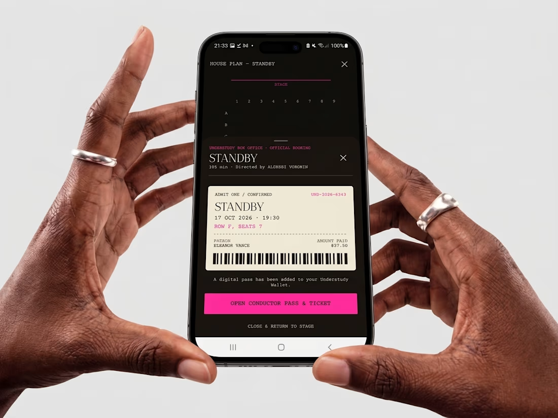
UNDERSTUDY turns one circle into the interface: eyes open shows, voids open seat plans, and a typewriter clock counts down to curtain.



Amazing work

Bold Illustrations make an instant impact
See full case study here for the branding evolution and website redesign for a B2B SaaS startup!


I loved these colours. Looking Stunning 😍