The network for creativity
Join 1.25M professional creatives like you
Connect with clients, get discovered, and run your business 100% commission-free
Creatives on Contra have earned over $150M and we are just getting started
Back to feedPost

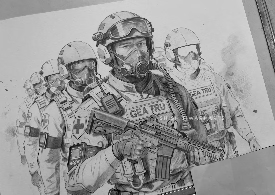
A complex tactical illustration focusing on gear precision and atmospheric storytelling. This project highlights the coordination and intensity of a special operations unit, rendered with a focus on technical accuracy and equipment realism.

The network for creativity
Join 1.25M professional creatives like you
Connect with clients, get discovered, and run your business 100% commission-free
Creatives on Contra have earned over $150M and we are just getting started





Related posts

Cool AI work


For me, it’s cultural context. AI can generate references, but it can’t fully replicate lived experience. As a South African creative, so much of my work relies on instinct, memory, language and the nuances of how we actually experience our culture.
When I’m reimagining iconic...

Should I go for left or right? Focusing on updating and finishing up my portfolio... and then I came across this crossroads. Another alternative is to make them switchable themes through a toggle, but I still need to decide which should be the default.

27 voted
75%
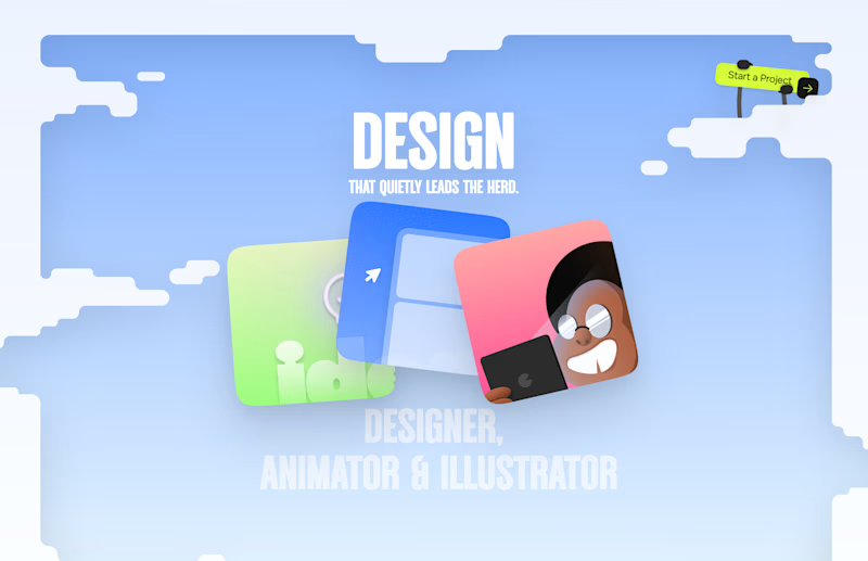
9 voted
25%
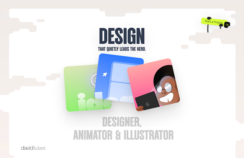
36 votes
Closed

Left is better because the text is readable, the overall blue background is not flashing to the eyes as compared to the right one.
For the top right button " Start a project ", you can add some animation so that it stands out and encourage users to click on it.

Good Terms -- Logo Design