The network for creativity
Join 1.25M professional creatives like you
Connect with clients, get discovered, and run your business 100% commission-free
Creatives on Contra have earned over $150M and we are just getting started
Back to feedPost

This project explores motif development inspired by the intricate stucco carvings, floral frescos, and symmetrical archways of the Badshahi Mosque. By isolating the mosque’s signature Mughal design details and translating them into clean vector assets, the suite bridges historic heritage with contemporary graphic design.

The network for creativity
Join 1.25M professional creatives like you
Connect with clients, get discovered, and run your business 100% commission-free
Creatives on Contra have earned over $150M and we are just getting started
Related posts

A little more about the inspiration behind Tindara.
I wanted the identity to have a connection to Tindari, Sicily. The Madonna di Tindari statue was the starting point for the symbol, while Sicilian decorative patterns inspired the graphics around it.
For the colors, I chose mustard yellow, deep green, and burgundy, balanced with cream. I wanted to bring some of that warmth and richness into the packaging, while keeping the different elements comfortable together.
For me, these references are what give the project its character and sense of place.



Colifa is a self-initiated branding concept for a young Argentine criolla wine, created to keep my creativity in motion. It’s my way of designing what I feel when I’m with my people: loud, funny, easy, and open to everyone at the table.


The scribbly hand-drawn tangle against those soft, bubbly COLIFA letterforms gives the label a loud-but-friendly table energy. Was the texture in the background mostly Firefly, or did you draw it by hand in Illustrator?

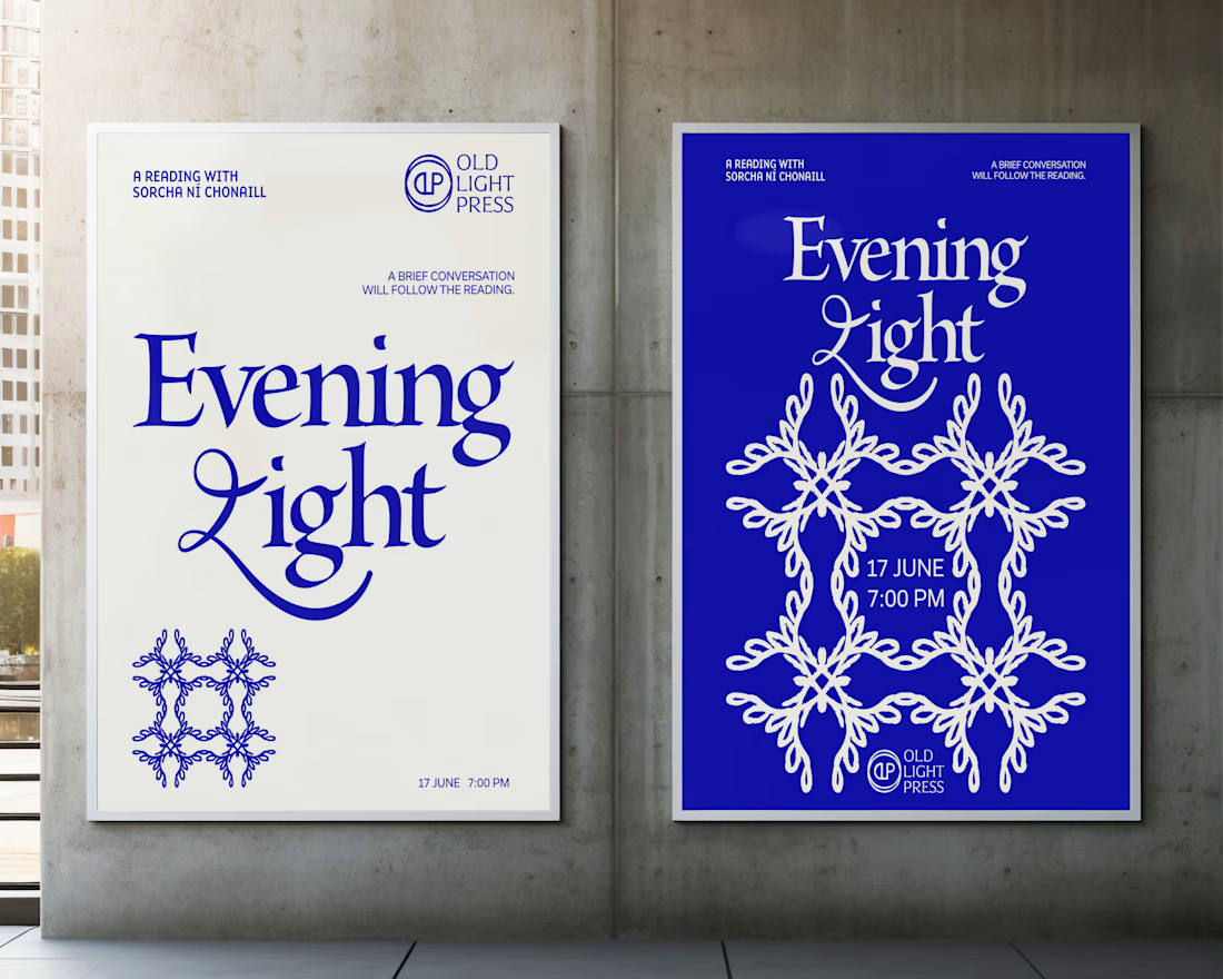
Brand identity concept for Old Light Press.

I love that all of your projects have a whimsy vibe 💖