The network for creativity
Join 1.25M professional creatives like you
Connect with clients, get discovered, and run your business 100% commission-free
Creatives on Contra have earned over $150M and we are just getting started
Back to feedPost

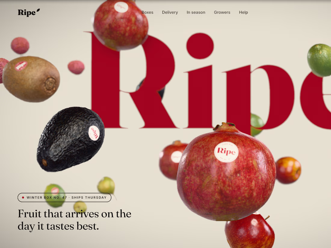
Landing page for a tree-ripened fruit subscription brand, in four languages, with a real-time 3D hero. Art direction, design and front-end development.

Cropping the wordmark off the frame while the fruit floats in front makes Ripe feel editorial rather than grocery. With the site in four languages, did the oversized serif hold up across the different scripts, or does the 3D hero end up carrying the brand on its own?
Thanks Artur. The wordmark stays in Latin everywhere since it's the logo. Headlines switch to a serif matched for each script. But honestly the fruit carries a lot of it. Once the type changes, the 3D is what keeps it feeling like one brand.
The network for creativity
Join 1.25M professional creatives like you
Connect with clients, get discovered, and run your business 100% commission-free
Creatives on Contra have earned over $150M and we are just getting started






Related posts


I like the font!

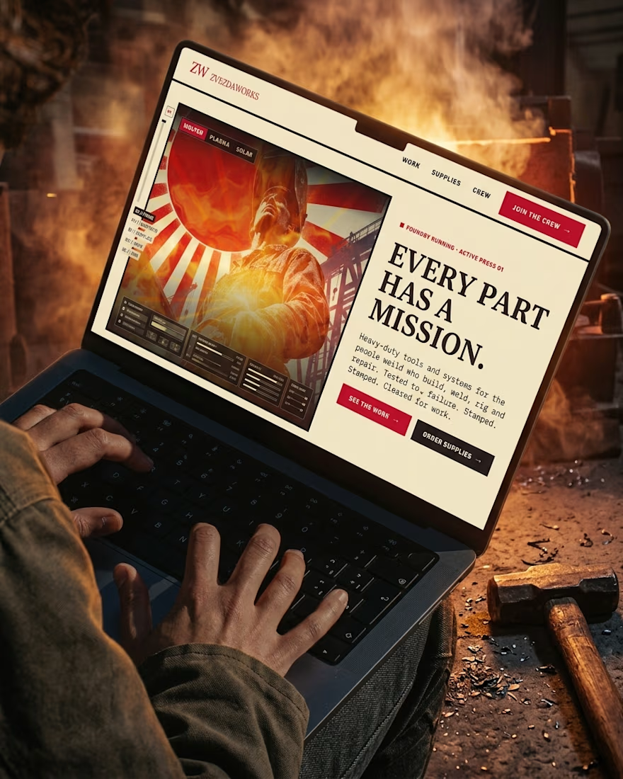
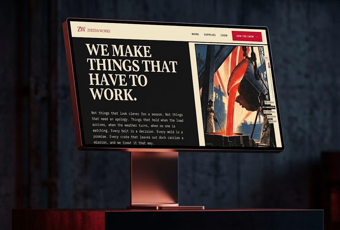
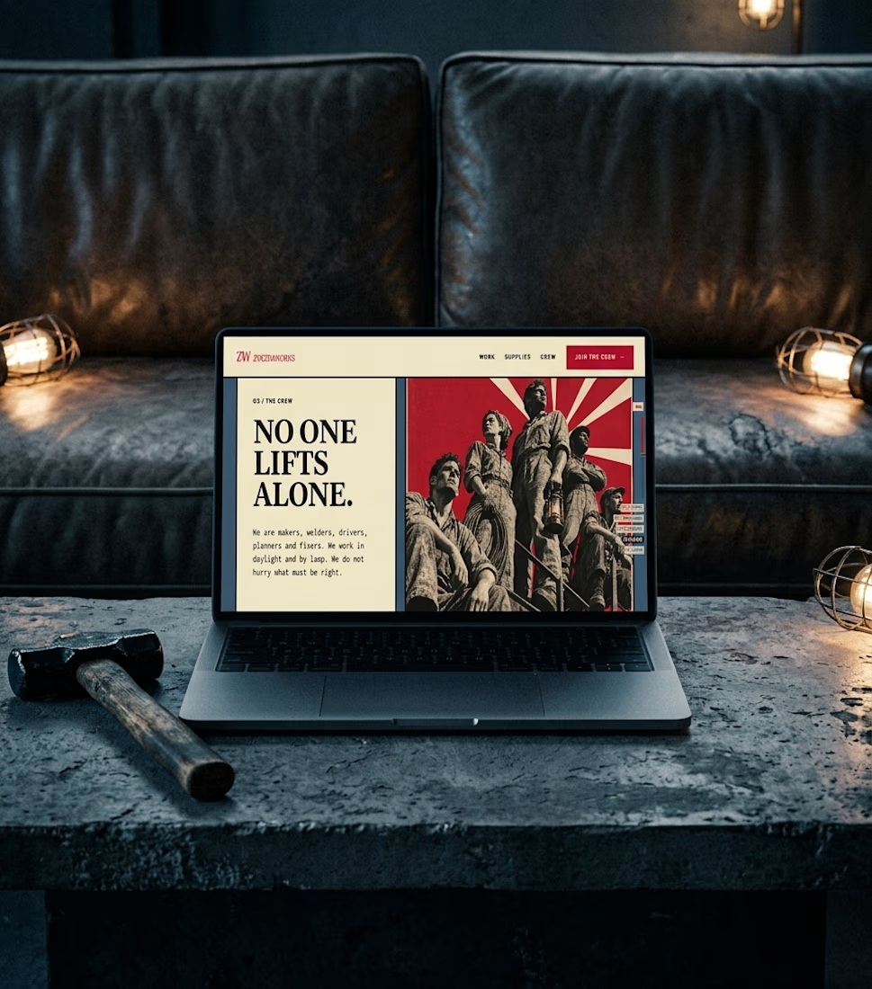
Ever wondered what a space-race poster would sell if it sold hammers?
The Zvezda Works case study answers that, and it’s nearly here.
Watch this space.


How far can you take a logo beyond the first draft?
I started with Recraft's Logo Maker and a fictional idea: Bibu's Paws, a cosy little dog rescue and adoption shelter.
I wanted the identity to feel warm, homely and full of character, so I explored a few logo directions before settling on the little dog tucked inside a house.
From there, I took the idea further, building out the visual identity with an earthy colour palette, typography, illustrations and a few real-world applications: the shelter space, dog merchandise and an adoption welcome kit.
I enjoyed seeing how a small starting point could grow into a brand with its own personality and world.
Now I'm curious: if you were building a brand around this logo, what would you create next?






It turned out so cozy, you did great


