The network for creativity
Join 1.25M professional creatives like you
Connect with clients, get discovered, and run your business 100% commission-free
Creatives on Contra have earned over $150M and we are just getting started
Back to feedPost


1,200 women tested your serum – but your page has the same copy pasted 20+ times. That's not a product page. That's a copy-paste graveyard.
Just redesigned the product page for R3ivive – a skincare serum.
The old page was a conversion disaster:
· Same content repeated 20+ times – "The Numbers Don't Lie" section copy-pasted over and over. "Real Skin. Real Routines. Real Results." repeated endlessly.
· No price anchoring – product price? Nowhere to be found. Buyers couldn't see the deal.
· Zero social proof – 1,200 women tested it, but no reviews, no ratings, no customer count visible.
· No trust badges – no guarantee, no secure checkout, no shipping info.
· No clear CTA – buried under a mountain of repetitive text.
· "How to Use" – 6 steps, but
confusing. Cleanse → Apply serum → Use cleanser to apply serum? Wait, what?
The new mobile-first page I built:
· Price anchoring: Show original price crossed out → [Price] (Save X%). Instant "deal" perception above the fold.
· Social proof stacked: ★★★★★ (X reviews) + "1,200 women tested it" – credibility before they scroll.
· Benefit hierarchy: Reduces wrinkles → Improves texture → Hydrates & nourishes. 3 key benefits, not 20.
· Clear routine: Cleanse → Apply serum → Massage gently → Moisturize. Simple, not confusing.
· Trust stacked: 30-Day Guarantee + Free Shipping + Secure Checkout – every objection killed before the CTA.
· Mobile-first design: Scannable, thumb-friendly, no endless scrolling through copy-pasted fluff.
Result? A page that stopped treating buyers like robots and started selling confidence, clarity, and visible results.
If your product page has more copy-paste than a high school essay, DM me "PDP" – I'll audit your mobile page and show you exactly where you're losing buyers. No fluff. Just honest feedback.


The network for creativity
Join 1.25M professional creatives like you
Connect with clients, get discovered, and run your business 100% commission-free
Creatives on Contra have earned over $150M and we are just getting started











Related posts

FOCUS — Creative Portfolio & Digital Art Website 🌸✨
A visually expressive website concept for a creative portfolio, built around digital art, bold imagery, and visual storytelling
The design combines vibrant pink tones, soft gradients, experimental typography, and immersive photography to create a distinctive editorial experience
Special attention was given to:
• Bold editorial hero composition
• Vibrant pink and dark color palette
• Experimental typography and visual details
• Immersive photography and digital artwork
• Creative project gallery and navigation
• Responsive mobile experience
• Clean layouts with a strong visual identity
The result is an expressive digital experience that puts creativity, emotion, and visual storytelling at the center of every screen 💗
Looking to create a standout portfolio or website for a creative brand? Let’s connect 🚀






I designed and built Encore, a scheduling app for a three-office orthodontic practice, then made its launch film the same way I made the app: from the real thing.
Every screen in the film is the live app, recorded on an iPhone 17 Pro simulator. I built the phones as 3D models in Rive, mapped the recordings onto their displays, and choreographed the camera, a three-phone orbit, and a closing wall of twenty screens on a single Rive timeline. No mockups, no After Effects. Swap a screen or retime a move and the film re-renders.


Nice work!!

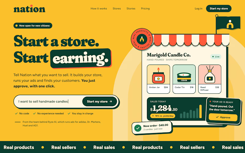
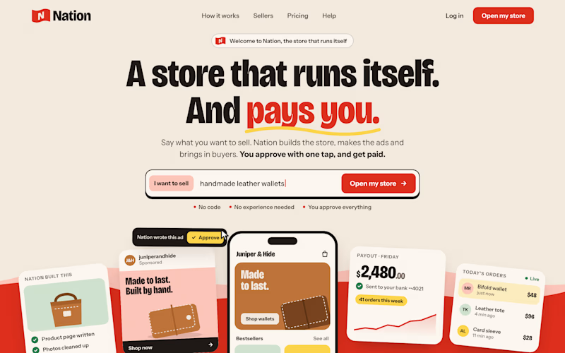
Two visual directions for the same brief. Which do you prefer?
2 voted
29%
5 voted
71%
7 votes
Closed

Direction A is more better to me it feels modern professional cartoony style that's impressive ❤️❤️
Great job Ayoub🔥🔥