The network for creativity
Join 1.25M professional creatives like you
Connect with clients, get discovered, and run your business 100% commission-free
Creatives on Contra have earned over $150M and we are just getting started
Back to feedPost

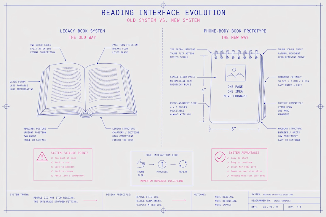
Reading Interface Evolution
A system-level breakdown of why engagement drops in traditional formats and how to redesign for modern behavior.
This framework highlights:
∙ Friction points in legacy reading systems
∙ The role of physical and cognitive constraints
∙ A modular, low-commitment alternative aligned with real-world usage
Core idea:
People did not stop reading. The interface stopped fitting.
Useful for:
Content creators, educators, UX thinkers, and anyone designing for attention in fragmented environments.
The network for creativity
Join 1.25M professional creatives like you
Connect with clients, get discovered, and run your business 100% commission-free
Creatives on Contra have earned over $150M and we are just getting started





Related posts

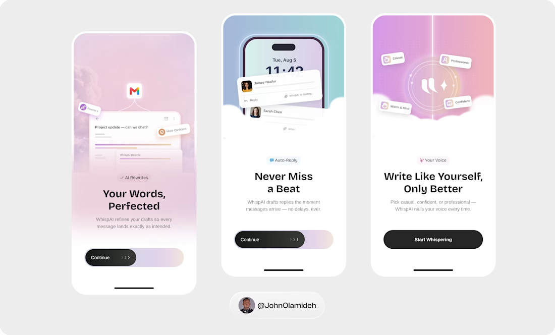
Clean visuals. Thoughtful details. A UI designed to feel as good as it looks. ✳️
Motion that makes the interface feel alive.
Smooth transitions, subtle interactions, intentional movement. 🎞️


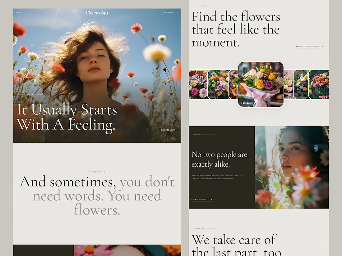
Figma to lovable by connecting MCP
One prompt. One Figma file. A working website. 👀
So, what did I actually do here?
I analyzed how AI interprets UI designs, how it understands layer names, and how naming conventions affect the generated output.
Then I structured my Figma file accordingly and gave Lovable a single prompt.
And honestly? It nailed it.
No complicated back-and-forth. Just a better-structured design and a smarter workflow.
Live preview: https://fleeswora.lovable.app/
This experiment reminded me that AI-assisted design isn’t just about writing better prompts. It’s also about preparing our designs so AI can understand them.
Designers, are you optimizing your Figma files for AI yet?



PROSPECT — Typography Refinement Concept
An independent typography study based on PROSPECT’s public legacy website.
Desktop and mobile concepts exploring calmer headings, clearer hierarchy, readable line lengths and improved button contrast. Existing copy wording, logo and construction photography are retained.
Includes proposed typography scales and practical recommendations for Figma and website implementation.
Personal concept study; not commissioned by PROSPECT.
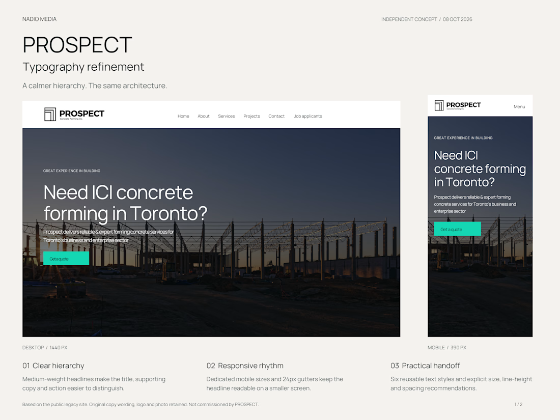

The adjustment to button contrast is interesting because it lets the call to action pop while keeping the overall calm vibe.