The network for creativity
Join 1.25M professional creatives like you
Connect with clients, get discovered, and run your business 100% commission-free
Creatives on Contra have earned over $150M and we are just getting started
Back to feedPost

PROSPECT — Typography Refinement Concept
An independent typography study based on PROSPECT’s public legacy website.
Desktop and mobile concepts exploring calmer headings, clearer hierarchy, readable line lengths and improved button contrast. Existing copy wording, logo and construction photography are retained.
Includes proposed typography scales and practical recommendations for Figma and website implementation.
Personal concept study; not commissioned by PROSPECT.

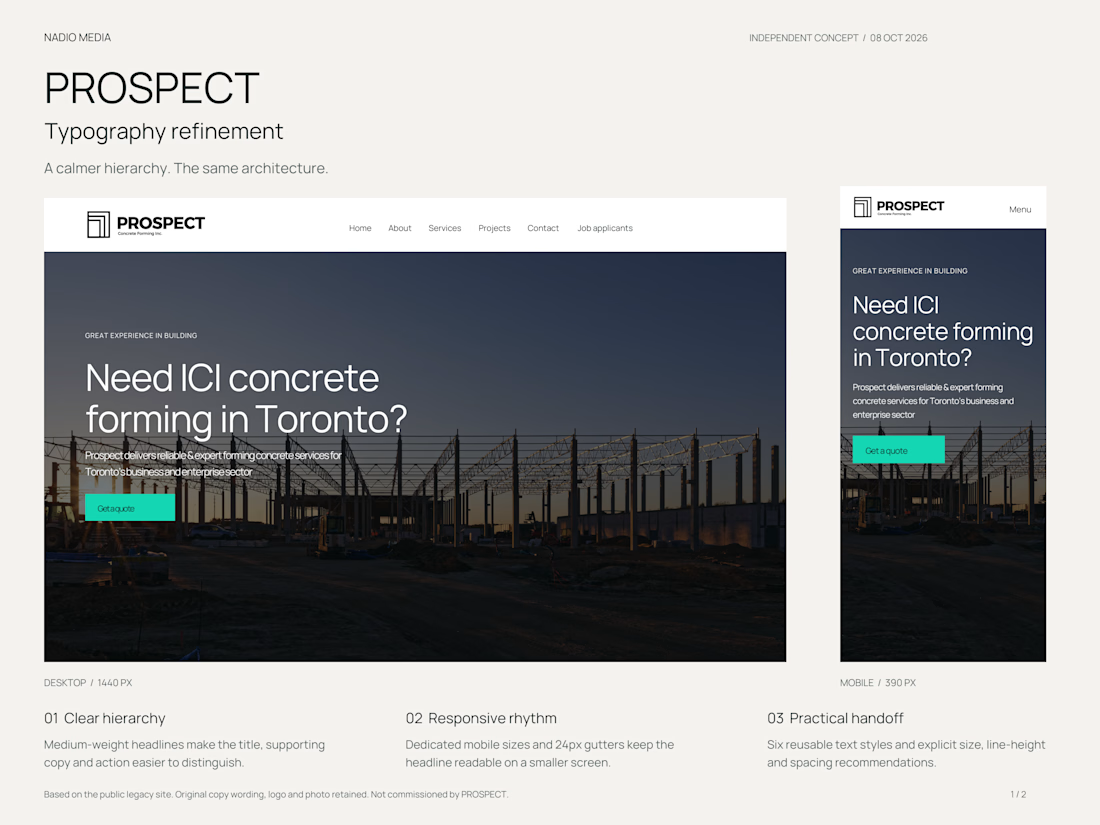

The adjustment to button contrast is interesting because it lets the call to action pop while keeping the overall calm vibe.


The teal button against that muted construction photo keeps the CTA readable without shouting over the headline.
The network for creativity
Join 1.25M professional creatives like you
Connect with clients, get discovered, and run your business 100% commission-free
Creatives on Contra have earned over $150M and we are just getting started





Related posts

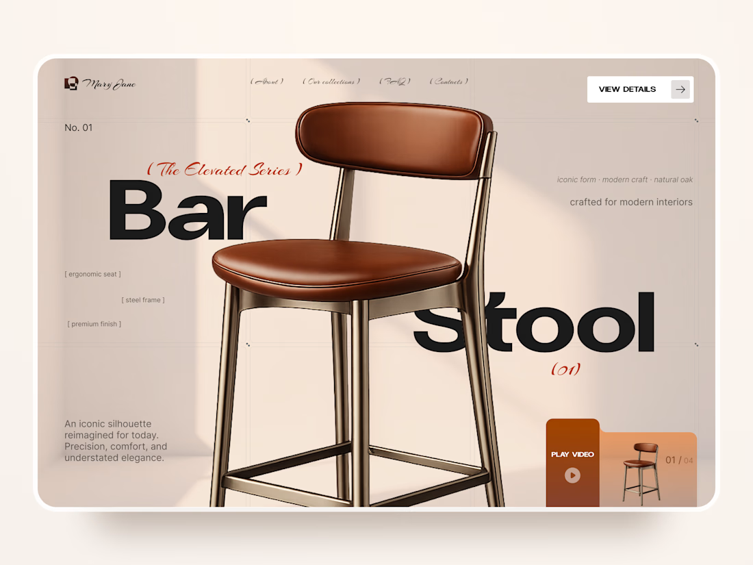
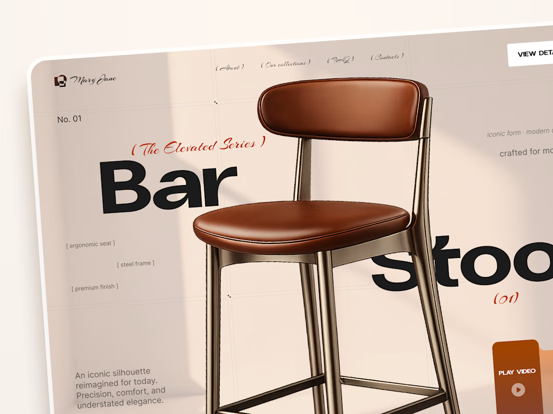
Mary Jane — Bar Stool Product Landing Page 🪑✨
A refined product landing page concept for a modern furniture brand, built around one statement piece
The design combines warm neutral tones, oversized typography, and editorial layouts to give the bar stool a premium, design-focused feel
Special attention was given to:
• Product-first composition
• Clean editorial typography
• Warm premium aesthetic
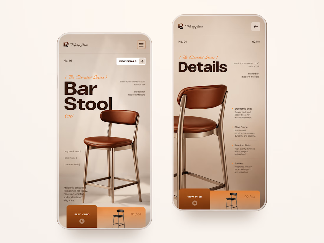
• Product details and features
• Video and 3D presentation
• Responsive mobile layout
The result is a simple, elegant experience that keeps the product at the center while giving the brand a distinctive visual character 🤎


Nice work


A calm, editorial landing page for an architecture studio, built around daylight and materials. We'd love to hear your thoughts! 🏛️


The warm timber slats against the pale page feel calm. Did you build the motion in Jitter?


