The network for creativity
Join 1.25M professional creatives like you
Connect with clients, get discovered, and run your business 100% commission-free
Creatives on Contra have earned over $150M and we are just getting started
Back to feedPost
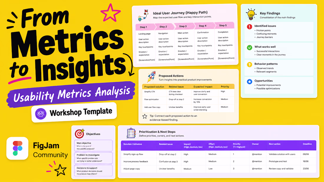
Usability metrics are often available. The harder part is turning them into decisions.
Teams may have task completion rates, drop-off data, session recordings, survey responses, usability test notes, dashboards, and support tickets. But when those signals live in different places, it becomes harder to answer the questions that matter:
• What is actually getting in the way of users completing a task?
• Which issues should be prioritized first?
• What evidence supports the proposed solution?
• Who owns the next step?
That's why I built the Usability Metrics Analysis Canvas, my first FigJam Community template.
It's designed to help UX, Product, Data, and Engineering teams move from scattered usability data to a clearer, shared view of what should happen next.
The canvas includes:
• Analysis goals and decisions to support
• Project team, success metrics, and initiative timeline
• Ideal user journey / happy path
• Key findings and supporting evidence
• Proposed actions
• Prioritization, ownership, and next steps
It can be used for usability testing reports, product audits, funnel analysis, dashboard reviews, UX research synthesis, stakeholder workshops, and post-launch reviews.
This is my first FigJam Community template, and I'd love feedback from anyone who works with UX research, product decisions, or usability metrics. The link is in the comments below.
What would make this more useful for your team?
hashtag#UXResearch hashtag#UsabilityTesting hashtag#ProductDesign
The network for creativity
Join 1.25M professional creatives like you
Connect with clients, get discovered, and run your business 100% commission-free
Creatives on Contra have earned over $150M and we are just getting started
Related posts
Which landing page wins in the first 3 seconds?
Same product. Same goal. Two different creative directions.
A focuses on energy, motion, and emotional impact.
B prioritizes clarity, structure, and instant readability.
If you landed on this website for the first time, which version would make you stay longer?
Vote A or B and tell me why.
Your feedback helps shape the final design.
12 voted
50%
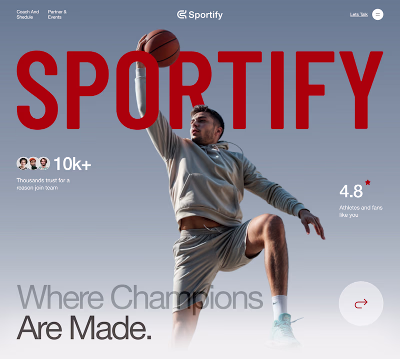
12 voted
50%

24 votes
Closed
I really appreciate the subtle positioning of the 'Sportify' branding across both versions. Letting the player's head and the basketball layer overlapping the text in Version A gives it such great depth, while keeping it crisp and structural underneath the countdown in Version B...
Everyone says balancing usability, aesthetics, and readability on a data heavy dashboard is just good design. It's not 🙃 it's a constant tug of war: usability wants space, aesthetics wants clean, readability wants density, and on this license management build every extra column (seats, expiry, renewal, cost) buys clarity and steals it from something else in the same breath 📊
FertiFlow is a modern digital solution that combines a patient-facing website with an AI-powered dashboard to simplify fertility care for both patients and healthcare professionals.
✨ Key Features
🌐 Responsive website with seamless appointment booking.
🎨 Clean, premium UI with a calming healthcare design.
👩⚕️ Doctor dashboard for managing patients, appointments, and treatments.
📂 Digital medical records and fertility journey timeline.
💊 AI-assisted prescription generation and medication tracking.
🎙️ AI consultation recorder that transcribes doctor–patient conversations into structured medical notes.
🤖 Automatic consultation summaries and follow-up recommendations.
🔒 Secure document storage and role-based access for patient data.
This project showcases an end-to-end healthcare ecosystem, demonstrating how AI and thoughtful UX can improve clinic efficiency while delivering a seamless patient experience.
Amazing Work!
Challenges
View allTrending
Claude
Claude has entered the design space. How are you using Claude Design?
Contra University
Learn from expert creatives how to earn more using next-gen AI tools.
fifaworldcup2026
The World Cup is here and the whole world's watching. How are you designing for the world stage?
creativeaiflow
Creative AI workflows are evolving. What tools do you use, and what are their strengths and weaknesses?
freelancerlife
Freelancer life is wins, pivots, and everything in between. What’s yours right now?