The network for creativity
Join 1.25M professional creatives like you
Connect with clients, get discovered, and run your business 100% commission-free
Creatives on Contra have earned over $150M and we are just getting started
Back to feedPost

A new product means a new little design problem to solve. And I’m very much here for it.
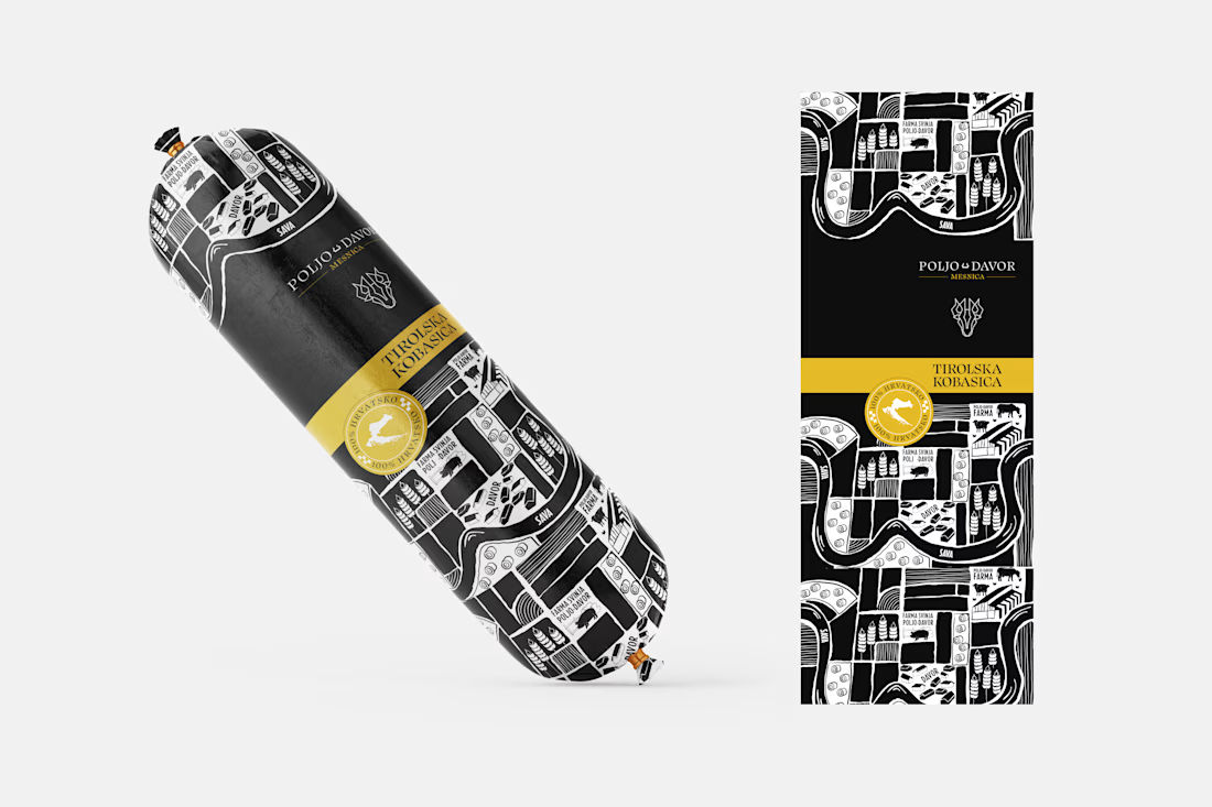
I’ve been working with Poljo Davor on expanding their product line, and this time we’re introducing a new one: Tirolska kobasica.
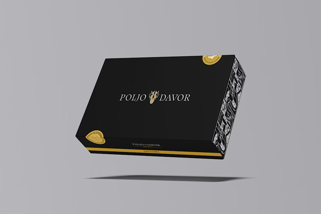
The goal wasn’t to create packaging that feels disconnected from the existing brand, but to give the new product its own character while keeping it recognisably Poljo Davor.
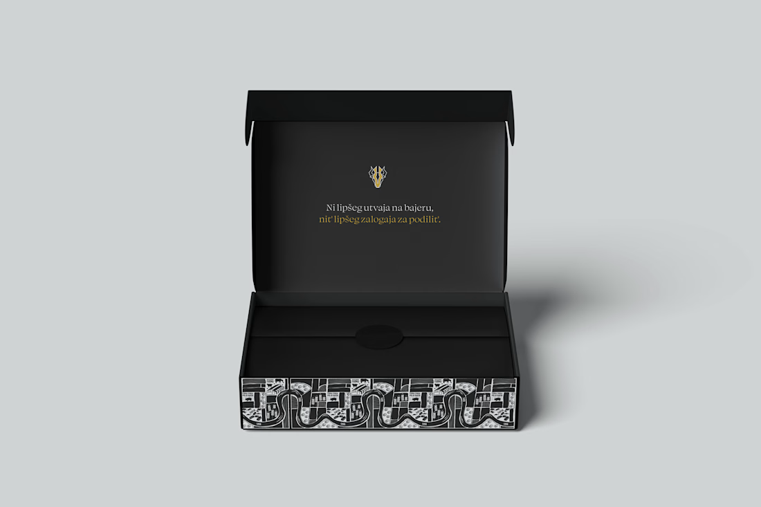
For this line, I developed a new illustration system built around the world behind the product: the farm, the production, the people and all those little details that make the brand feel local and real. The illustration then becomes a repeatable pattern, giving the packaging a bold visual presence while still leaving space for the product name and key information to do their job.
The black and warm yellow combination keeps the look strong and recognisable, while the illustration adds that slightly playful, handcrafted layer I wanted the new line to have.
And this is probably my favourite part of packaging design: taking one brand and figuring out how it can keep growing without losing itself.
New product. New illustration. Same brand, just a little more to say.
More of this one coming soon. 👀
The network for creativity
Join 1.25M professional creatives like you
Connect with clients, get discovered, and run your business 100% commission-free
Creatives on Contra have earned over $150M and we are just getting started







Related posts

Sharing my my retro futuristic packaging design for @scentramotors car perfumes and diffusers :) Created using: @Figma @Adobe @Pacdora PTE. LTD. @ChatGpt @claude (help with text).


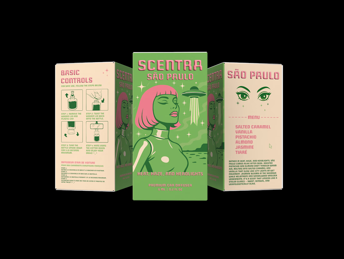

Cool! Love the illustration and typography. Did you use a custom font for “Scentra”?

Just added a new packaging case study to my portfolio. I did the taste test here, but in the end chose the one that didn't win.


Real eggs. No apologies 🥚
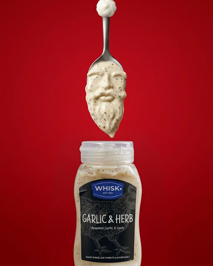
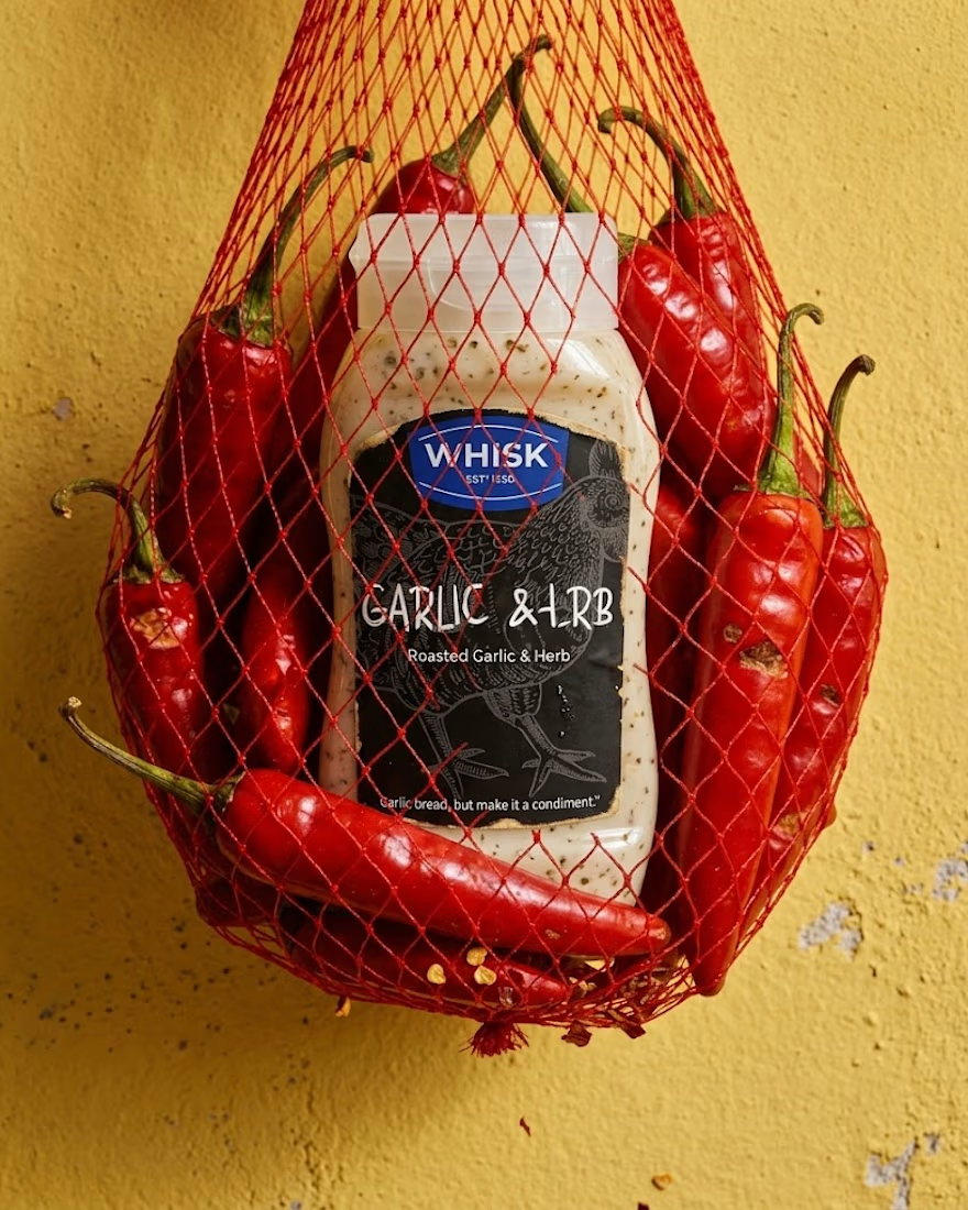
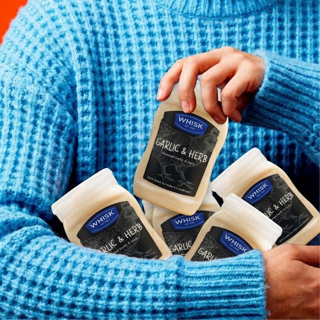
Spent the past week designing WHISK, an artisan mayonnaise brand built on one idea: even the most overlooked item in the fridge deserves a brand that takes it seriously.
No squeeze bottle, no label built to disappear into the shelf. Just a glass jar, a short ingredient list, and four flavors told apart by one accent color each. Classic, garlic and herb, smoked chili, vegan. 🫙
Sometimes the boldest thing a condiment can do is be particular about itself.


The animation looks top tier! Nice work