The network for creativity
Join 1.25M professional creatives like you
Connect with clients, get discovered, and run your business 100% commission-free
Creatives on Contra have earned over $150M and we are just getting started
Back to feedPost

What if today we looked at how service sites scale down?
Desktop hero sections give you plenty of room for side-by-side text, images, and service feature cards (Grooming, Pet Sitting, Wellness). But on mobile, stacking all those elements can make the hero feel endless before a user even reaches core content.
When designing for booking-heavy local businesses, do you hide minor feature cards on mobile layouts, or stack them all vertically?
What’s your rule of thumb for mobile section heights?
The network for creativity
Join 1.25M professional creatives like you
Connect with clients, get discovered, and run your business 100% commission-free
Creatives on Contra have earned over $150M and we are just getting started











Related posts

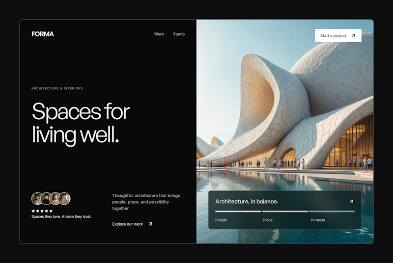
Design Exploration: Hero Section of Architecture Website. Which one do you think much better?


12 voted
43%

16 voted
57%
28 votes
Closed


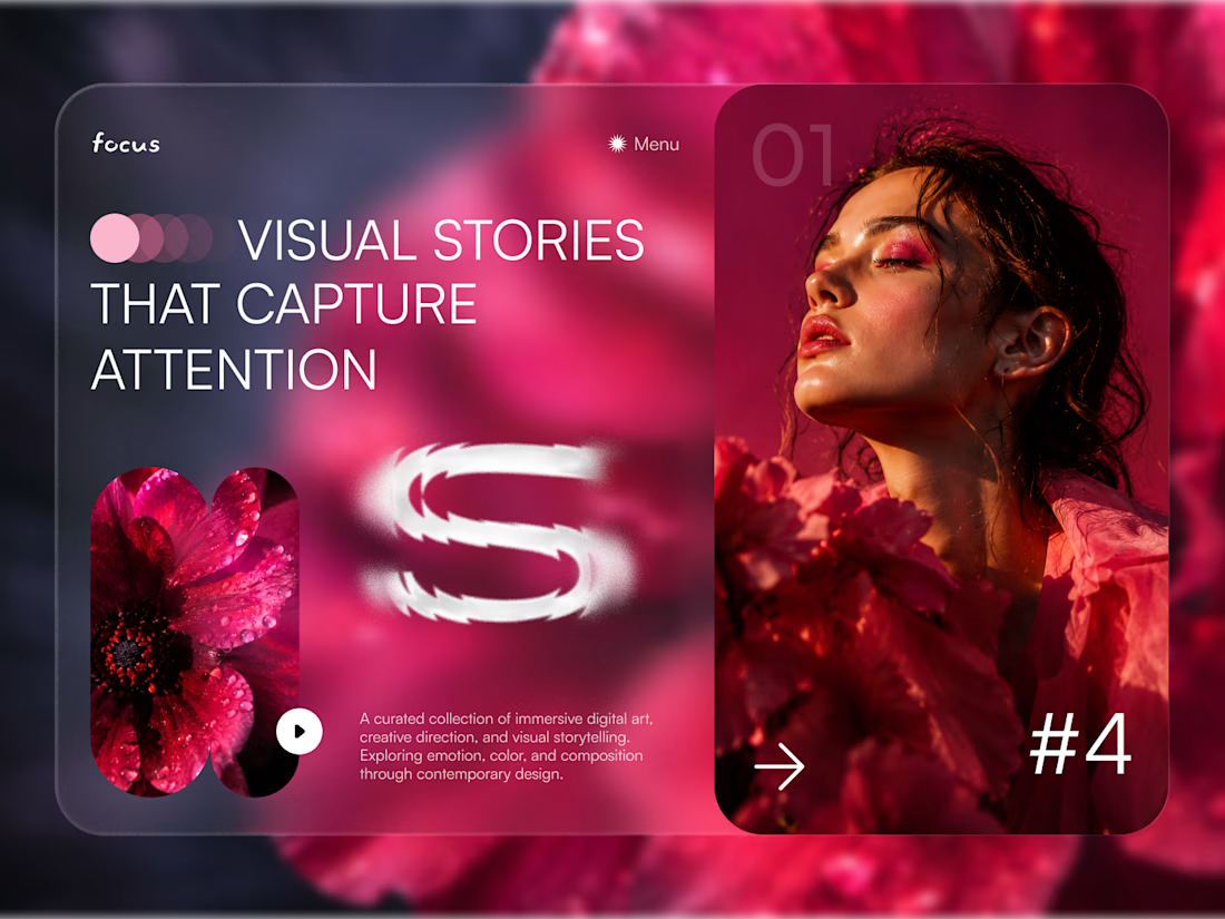
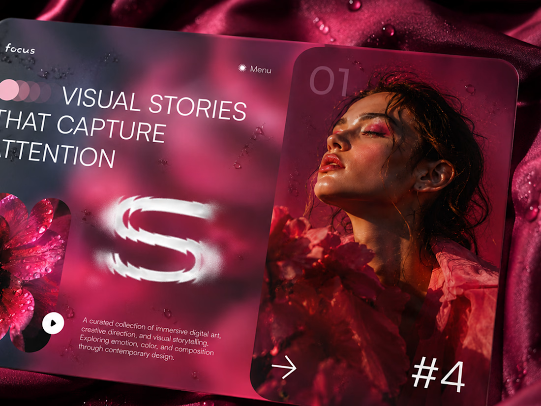
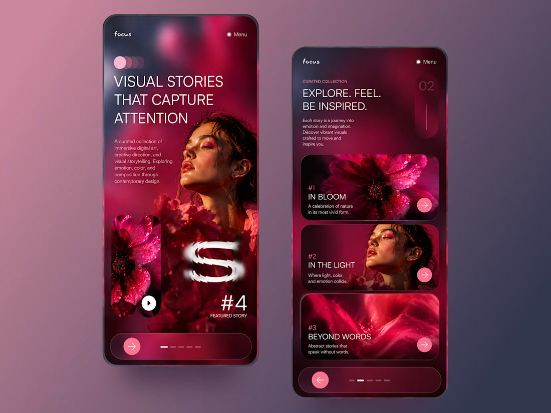
FOCUS — Creative Portfolio & Digital Art Website 🌸✨
A visually expressive website concept for a creative portfolio, built around digital art, bold imagery, and visual storytelling
The design combines vibrant pink tones, soft gradients, experimental typography, and immersive photography to create a distinctive editorial experience
Special attention was given to:
• Bold editorial hero composition
• Vibrant pink and dark color palette
• Experimental typography and visual details
• Immersive photography and digital artwork
• Creative project gallery and navigation
• Responsive mobile experience
• Clean layouts with a strong visual identity
The result is an expressive digital experience that puts creativity, emotion, and visual storytelling at the center of every screen 💗
Looking to create a standout portfolio or website for a creative brand? Let’s connect 🚀




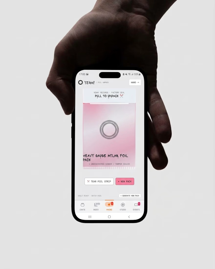
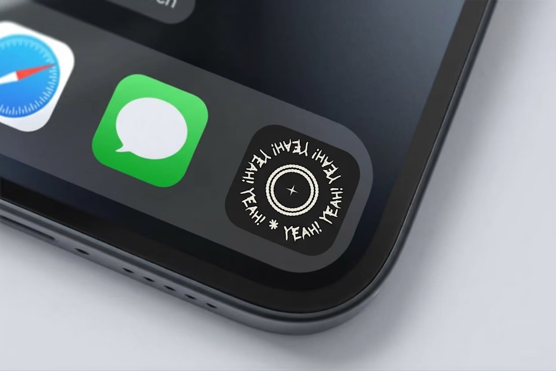
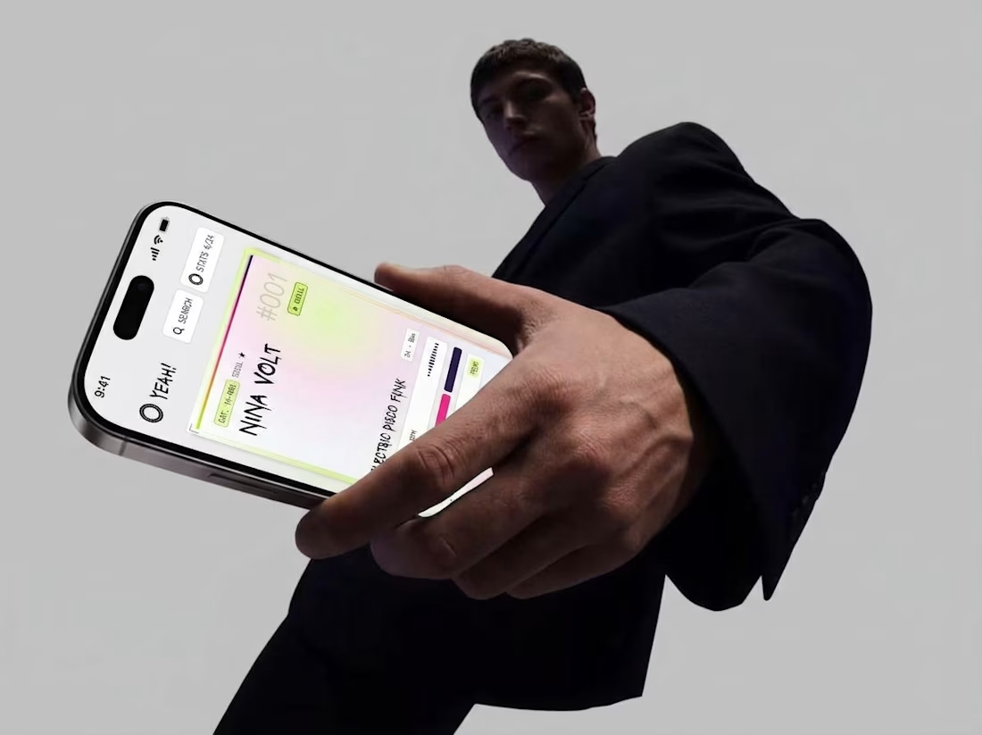
Friday app: yeah!
Cold, clean interface. Hand-painted graffiti names dropped straight on top. Every singer gets their own color, and every pack is a foil seal you tear open with your thumb.
Music as a collectible.