The network for creativity
Join 1.25M professional creatives like you
Connect with clients, get discovered, and run your business 100% commission-free
Creatives on Contra have earned over $150M and we are just getting started
Back to feedPost

Its been a while. So here is some sketches from my sketchbook. Exploring, thumbnailing, researching. Some I started turning into illustrations, while others remains as thought fragments to be used in the future.


The network for creativity
Join 1.25M professional creatives like you
Connect with clients, get discovered, and run your business 100% commission-free
Creatives on Contra have earned over $150M and we are just getting started
Related posts

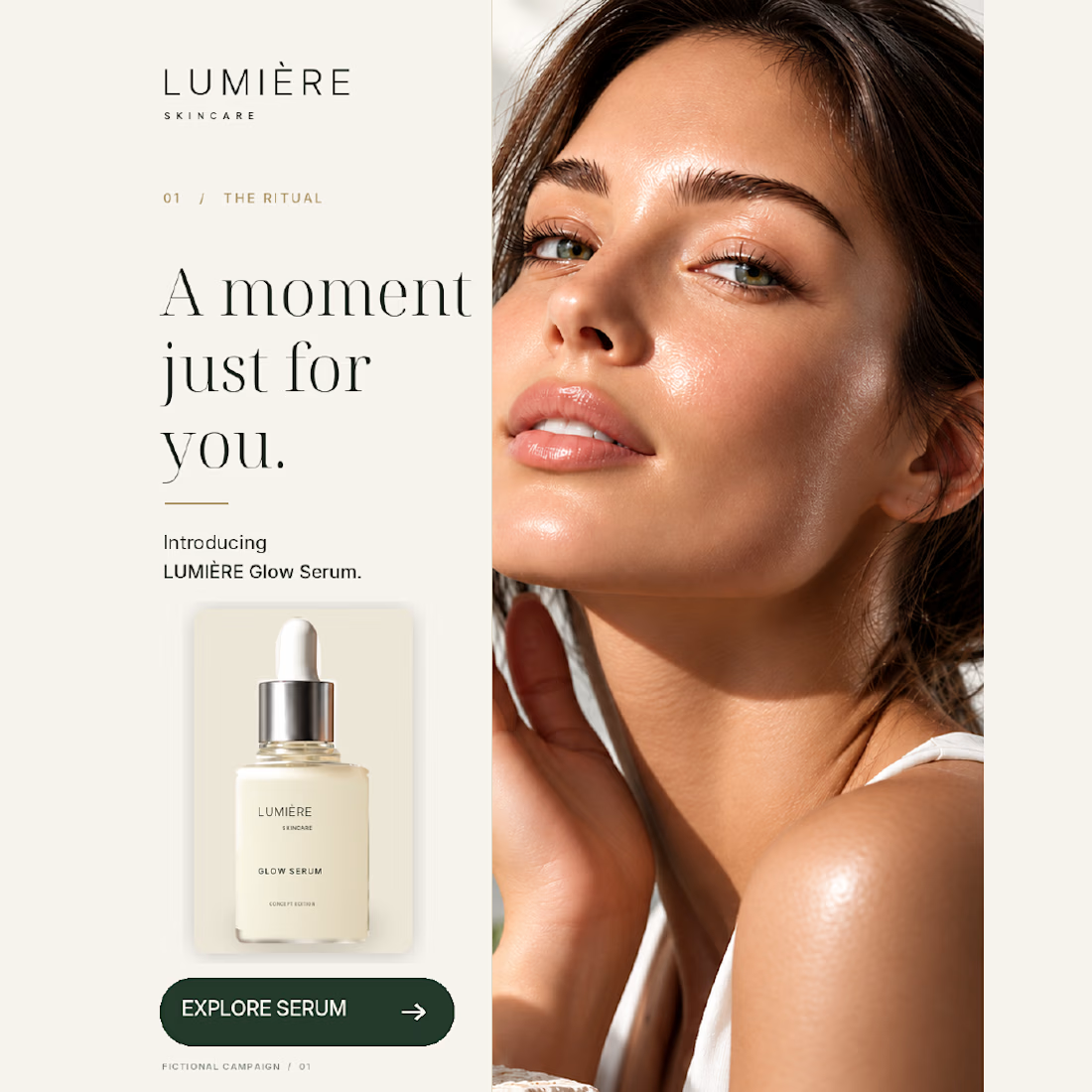
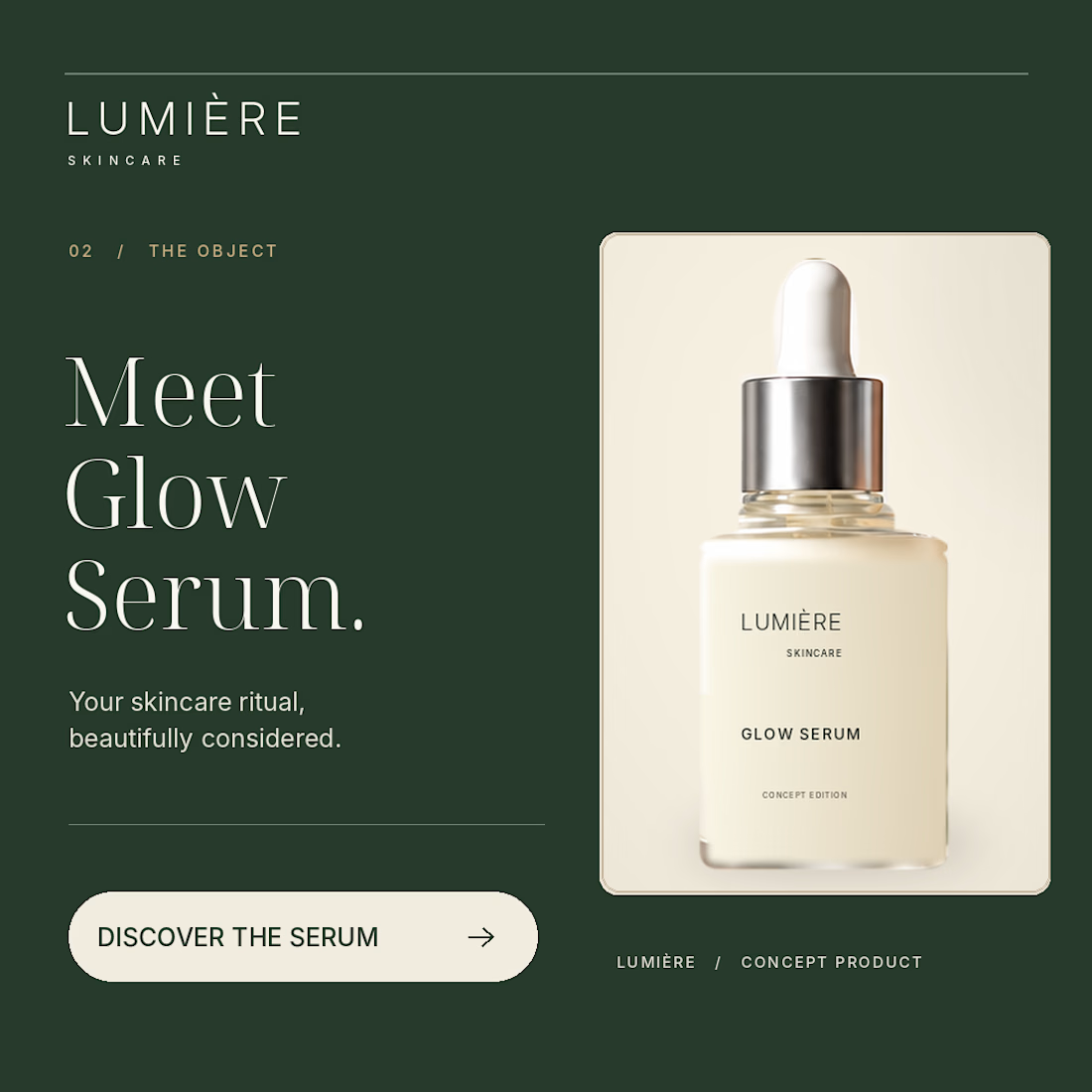
Same skincare brand. Two very different first impressions.
For my latest NeuroDNA project, LUMIÈRE, I explored two creative directions:
01 — the face and the skincare ritual.
02 — the bottle as the main focus.
Warm ivory, deep green and consistent packaging connect both designs. The imagery is AI-assisted, with layout and typography composed separately.
LUMIÈRE is a self-initiated concept for a fictional brand.
For a skincare brand you’ve never heard of, which would make you pause — 01 or 02, and why?


Great job bro 🎉🎉


My portfolio has evolved! ✨ Here’s the old version alongside the new one—which is your favorite? 👀 Let me know in the comments and share to help others discover my work! 💚
4 voted
33%
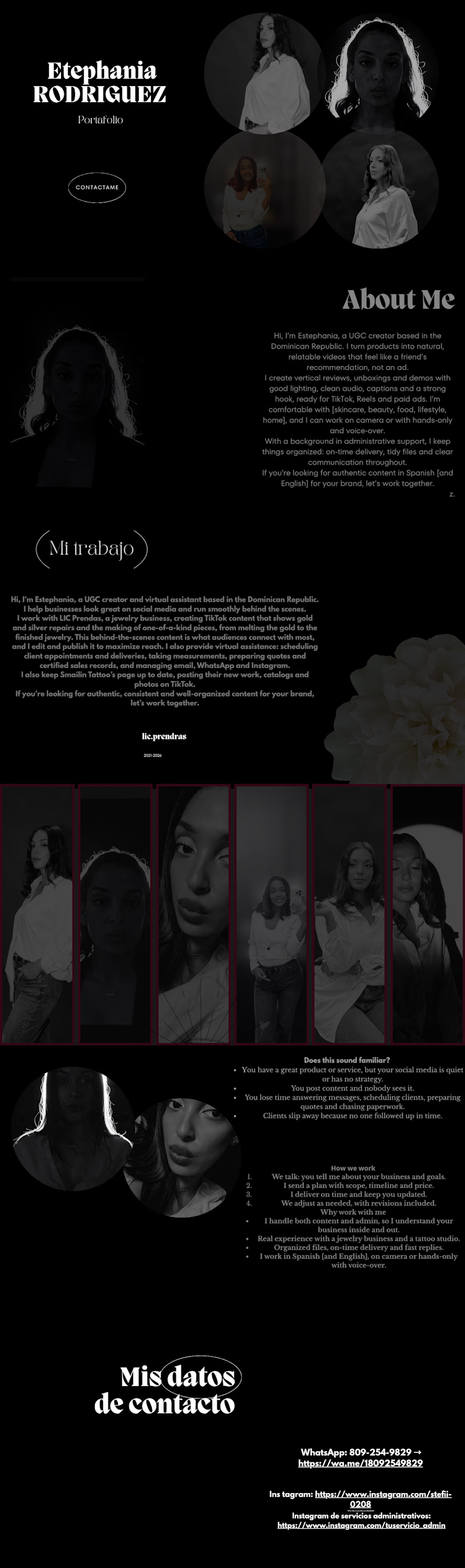
8 voted
67%
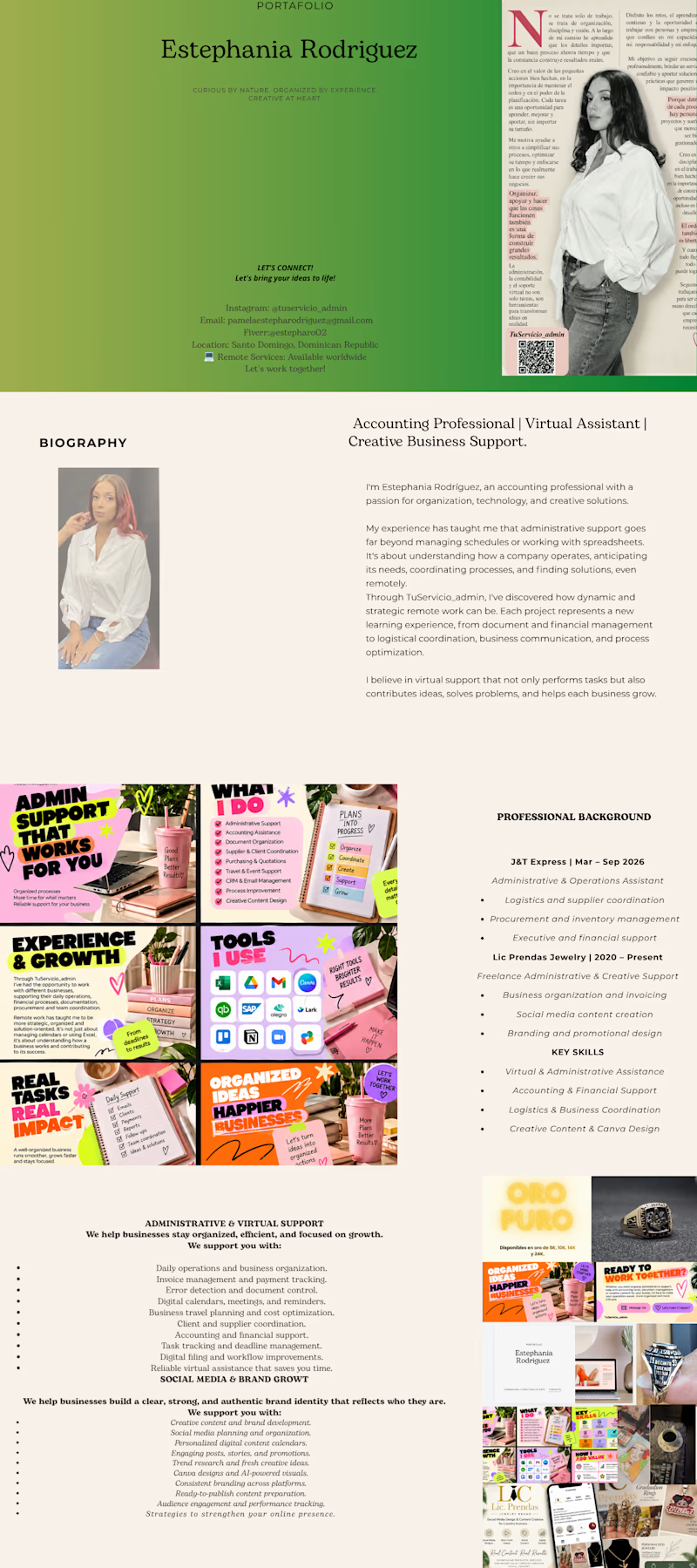
12 votes
Closed

The new version looks like a great step forward! Love seeing how your style and creativity evolve over time. 💚✨

A business card concept for a financial advisory brand.
For finance, I wanted the card to feel trustworthy and calm rather than flashy. A warm gold and cream palette, flowing curves at the top to add movement, and a clean contact block with simple icons so the details are easy to scan.
Gold and cream for a finance brand: classic and trustworthy, or too soft? Tell me what you think. 👇

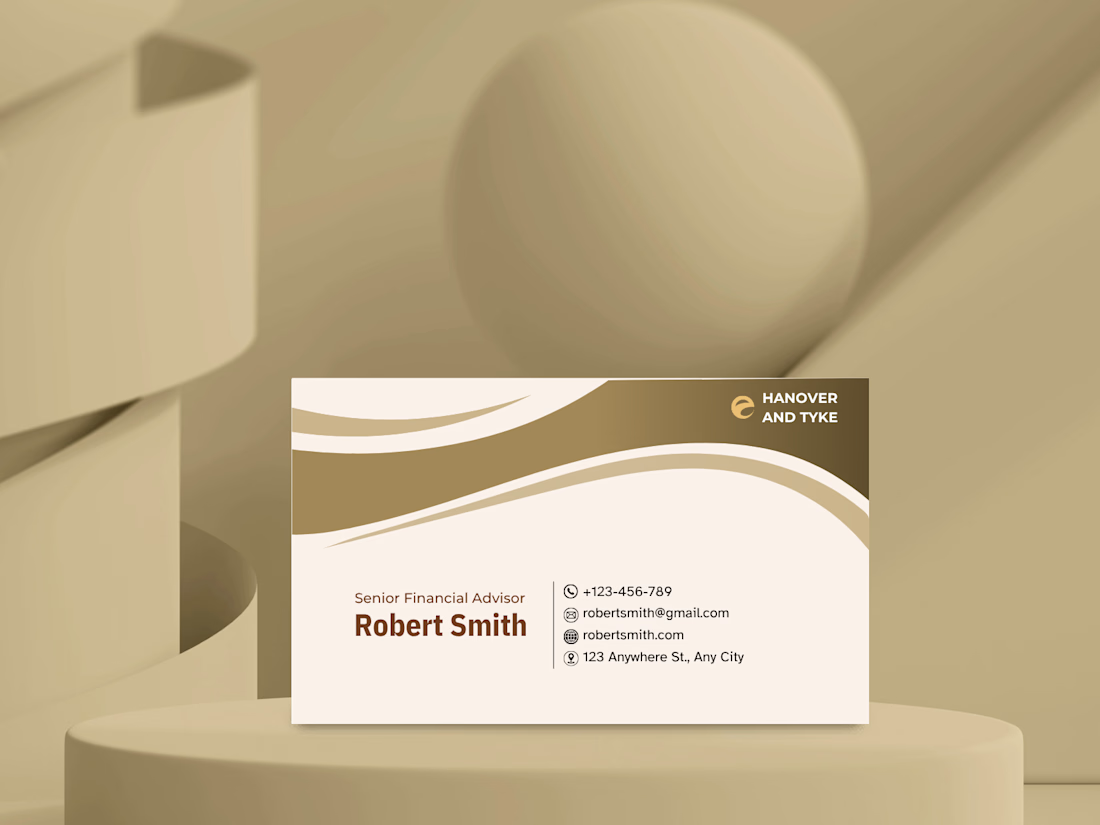

This is a clean and elegant business card design. The soft beige and gold color palette feels sophisticated and trustworthy, which works perfectly for a financial advisor. The wave elements add a modern touch without making it look cluttered. Typography is well-balanced, and the...