The network for creativity
Join 1.25M professional creatives like you
Connect with clients, get discovered, and run your business 100% commission-free
Creatives on Contra have earned over $150M and we are just getting started
Back to feedPost
A business card concept for a financial advisory brand.
For finance, I wanted the card to feel trustworthy and calm rather than flashy. A warm gold and cream palette, flowing curves at the top to add movement, and a clean contact block with simple icons so the details are easy to scan.
Gold and cream for a finance brand: classic and trustworthy, or too soft? Tell me what you think. 👇

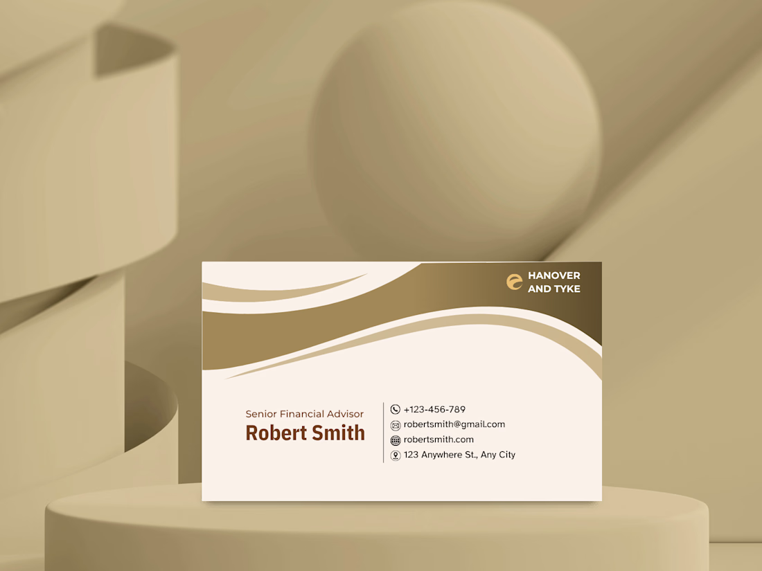

As someone working in finance, I really like this direction. Gold and cream feel elegant and trustworthy, which is exactly the kind of impression you want when people are trusting you with their finances. ✨

Thank you! That means a lot. Elegant and trustworthy was exactly the goal. ✨

This is a clean and elegant business card design. The soft beige and gold color palette feels sophisticated and trustworthy, which works perfectly for a financial advisor. The wave elements add a modern touch without making it look cluttered. Typography is well-balanced, and the...
Really appreciate the detailed feedback! Balancing elegance and trust was the goal for this one.
The network for creativity
Join 1.25M professional creatives like you
Connect with clients, get discovered, and run your business 100% commission-free
Creatives on Contra have earned over $150M and we are just getting started



Related posts
Warm. Minimal. Memorable.
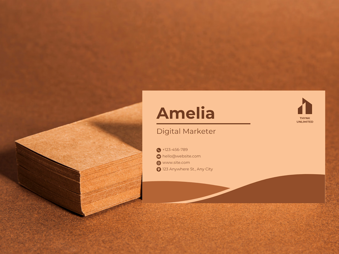
Designed this business card for a Digital Marketer and honestly, the earthy tones did all the talking.
What made this design work:
Brown & peach palette = warm yet professional
Clean layout no clutter, just essentials
Wave element adds elegance without overdoing it
Typography bold enough to leave an impression
Because your business card is the first impression you leave make it count.




Archive gems are the best! Love that you still love it after all this time - that's when you know it's timeless work. 👀


A softer side of Eroglu Studios.
A new portfolio for Alper Mlope, a freelance writer who brings philosophy and human emotion into social media storytelling.
Warm cream, orange and turquoise. Oversized type. Shapes and letters that respond to your cursor. A playful introduction to the person behind the words.
Designed and developed in HTML, CSS and vanilla JavaScript.
Case Study: https://contra.com/p/OE6BFAkP-personal-website-for-alper-mlope?r=eroglustudios
Explore live: https://infomlope.com/
Love the warm colours and playful typography! ✨ Such a creative way to reflect a writer’s personality through web design. 👏