The network for creativity
Join 1.25M professional creatives like you
Connect with clients, get discovered, and run your business 100% commission-free
Creatives on Contra have earned over $150M and we are just getting started
Back to feedPost

I'm super excited 😊 to share one of my recent projects: Border Line Peptides.
Working on this project was an opportunity to combine strategic branding, conversion focused web design, and ecommerce best practices to create a professional online presence for a growing peptide brand.
My focus was to create a website that not only looks premium but also builds trust, improves the customer journey, and provides a seamless browsing experience across all devices.
Key areas I mainly focused on:
1. Premium and modern brand presentation
2. Conversion focused user experience
3. Mobile responsive design
4. Fast loading performance
5. Strategic product showcase
6. Trust building design elements
7. Ecommerce optimization
Every successful ecommerce brand needs more than just a beautiful website. It needs a digital experience that communicates credibility, guides customers effectively, and supports business growth.
Proud to have contributed to the growth of Border Line Peptides and looking forward to helping more ecommerce brands, Shopify stores, and direct to consumer businesses scale their online presence.
Website Link: www.borderlinepeptides.com
#ShopifyExpert #Ecommerce #WebDesign#MarketingStrategist #ConversionOptimization #BrandStrategy #ShopifyDeveloper #WebsiteDesign #EcommerceGrowth #DigitalMarketing #UserExperience #LeadGeneration #WordPress #ElementorPro


The network for creativity
Join 1.25M professional creatives like you
Connect with clients, get discovered, and run your business 100% commission-free
Creatives on Contra have earned over $150M and we are just getting started








Related posts

How can branding make people feel part of a community?
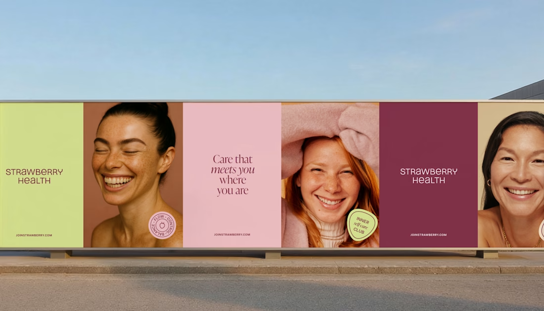
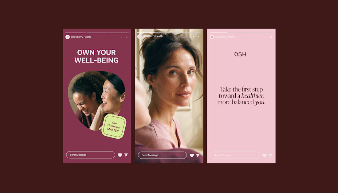
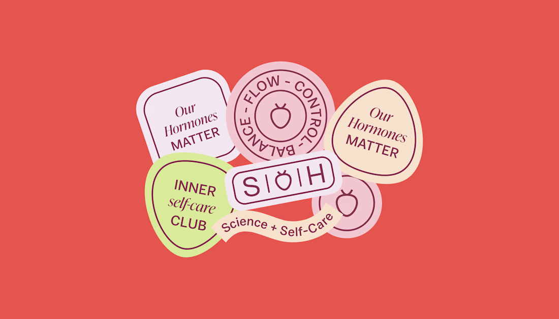
When working on Strawberry Health, we explored how visual identity could make women’s health feel more approachable and collective.
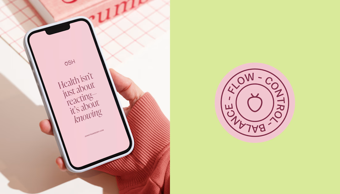
One of the ways was through supporting brand elements: stickers, badges and phrases that could live beyond the logo and become expressions of belonging.
These elements turned the identity into something people could interact with, share and make their own.
It’s a small detail, but I think it’s an important part of building brands around communities: the identity shouldn’t only identify the brand. It should give people something to identify with.

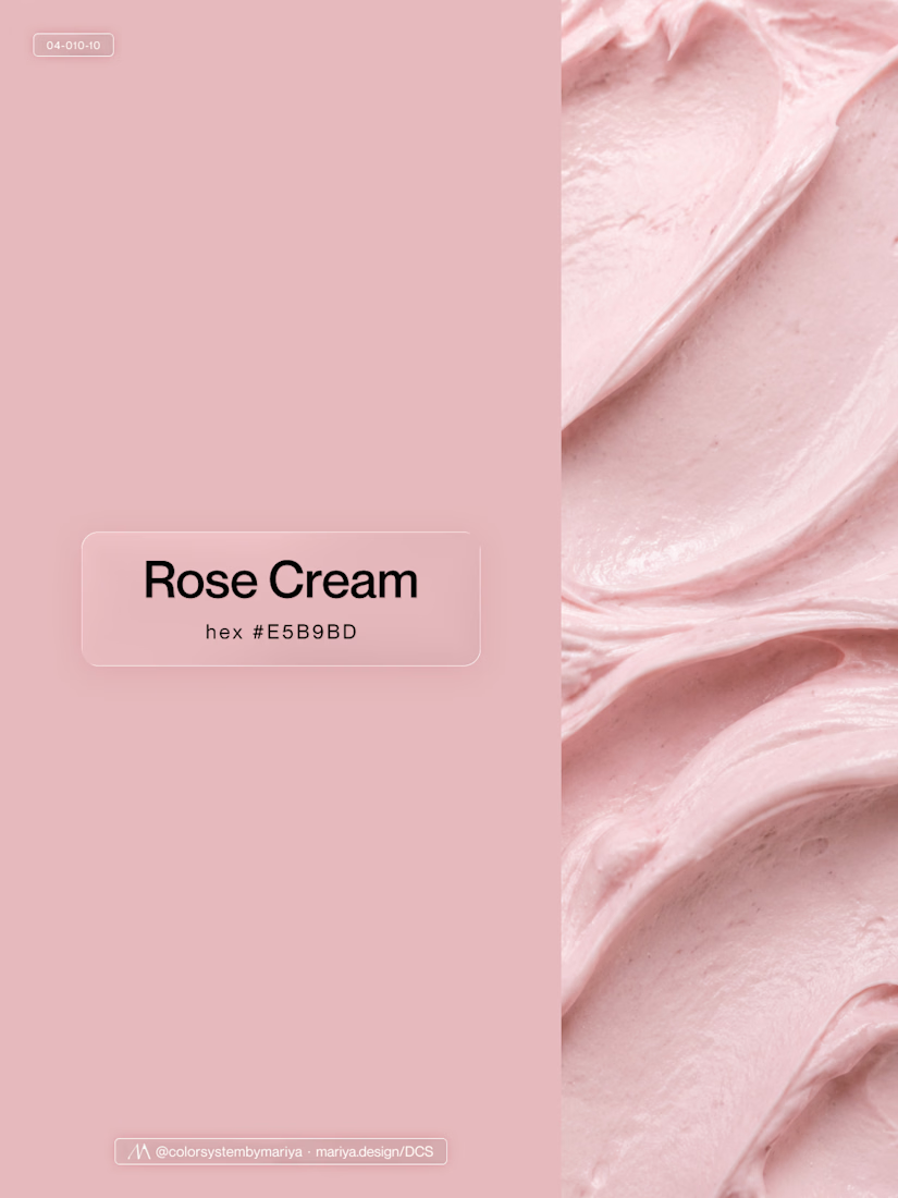
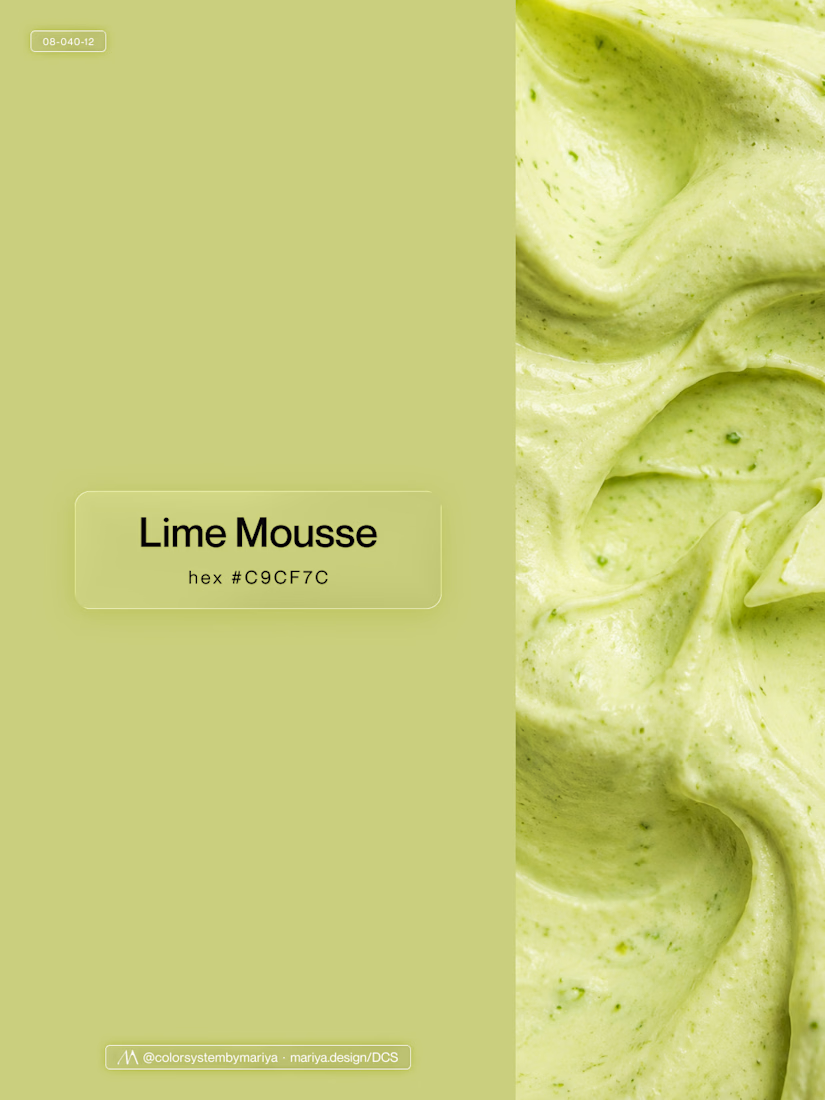
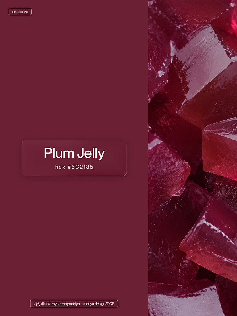
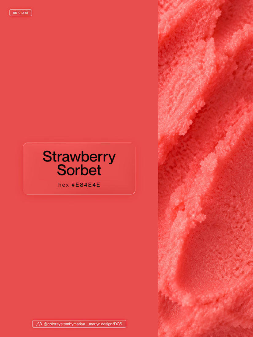
Love, love, love the colors. My mind goes: Rose Cream, Lime Mousse and Plum, hmmmm, which Plum... Plum Jelly. And of course, Strawberry Sorbet.
Let me match the vibe using my delicious swatches 😊

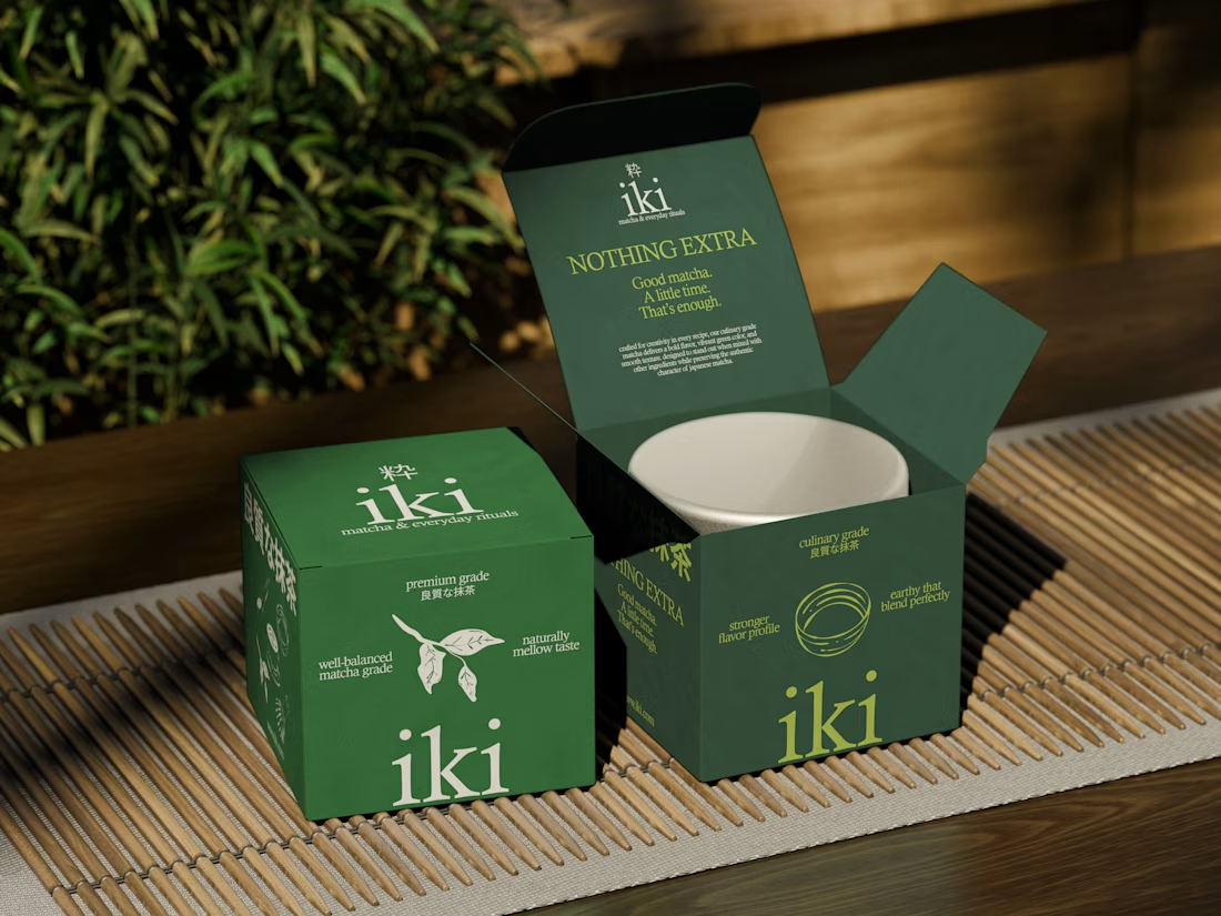
more visuals from iki, a matcha shop i’ve been working on 🍵
the project is getting close to its final stage, and it’s been really interesting to see how the initial concept has gradually turned into a complete brand.
from the strategy to the visual identity, every decision has helped shape a more cohesive and distinctive world for iki.
almost there. excited to share more of the final result soon
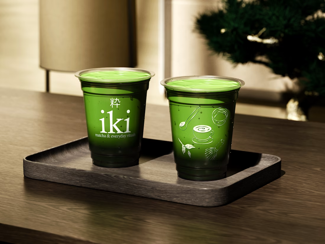
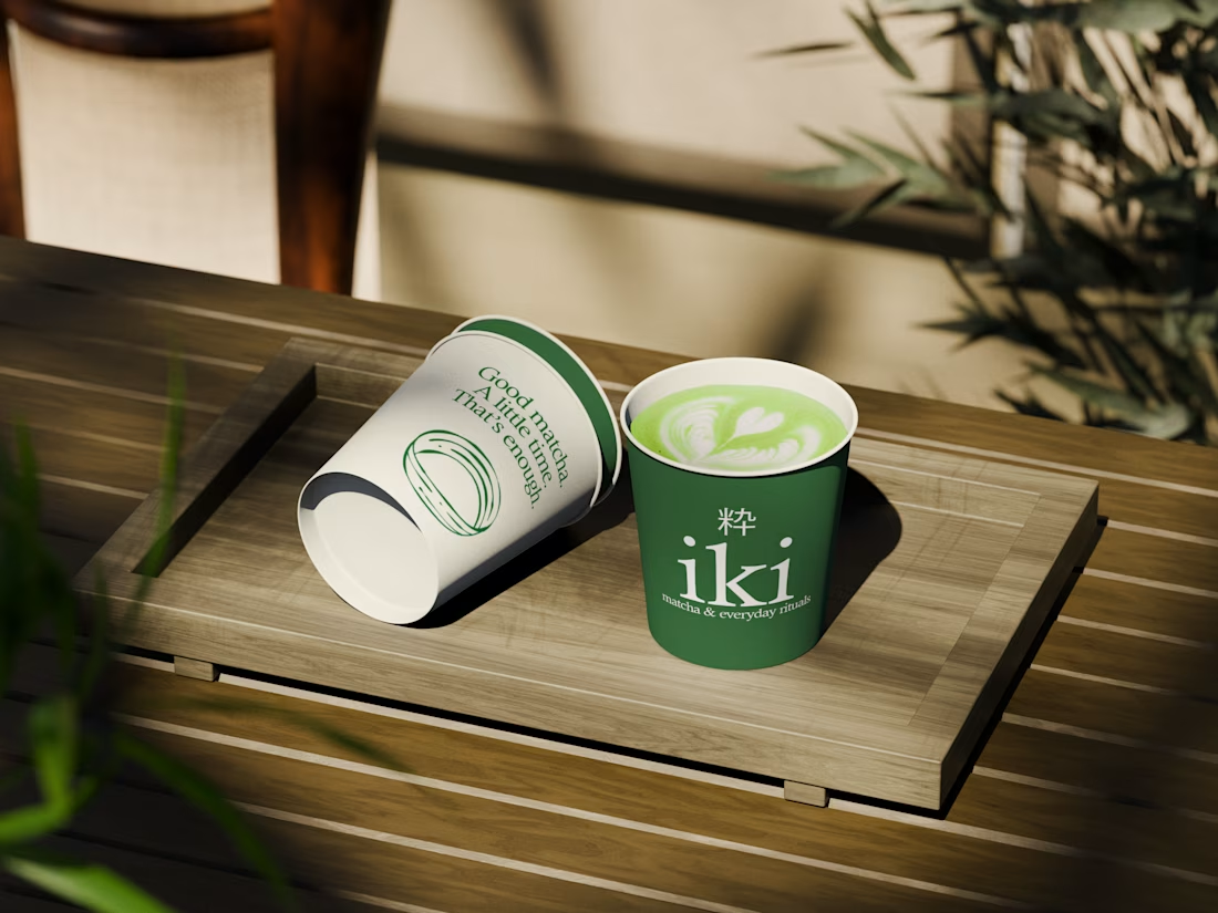
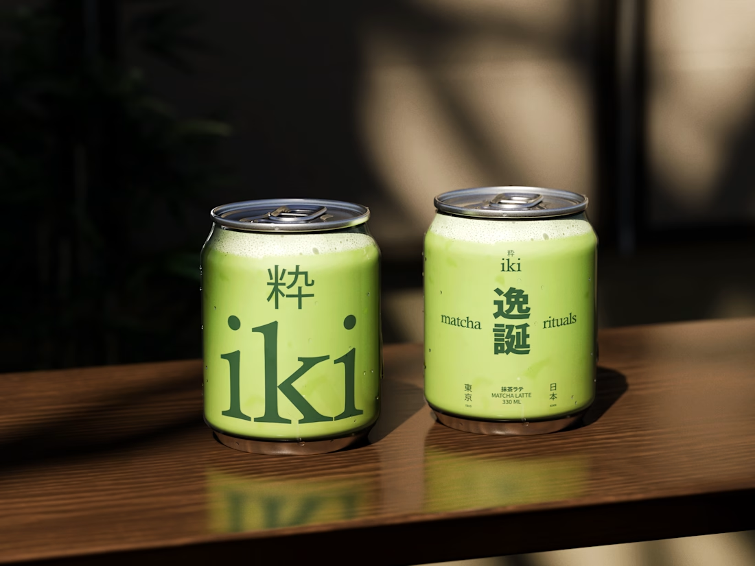

Strong concept and thoughtful execution. The logo feels distinctive and communicates the brand identity clearly.

New case study added!
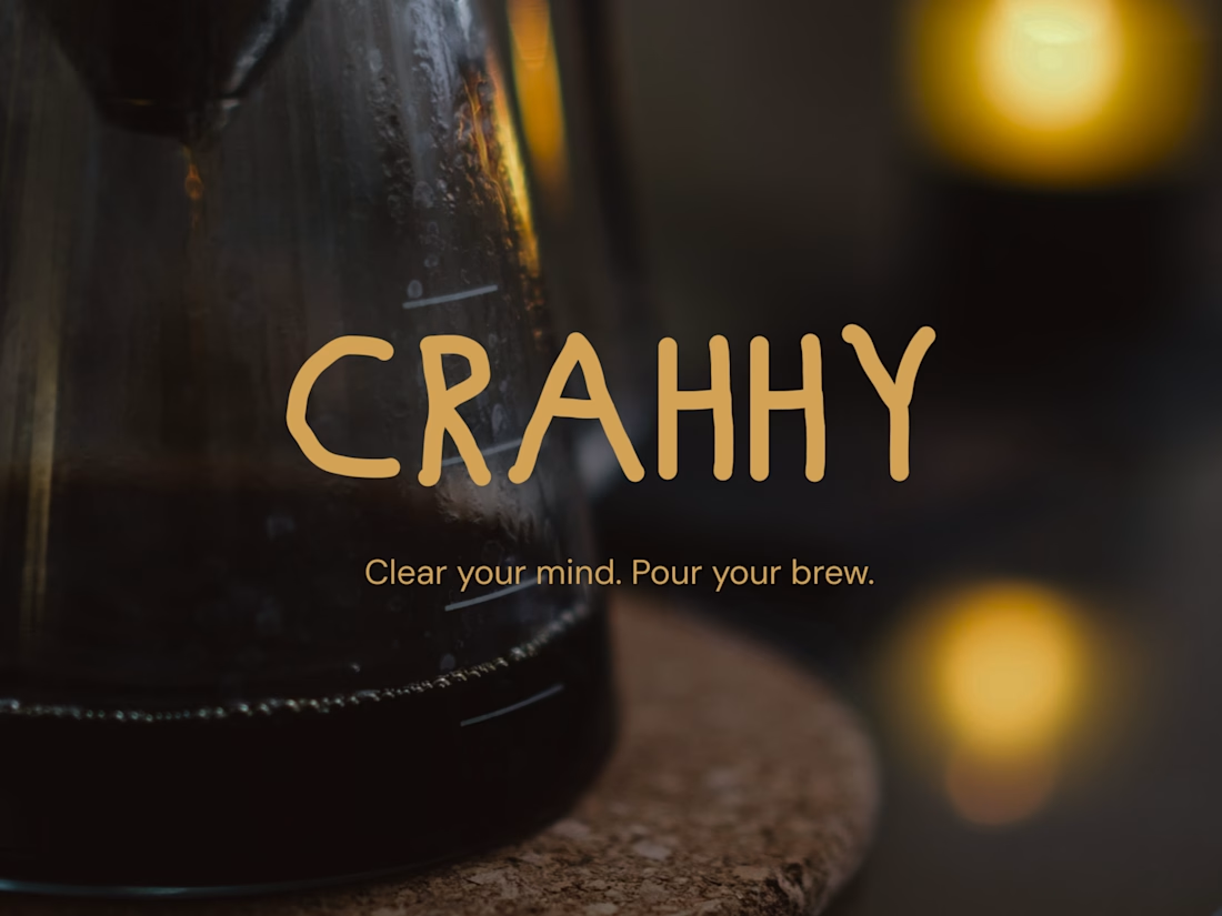
Crahhy is a speciality coffee brand rooted in the relatable human psychology of coffee cravings.
The objective was to design a brand that is minimal on the outside yet delightfully chaotic on the inside, blending specialty coffee aesthetics with honest, humorous storytelling.


minimal outside chaotic inside is the right brief for coffee