The network for creativity
Join 1.25M professional creatives like you
Connect with clients, get discovered, and run your business 100% commission-free
Creatives on Contra have earned over $150M and we are just getting started
Back to feedPost


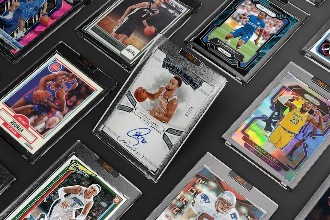
Throwback to working with these epic mockups for TIME4. I built a whole Memberstack & Webflow site around their rare finds and community raffles.



looking great!
Thanks Nicolette!
The network for creativity
Join 1.25M professional creatives like you
Connect with clients, get discovered, and run your business 100% commission-free
Creatives on Contra have earned over $150M and we are just getting started
Challenges
View all


Related posts

AX Creative | A city that builds itself as you scroll.
What if an agency website didn't just talk about building, but actually built something?
A homepage redesign concept for AX Creative, a growth agency operating across Melbourne, Sydney, Singapore, and Kuala Lumpur.
Their philosophy is simple: "We don't run campaigns. We build."
I took that literally.
As you scroll, a wireframe Melbourne rises into view. The sun moves from dawn to golden hour. Each section unfolds like an architectural drawing, turning the homepage into a living blueprint.
Designed and developed in Webflow with GSAP. Oversized Archivo typography, IBM Plex Mono annotations, a single sun-yellow accent, a live solar HUD, and a glowing masterplan bring the concept together.
The idea was to make the agency's positioning something visitors experience, not just read.
#Webflow #GSAP #WebDesign #CreativeDirection #ScrollAnimation #InteractionDesign


Taking "we build" literally with a city that rises as you scroll is a great concept. Dawn to golden hour as you go is a nice detail.
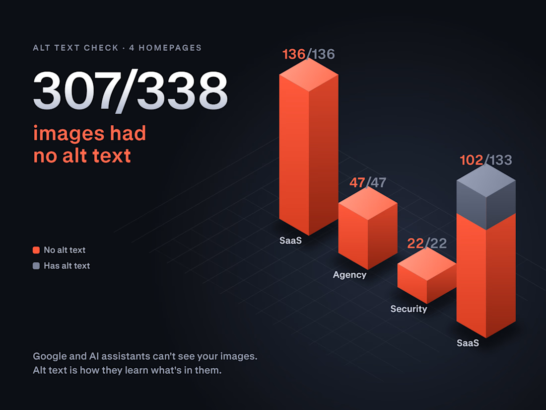
307 of 338 images had no alt text.
This weekend I checked 4 company homepages before applying to their projects: two SaaS products, a marketing agency and a security company. On three of them, not a single image had alt text. The fourth was missing it on 102 of 133.
Why it matters more now: Google and AI assistants like ChatGPT and Perplexity can't see your images. Alt text is how they learn what your product screenshots, team photos and diagrams show.
It's also one of the cheapest fixes there is. In Webflow you set alt text once per asset in the Assets panel, and every page that uses that image is covered.
Not sure how your site looks to Google and AI search? Drop your URL in the comments and I'll tell you the first thing I'd fix.

Great audit. One thing that makes the fix pay off for AI search too: give decorative images an empty alt (alt="") and describe only the meaningful ones by what they show, e.g. "invoice dashboard with overdue payments" rather than "dashboard screenshot". Alt text that names the...


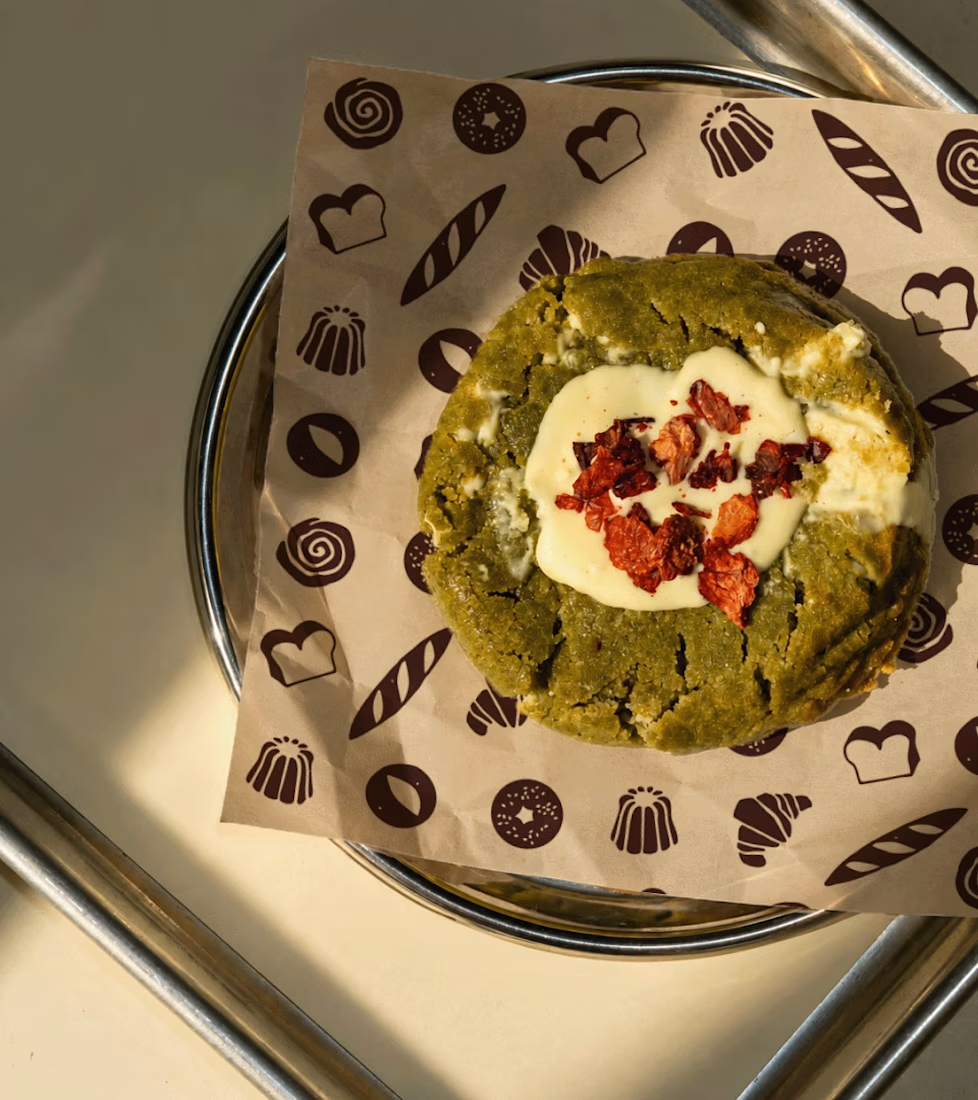
Another set of mockups for Bakedwell


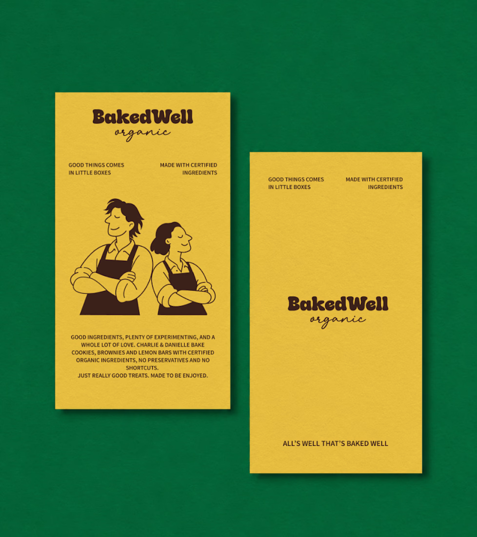
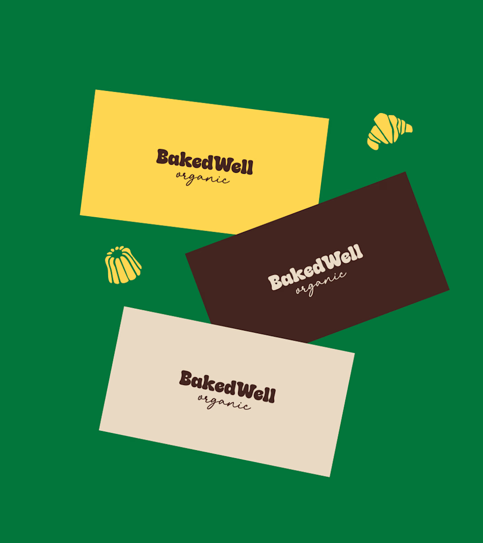
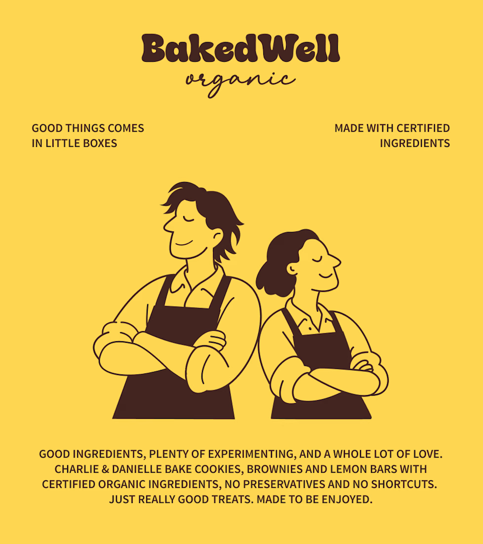

Forest green and mustard with the two bakers in flat illustration is a warm, confident pairing, and the cards read clearly. Contrarian take: the illustrated pair is the strongest asset here, stronger than the wordmark. If I owned BakedWell, I would put those two on the bag and the window and let the logo go smaller.