The network for creativity
Join 1.25M professional creatives like you
Connect with clients, get discovered, and run your business 100% commission-free
Creatives on Contra have earned over $150M and we are just getting started
Back to feedPost
Taste Test

I’m exploring two different colour directions for a contemporary jewellery brochure. Which one feels the most luxurious, modern, and memorable to you?


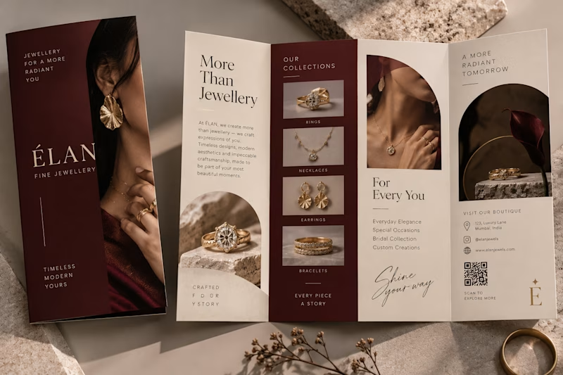
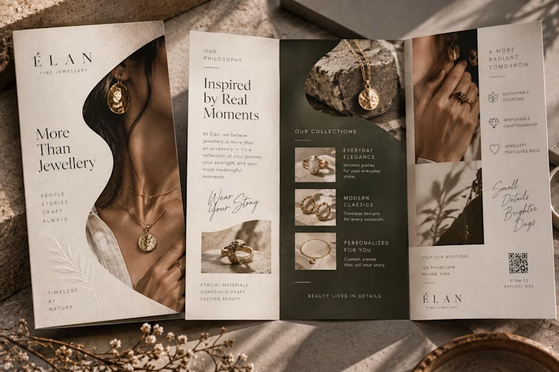
9 votes
Ends in 1d

This is Actually outstanding design work mam,
Its like Ultra pro max plus + 1TB + I phone Duo 2TB level design 💯

Definitely Option 1. The burgundy adds a beautiful premium touch.


Option 2
The network for creativity
Join 1.25M professional creatives like you
Connect with clients, get discovered, and run your business 100% commission-free
Creatives on Contra have earned over $150M and we are just getting started

Challenges
View all


Related posts

Tried creating this gradient effect I have been seeing a lot these days in After Effects.
Which one do you like?
26 voted
76%
8 voted
24%
34 votes
Closed

both looks great!!


Pops out better in Light

Which cover for a new case study do you like more?

19 voted
40%

29 voted
60%

48 votes
Closed

Really inspiring work!