The network for creativity
Join 1.25M professional creatives like you
Connect with clients, get discovered, and run your business 100% commission-free
Creatives on Contra have earned over $150M and we are just getting started
Back to feedPost

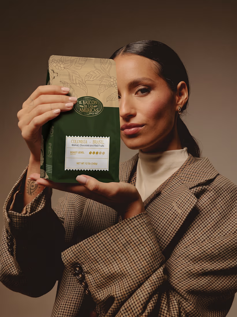
Premium Coffee Packaging, Bag & Label Design

The network for creativity
Join 1.25M professional creatives like you
Connect with clients, get discovered, and run your business 100% commission-free
Creatives on Contra have earned over $150M and we are just getting started



Related posts

LUMINA - Premium Skincare Cream Packaging & Label Design
Minimalist and elegant cosmetic jar label design created for a luxury skincare brand. Focused on clean typography, premium branding, and aesthetic product presentation.

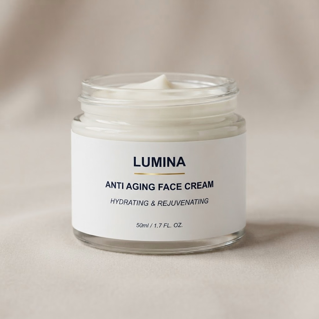

The gold rule under the wordmark does a lot of work on a label this restrained. Did you try the claim line in a lighter weight, so the product name and descriptor separate a bit more?


Which packaging color catches your eye first?
6 voted
46%
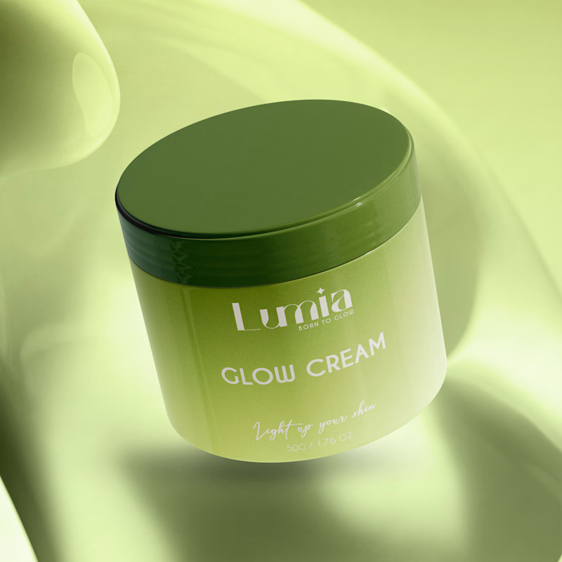
7 voted
54%
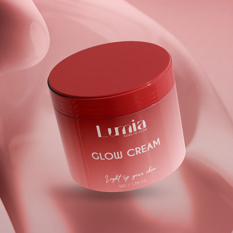
13 votes
Closed

The green version catches my eye first: the dark olive lid gives the lighter jar a clear focal point. I would also test the small white label text at thumbnail size, since the soft lighting reduces its contrast in both versions.

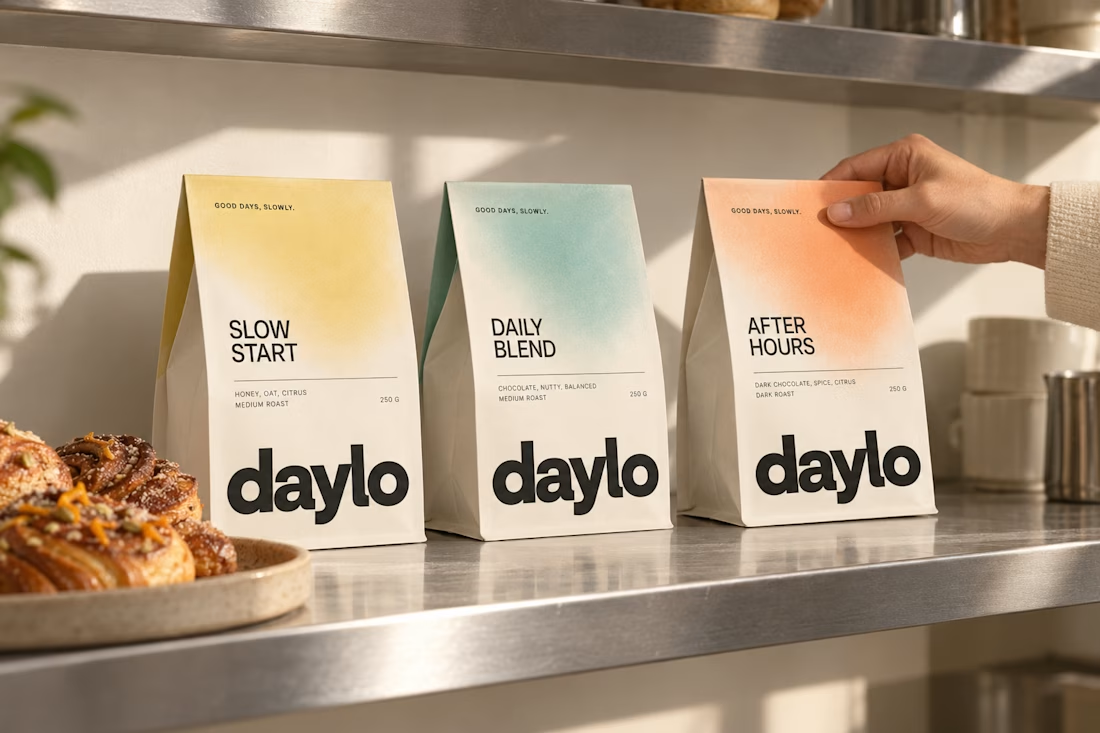
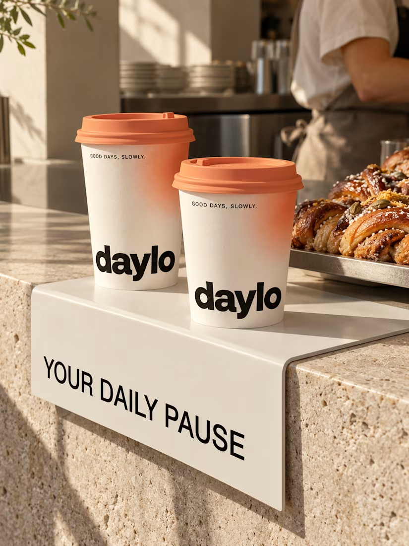
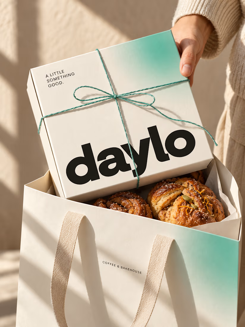
☕ Meet DAYLO - A minimalist coffee branding concept featuring bold typography, warm neutrals, and soft colors designed to make every cup feel a little more special. 🤎
Explore the full project on my Contra profile and let me know your thoughts!