The network for creativity
Join 1.25M professional creatives like you
Connect with clients, get discovered, and run your business 100% commission-free
Creatives on Contra have earned over $150M and we are just getting started
Back to feedPost

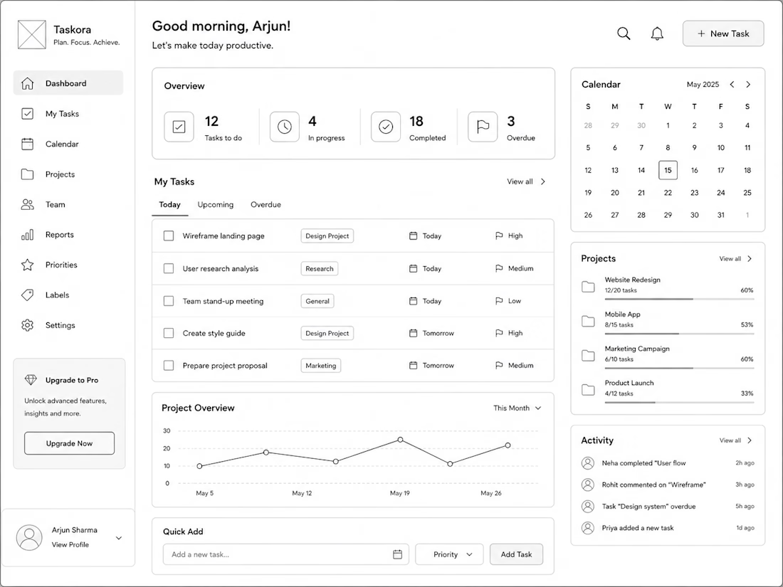
Wireframes are where the real UX decisions happen — before any colour, font, or component touches the file.
This is Taskora, a productivity dashboard wireframe I designed around a single question:
what does a user actually need to see the moment they open this app?
The overview stats sit at the top so your day's status is never buried. The task list defaults to Today, not All Tasks, because most productivity tools overwhelm you on open. Calendar and projects stay visible but secondary — supporting context, not competing for it.
Every layout choice here has a reason behind it. That's what wireframing is for.
Currently open to UX wireframing projects starting at $200 — feel free to check out my Wireframing service or drop a message if you want to chat about your product.


The network for creativity
Join 1.25M professional creatives like you
Connect with clients, get discovered, and run your business 100% commission-free
Creatives on Contra have earned over $150M and we are just getting started





Related posts

A few things we’ve been working on this month.
Different industries, different problems, but the same goal: making complex products feel simple, clear, and trustworthy.
Fintech → Investment Banking → Geospatial AI
More projects are still in progress.
Full case studies coming soon.






This is the kind of work I enjoy seeing — simple, focused, and actually thought through.

Then: 1 month, 1 template.
Now: 1 week, 15 templates.
Same designer, different workflow.
I wrote up how I built no-code.supply: fifteen website templates, each with its own brand, in HTML and React, and some in Framer too. Claude Code did most of the typing. I did the directing.
no-code.supply
How I built 15 website templates with an AI coding agent in a week
How I built 15 AI-ready website templates with Claude Code in a week: the workflow, the quality bar, and why a template is only the starting point.

Going from one template a month to fifteen a week is wild. How much of the design direction did you still do by hand?

Next intelligence. A brand you can feel.
Ice blue, deep black and refracted glass bring texture, depth and a sense of touch to an invisible technology. An identity designed to be recognised. And felt.
Brand identity and visual direction for Niwos, a platform that brings AI agents together as a digital workforce.
Five modules. One W. A simple idea at the heart of the identity: working as one.
I’ve really enjoyed working on this project with Muhammed. His trust in my design judgement and openness to new ideas gave me the creative freedom to explore fully.
Here’s hoping this is just the first chapter of an exciting journey with him and his team.


👍 nicely done