The network for creativity
Join 1.25M professional creatives like you
Connect with clients, get discovered, and run your business 100% commission-free
Creatives on Contra have earned over $150M and we are just getting started
Back to feedPost

Managing public street-lighting 🚦 (PJU) for Indonesia’s Department of Transportation (Dishub) used to feel like operating in the dark. Literally.
The pain points were painfully real: zero transparency, fragmented teams, manual tracking, and no true digitalization.
Supervisors were stuck playing detective. Are the lamps actually installed? Or are those progress reports and photos just being recycled? In public infrastructure, this "black box" leads to major delays and budget leaks.
💡 :To fix this, I engineered the PJU Field-Operations App—turning bureaucratic chaos into a transparent, fraud-proof workflow:
📍 No more guessing: Crews plot exact assets on a Live GPS Map.
📊 No more "ghost" reports: Progress is tracked granularly from 0 to 100%.
📸 No more fake photos: Submissions require tamper-evident, geotagged watermarks as bulletproof proof of work.
🤝 No more silos: Connects contractors and Dishub officials in one real-time dashboard.
We didn't just build an app; we built accountability for smart cities.
Need to transform chaotic field operations into a streamlined, digital source of truth? Let’s connect! 👇


The network for creativity
Join 1.25M professional creatives like you
Connect with clients, get discovered, and run your business 100% commission-free
Creatives on Contra have earned over $150M and we are just getting started

Challenges
View all


Related posts

Designed a clean, premium website concept for Arave — a modern digital watch brand. Focused on strong visuals, product storytelling, and a minimal, technical feel.
Would love to hear your thoughts — what do you think I could improve in this project?


"Built to be taken apart" reframes repairability as the premium feature, not a compromise - most watch sites hide the mechanism, this one leads with it.

Love blending and bolding things up.
I'm blending a retro 8-bit aesthetic with modern Web3 UI, turning token creation into a mini-quest with zero UX friction.


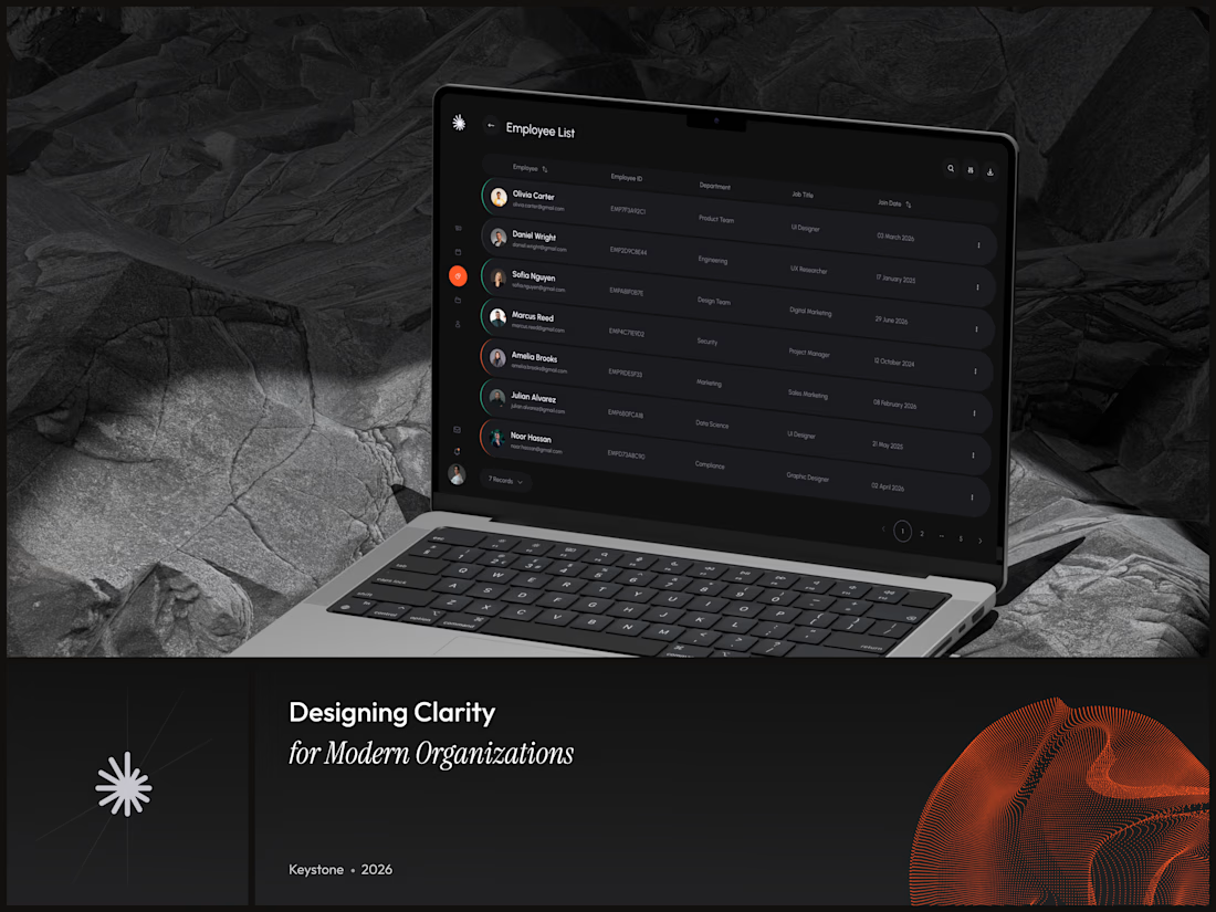
Keystone - HR Management Platform
Employee list screens are the homework assignment of SaaS design. A table is a table is a table. Nobody's winning an award for this view and that's exactly why it matters.
The restraint here is the point. No colored tags, no status badges fighting for attention, no dashboard widgets crammed into the sidebar. Just the data, breathing in a dark container with enough row spacing that your eyes don't blur at record five.
That split between a bold brand identity and a restrained product UI is one of the hardest things to get right in B2B SaaS.
#SaaS #DashboardDesign #DarkUI #B2BTech #ProductDesign
"A table is a table" is the harder argument to make internally than the design itself - most teams would've shipped colored status tags just to have something to show in a review.