The network for creativity
Join 1.25M professional creatives like you
Connect with clients, get discovered, and run your business 100% commission-free
Creatives on Contra have earned over $150M and we are just getting started
Back to feedPost

What does a coffee brand need to feel premium?
Not a complicated logo.
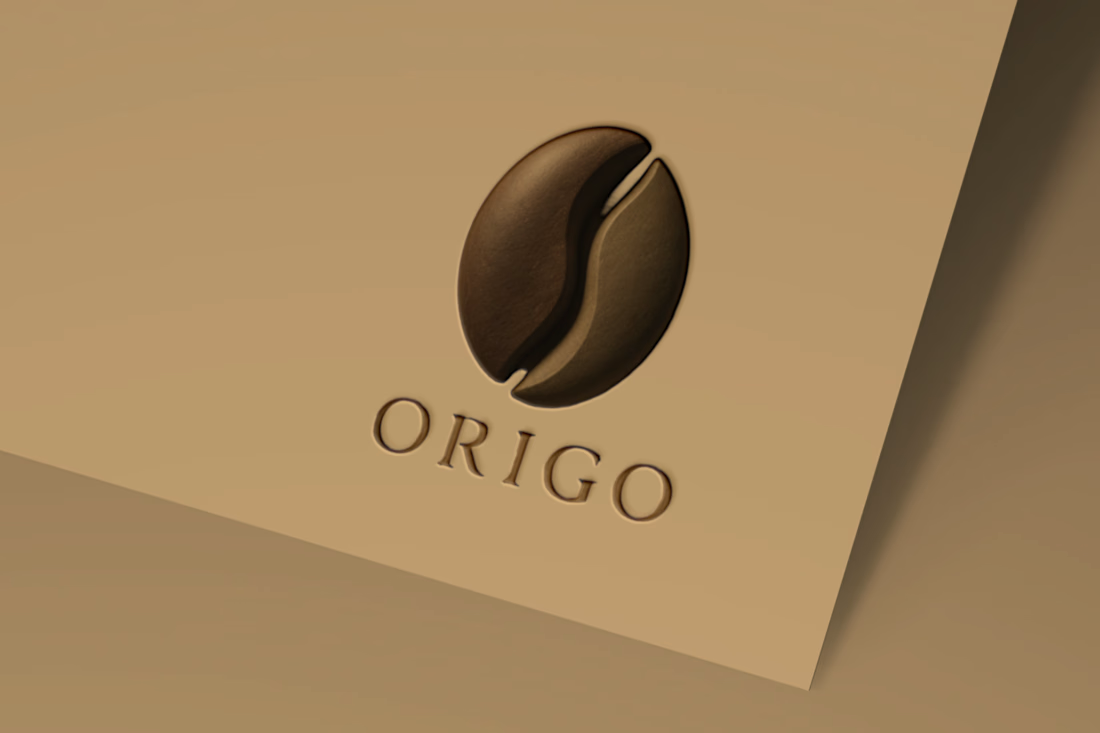
For Origo, I wanted the identity to feel warm, refined, and connected to coffee without relying on the usual coffee-shop clichés.
So I started with the most recognizable part of the experience the coffee bean and turned it into the core of the logo.
I kept the form simple and paired it with elegant typography then built the visual direction around warm, earthy tones.
The goal was simple:
☕ Make the coffee connection immediate
🤎 Keep the mark recognizable without adding unnecessary details
🤎 Create a premium feel without making the brand feel distant
🤎 Make the identity flexible enough for packaging, menus, signage, and digital use
This is one of my favorite parts of branding.
Taking something familiar and asking: “How can I make it feel like this brand?”
That’s where a logo stops being just a logo and starts becoming an identity.
Origo | Café Brand Identity Concept
The network for creativity
Join 1.25M professional creatives like you
Connect with clients, get discovered, and run your business 100% commission-free
Creatives on Contra have earned over $150M and we are just getting started











Related posts

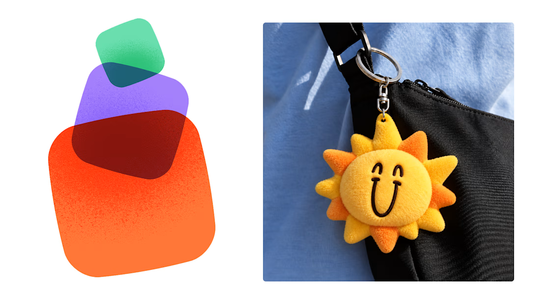
Most early-stage brands play it safe and disappear after a while. For Drylendar, I did the opposite.
3 weeks from brief to full identity: logo, illustration system, app visuals, collectible cards and even merch.
AI makes things cheaper. Personality makes brands memorable.
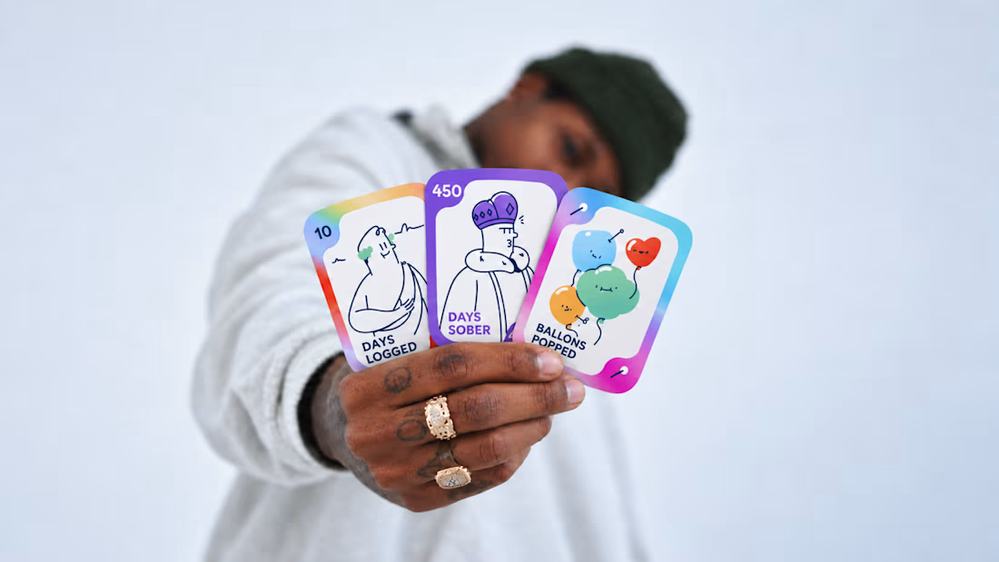
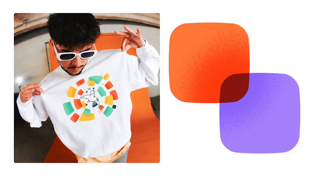
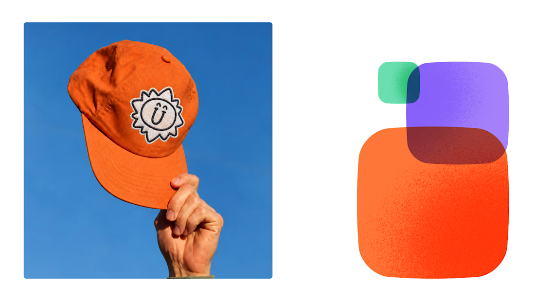

This is exactly what branding should be! 🔥 3 weeks for full identity, merch, cards - you really built personality, not just a logo. Love the Drylendar vibe. AI makes it cheap, but this makes it memorable - so true!

A little peek at the brand work we did for Elio Mortgage.
A warm, approachable identity full of warm vibrant colors paired with soft sun rising inspired gradients, inner glows and custom illustrations & more. Loved this direction!
Full case study coming soon, from process to final identity.
Plenty of logo explorations to share too!


That color palette takes the whole identity to a different level!! I loove it.

Brand Expressions -- Olivir



Thats so crazy!!!!!! Seeing this I feel we humans are still far better than AI