The network for creativity
Join 1.25M professional creatives like you
Connect with clients, get discovered, and run your business 100% commission-free
Creatives on Contra have earned over $150M and we are just getting started
Back to feedPost
Just wrapped up my latest Framer project — CrystalDent
A modern dental clinic website template that I designed from scratch.
Most healthcare websites feel cold and overly clinical.
So I asked myself — what would make a patient feel comfortable the moment they land on the page?
Here's what went into this:
✅ Warm beige tones to create a calm, welcoming experience
✅ A human-centered hero section that instantly builds trust
✅ Floating UI elements for depth without visual clutter
✅ Conversion-focused layout — every section guides users toward booking confidently


Love the shift from “clinical” to “comfort.” The warm tones and smiling hero immediately reduce friction and build trust.

Good work

thank you 😍
The network for creativity
Join 1.25M professional creatives like you
Connect with clients, get discovered, and run your business 100% commission-free
Creatives on Contra have earned over $150M and we are just getting started




Related posts


next update on the london architect site.
the homepage hero. you scroll, and instead of the page moving down, you walk up to the house, through the front door and into the living room.

Amazing!!

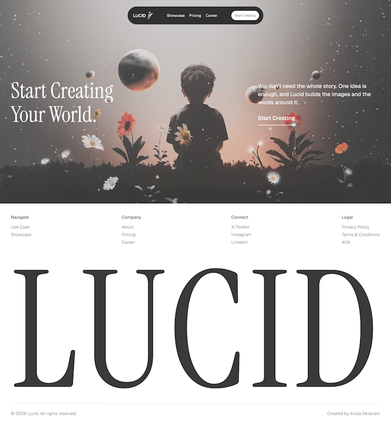
Same company, two different concepts for an AI storytelling platform. Which one suits better?
31 voted
86%
5 voted
14%
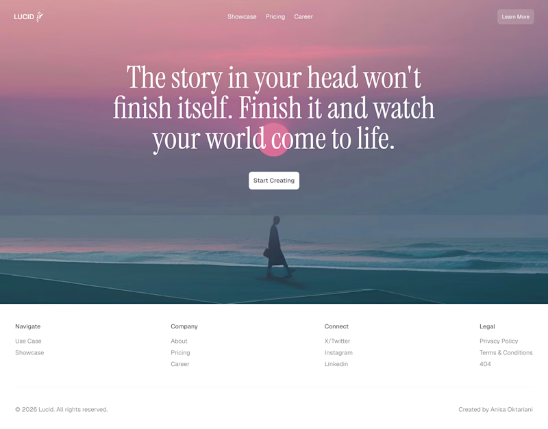
36 votes
Closed

Left!

I've spent years obsessing over the stuff nobody notices on a website. Until it's missing.
AI can now build a whole site in an afternoon. I think that's great.
But it still can't decide what feels right.
I don't think AI is the problem. It just stops at "it works". The last part, the spacing, the type, the way things move when you scroll, still needs someone who cares about it.
That's the part I've always loved doing. So I made a small thing around it: you bring the site AI built, I finish it in Webflow.
It's called Verdikt https://verdikt.studio


Agreed. AI gets you a working layout fast, but spacing and type rhythm are where it still feels off. I'd add forms and mobile checks to that list too. What's the most common fix people bring you?