The network for creativity
Join 1.25M professional creatives like you
Connect with clients, get discovered, and run your business 100% commission-free
Creatives on Contra have earned over $150M and we are just getting started
Back to feedPost


One of the biggest mistakes I see in luxury web design?
Confusing "expensive-looking" with "premium experience."
For this jewelry brand concept, the challenge wasn't creating another beautiful website.
It was designing an experience that makes people feel something.
Every layout decision, every transition, every piece of whitespace was used intentionally to create a sense of curiosity, emotion, and immersion.
Because great design isn't just about what users see.
It's about what they remember after they leave.
The brands that stand out today aren't always the loudest.
They're the ones that create experiences people can't stop thinking about.
Question for creative designer 👇
Which has a bigger impact on perceived luxury: visuals, copywriting, or user experience?


The network for creativity
Join 1.25M professional creatives like you
Connect with clients, get discovered, and run your business 100% commission-free
Creatives on Contra have earned over $150M and we are just getting started











Related posts

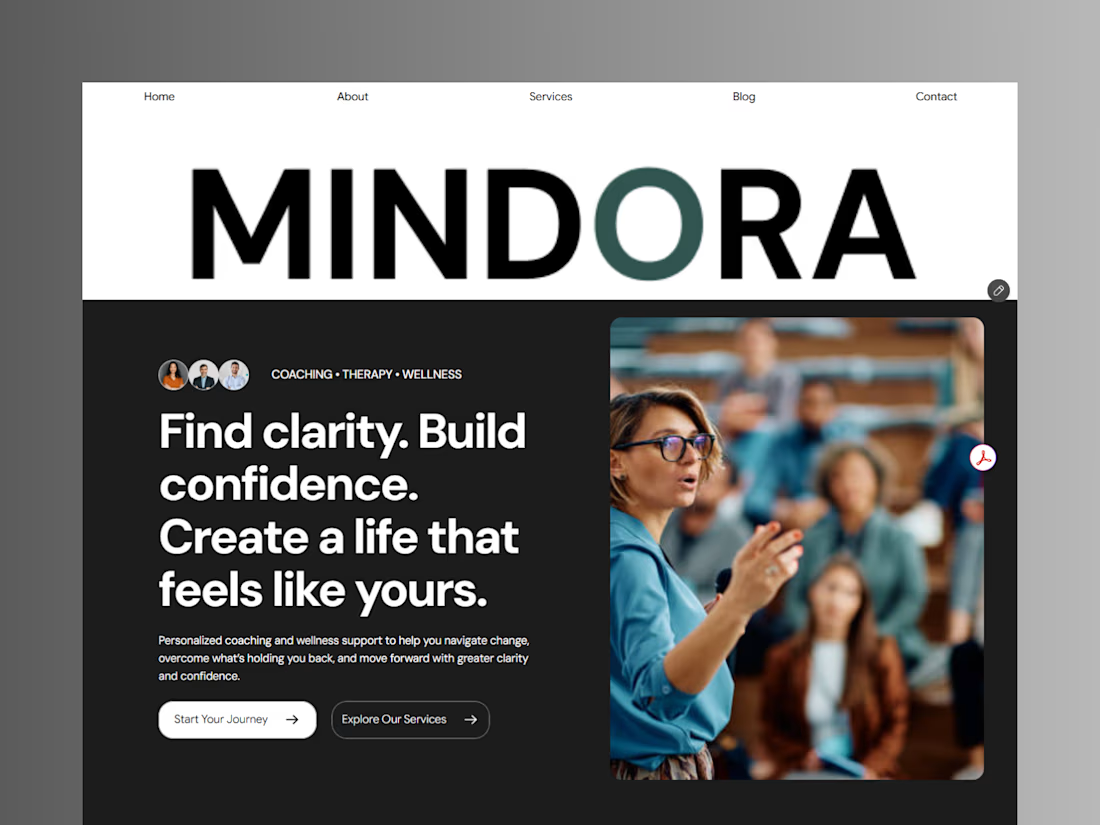
Introducing Mindora — a Life Coaching & Wellness Framer Template.
I designed Mindora for life coaches, wellness professionals, and personal growth brands looking for a calm, modern, and welcoming online presence.
Inspired by clarity, confidence, and meaningful growth, Mindora features a thoughtful layout, dedicated service sections, a blog for sharing valuable insights, and a clean visual style designed to help brands connect with their audience.
Built with Framer, it's a customizable starting point for creating a professional coaching or wellness website.
Explore Mindora and bring your next website idea to life.
Kindly check it out the template: https://www.framer.com/marketplace/templates/mindora-life-coach/


Great work

A flower that inflates arrives in the mail.
Next month, a phone made of shell.
STILL LIFE SERVICE. Case study dropping soon.
Which object earns your shelf? Reply below.
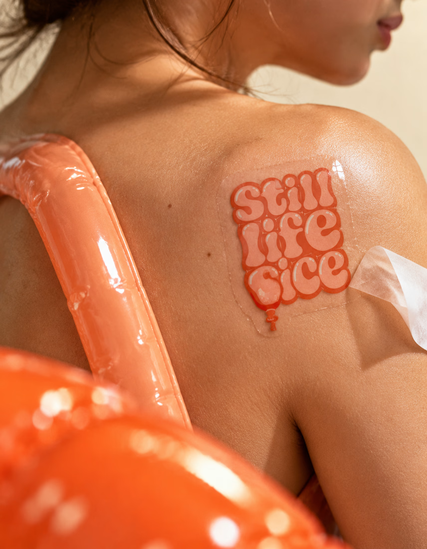
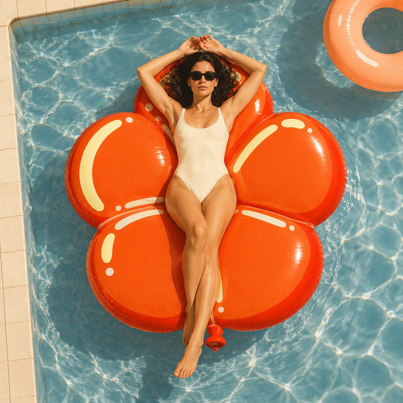
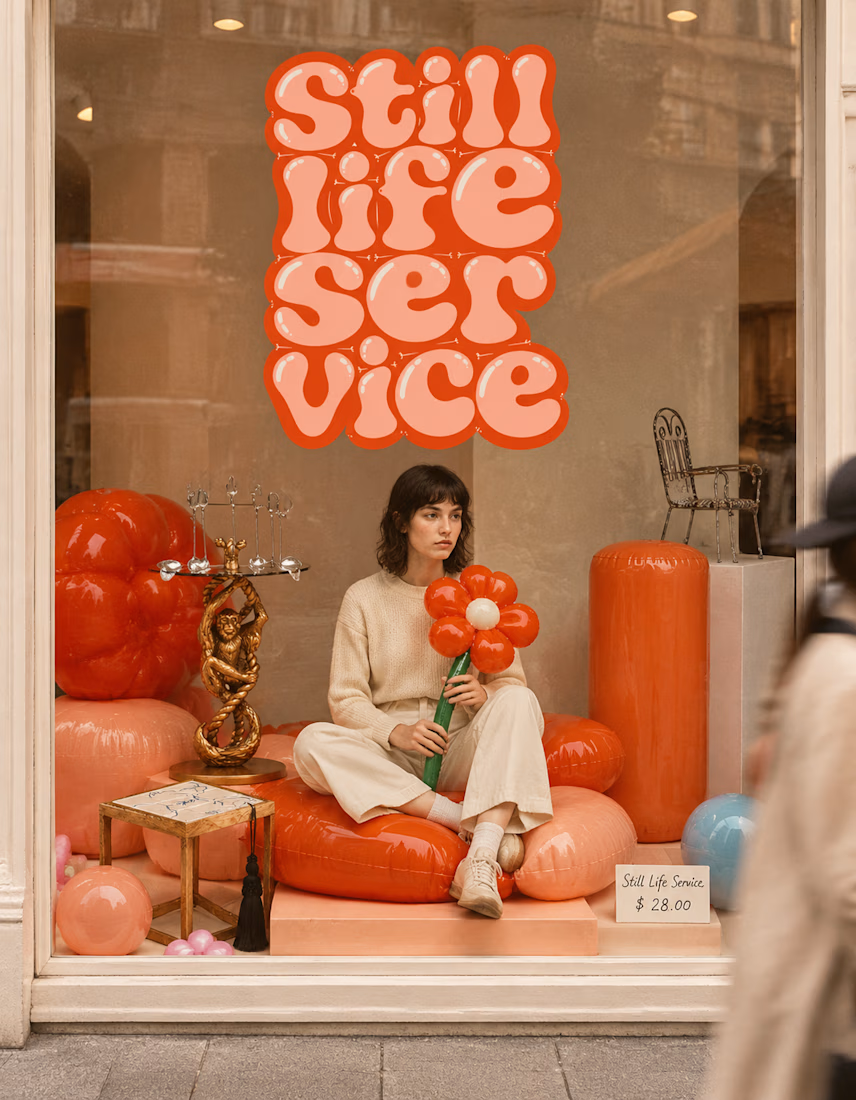

The inflatable flower. Only houseplant I'm guaranteed not to kill. Also, a new object every month is a sneaky good retention hook, people will stay subscribed just to see what's next.

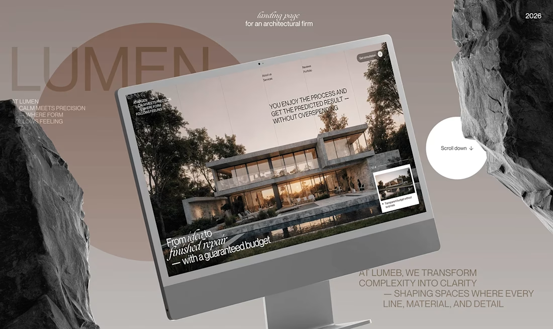
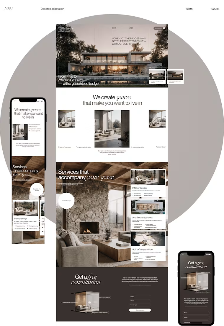
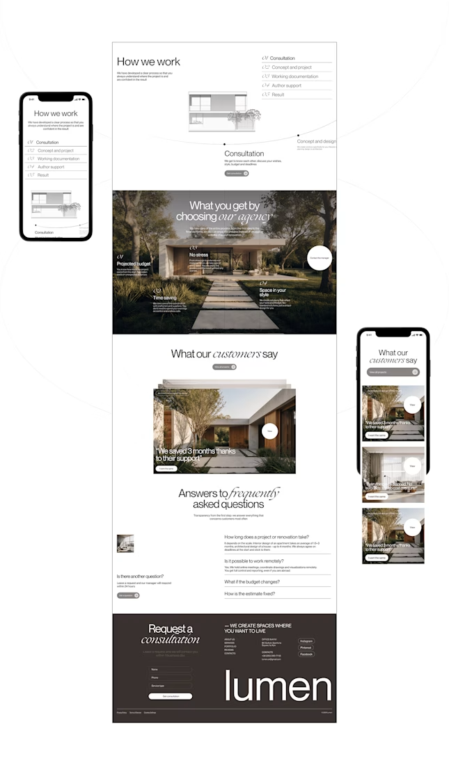
Lumen — UX/UI Design for a Premium Architecture Studio
Sometimes, the smallest details are what give a design its personality.
For Lumen, I found myself exploring how typography, architectural photography, colour, and layout could work together to tell a story before someone even starts reading.
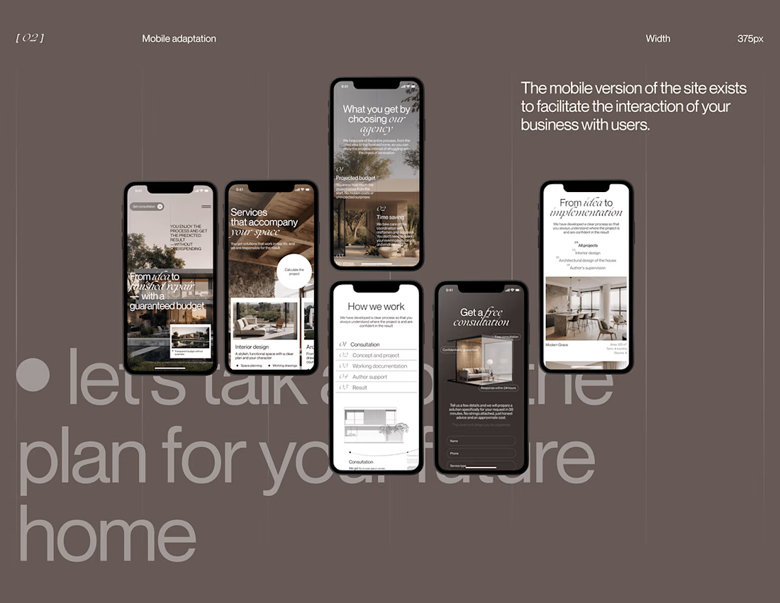
I played with oversized text, warm brown tones, editorial layouts, and a mobile experience that carries the same visual character as the desktop design.
I especially enjoyed putting the mobile screens together. Seeing the different sections come to life on a smaller screen made the whole concept feel more complete.
It's always interesting to see how different creative decisions can change the way people experience a brand.
What's one design detail that can make you appreciate a website even before you've explored everything?
#WebDesign #CreativeDesign #UIUXDesign #Architecture


i love this soooo wellllll, i just said welll with 4 l's thats how good this is