The network for creativity
Join 1.25M professional creatives like you
Connect with clients, get discovered, and run your business 100% commission-free
Creatives on Contra have earned over $150M and we are just getting started
Back to feedPost

Frontend Execution – Design-Led Webflow Build
I recently completed a design-led Webflow build focused on typography, spacing, and layout rhythm, where the goal was precise execution rather than reinterpretation.
Project: Founder Authority – Personal Website

The network for creativity
Join 1.25M professional creatives like you
Connect with clients, get discovered, and run your business 100% commission-free
Creatives on Contra have earned over $150M and we are just getting started





Related posts

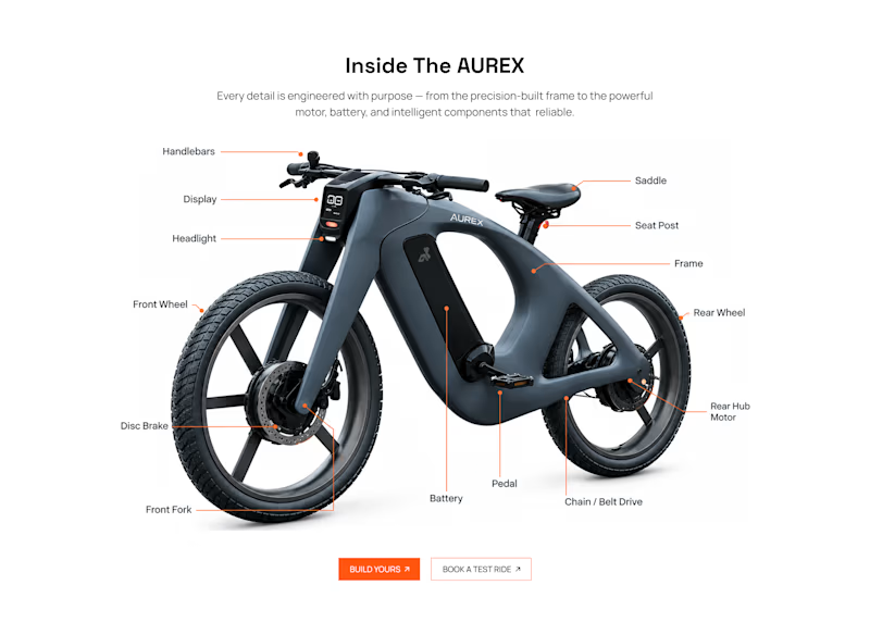
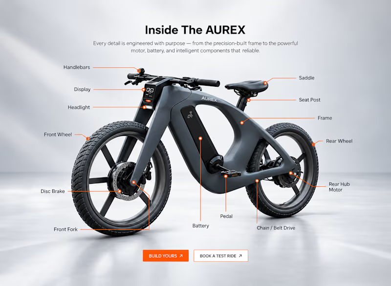
Light or refined - which E-Bike product breakdown section design would you choose?
Two concepts for the same AUREX e-bike. Same product, same components, two different presentation styles:
A - Soft Studio: subtle gray depth, larger product focus, and a more premium visual feel.
B - Clean Minimal: bright white background, tighter spacing, and a more technical editorial layout.
Which direction feels stronger for a premium e-bike brand and why?

5 voted
31%
11 voted
69%
16 votes
Closed

A feels more premium to me. The soft gray depth and bigger product focus make the bike feel like something special. B is great for specs, but A sells the feeling

love this

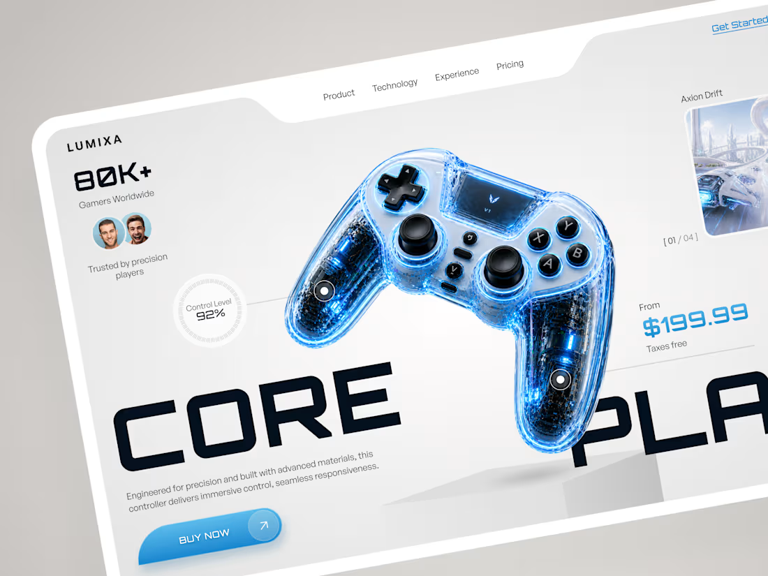
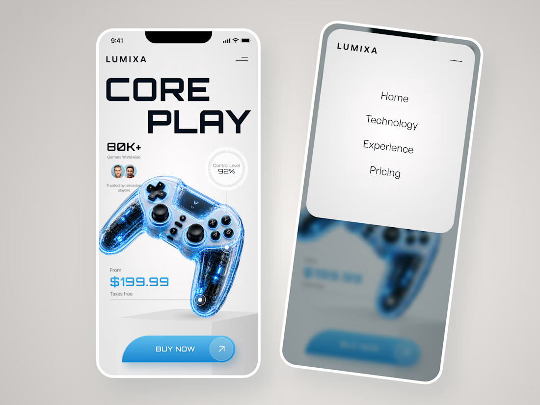
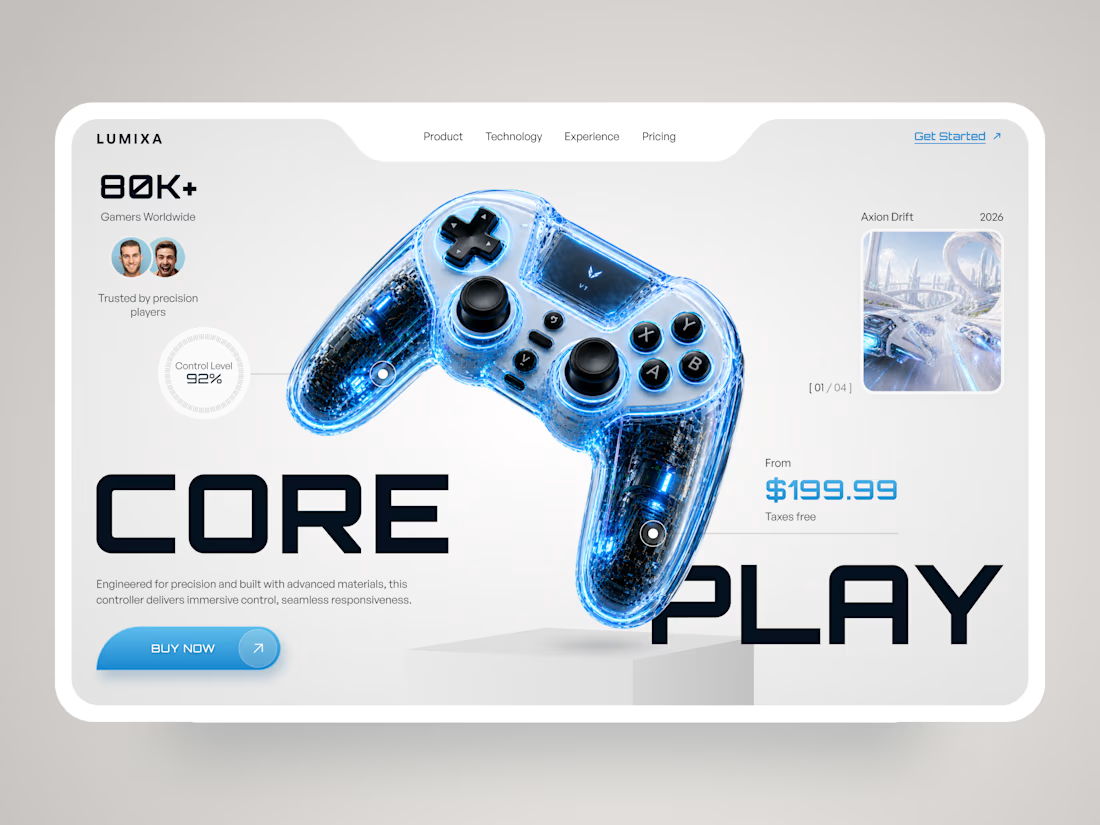
LUMIXA — Gaming Controller Product Landing Page 🎮⚡
LUMIXA is a futuristic product landing page concept created for a premium gaming controller built around precision, performance, and immersive play.
The goal was to make the product itself the center of the experience while...


Have you ever gone this bold on a 404? ⚡
Back to our latest poll: y'all voted Black (60%). We shipped Pink anyway.
Our client's call, not ours - and once you see her brand, you'll get why. Feminine-led, bold, unapologetic - Pink was never really up for debate on her end. 💗👠
See it live: https://productionportugal.com/404
404pagecreativewebsitewebdesignCreative Design Motion DesignWeb DesignAdobe After EffectsFigmaWebflow


You nailed the overall mood here. The details just reinforce it nicely.