The network for creativity
Join 1.25M professional creatives like you
Connect with clients, get discovered, and run your business 100% commission-free
Creatives on Contra have earned over $150M and we are just getting started
Back to feedPost

Responsive. Adaptive Product Icon System
A dark-mode look at the custom icon system we created for Responsive.
The translucent outer layer allows each icon to react to its environment, so the system can shift in feel between light and dark interfaces without losing its core visual language.
Designed by Lepisov Branding. Presentation built in Spline.


The translucent outer layer trick is such a clean way to handle light/dark without redesigning the whole set twice. Did Spline make that reactive shift easier than expected, or were there some snags getting the transitions smooth?

This is such a smart way to keep an icon set from feeling flat. How has the Responsive team been using it internally, do they treat it like a living system they can extend themselves, or do they still come back to you for new additions?


dark mode set is so clean

You did just amazing work
The network for creativity
Join 1.25M professional creatives like you
Connect with clients, get discovered, and run your business 100% commission-free
Creatives on Contra have earned over $150M and we are just getting started

Challenges
View all


Related posts

A little interactive experiment for Verdant 🌱
Writing unique code for animations makes iterating on reactive micro-interactions so much smoother. It completely transforms how a brand narrative feels in the browser.


Great job


This looks great



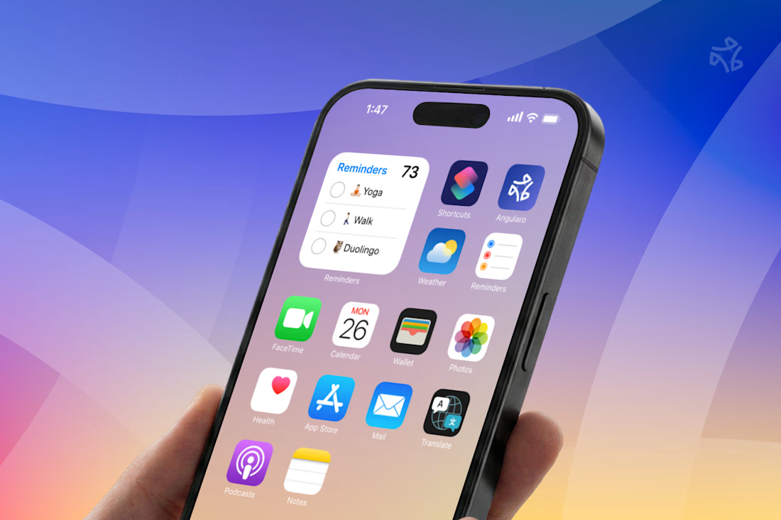


The wide counters are what let it survive the home screen — in that grid of other app icons it still reads as one shape instead of collapsing into noise, which is the real test for a CRM mark. Is the gradient locked to the logo, or does it shift across the product surfaces?