The network for creativity
Join 1.25M professional creatives like you
Connect with clients, get discovered, and run your business 100% commission-free
Creatives on Contra have earned over $150M and we are just getting started
Back to feedPost
Title
Executive Business Performance Dashboard (Power BI)
Description
I designed an Executive-level Business Intelligence Dashboard in Power BI that delivers real-time insights into revenue, profitability, customer behavior, and growth trends.
This dashboard is built for founders, managers, and decision-makers who need clarity—not clutter.
What This Dashboard Solves
Understand revenue, cost, and profit margin at a glance
Track YoY growth trends and monthly performance
Identify top-performing categories, regions, and channels
Analyze active customers, AOV, and customer profitability
Compare new vs returning customers
Enable data-driven executive decisions
you need a custom Power BI dashboard tailored to your business, let’s connect.
powerbidataanalyticsExcel VBABusiness StrategydatavisualizationData AnalysisData VisualizationMicrosoft Power BISQL


This is a well-structured executive dashboard. Focusing on clarity over clutter—especially by combining revenue, profitability, and customer metrics—makes it genuinely decision-ready. The YoY trends and customer segmentation add strong strategic value for founders and leadership teams. Clean, purposeful BI work.

Thanks a lot, Varghese. I focused on keeping the dashboard decision-oriented rather than visually heavy. Happy to hear the clarity, YoY trends, and customer segmentation came through clearly.
Glad to hear that. Designing with decisions in mind makes a real difference, especially at the executive level. Keeping YoY context and customer segmentation clear is what turns dashboards into practical tools rather than just visuals.

The network for creativity
Join 1.25M professional creatives like you
Connect with clients, get discovered, and run your business 100% commission-free
Creatives on Contra have earned over $150M and we are just getting started
Related posts

This interactive dashboard provides a comprehensive view of profit performance across multiple dimensions—time, segments, regions, categories, and sub‑categories.
This dashboard transforms raw business data into actionable insights by allowing stakeholders to quickly identify profitable areas, spot regional trends, and evaluate category performance. It’s designed for clarity, interactivity, and decision‑making support.

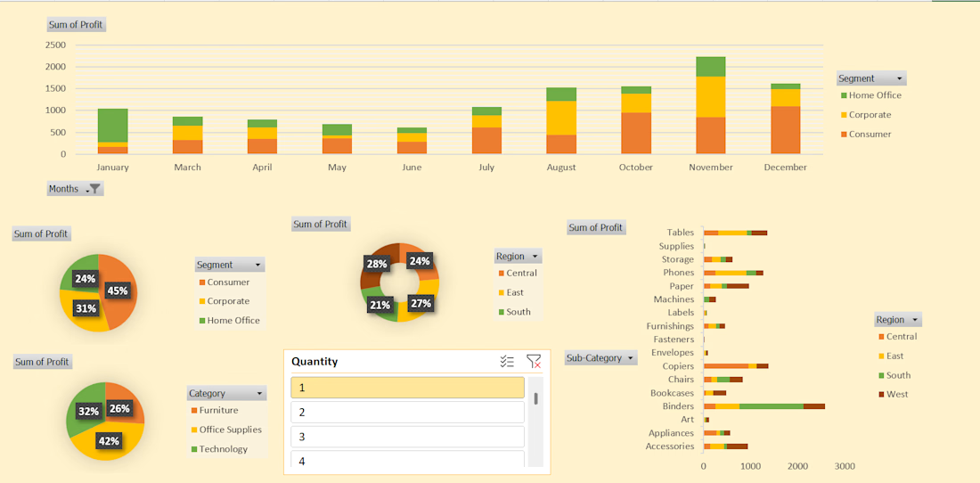
#This is an excellent Profit Dashboard which is made in MS Excel with multiple creative functions help in understanding Monthly , Yearly , Area wise Profits.




Awesome dude

Business data often lives across payment, analytics, CRM, advertising, and inventory platforms. Metrik brings those signals together in one dashboard built for startups and small businesses.
See revenue, orders, customers, and business health at a glance. Compare advertising spend and ROAS across channels, explore visual KPI cards, and use smart alerts to spot unusual changes and potential risks.
The interface pairs a clean layout and rounded components with soft gradients, colorful analytics, and clear visual hierarchy, helping make business performance easier to follow.
