The network for creativity
Join 1.25M professional creatives like you
Connect with clients, get discovered, and run your business 100% commission-free
Creatives on Contra have earned over $150M and we are just getting started
Back to feedPost

:GRLFRND Jeans Custom Affiliate Marketing Video
I love the idea of affiliate marketing - I think it's so fun when done right. Not only can I show everyone my favorite picks of the season, I can also make a little off of it without taking money out of the buyers' pockets.
I had a problem though, I was not ok with just posting a link and the photos of the clothing item from the ecommerce store it was from - I felt I might as well say "give me money!" Then, I decided to practice my graphic design by taking those photos and creating my own art which did the marketing on it's own!
I used Photoroom, Adobe Express, and my mobile phone to create this!

The network for creativity
Join 1.25M professional creatives like you
Connect with clients, get discovered, and run your business 100% commission-free
Creatives on Contra have earned over $150M and we are just getting started





Related posts

✨ Modern Fashion Poster Design - STYLE ✨
Designed a clean, high-fashion poster concept focusing on bold typography and minimalist aesthetics.
Concept: Modern Fashion | Define Your Style
Tool: Canva / Photoshop
Style: Luxury, Minimal, Editorial
Open to feedback and freelance work!
#GraphicDesign #PosterDesign #FashionDesign #Canva #ContraCommunity


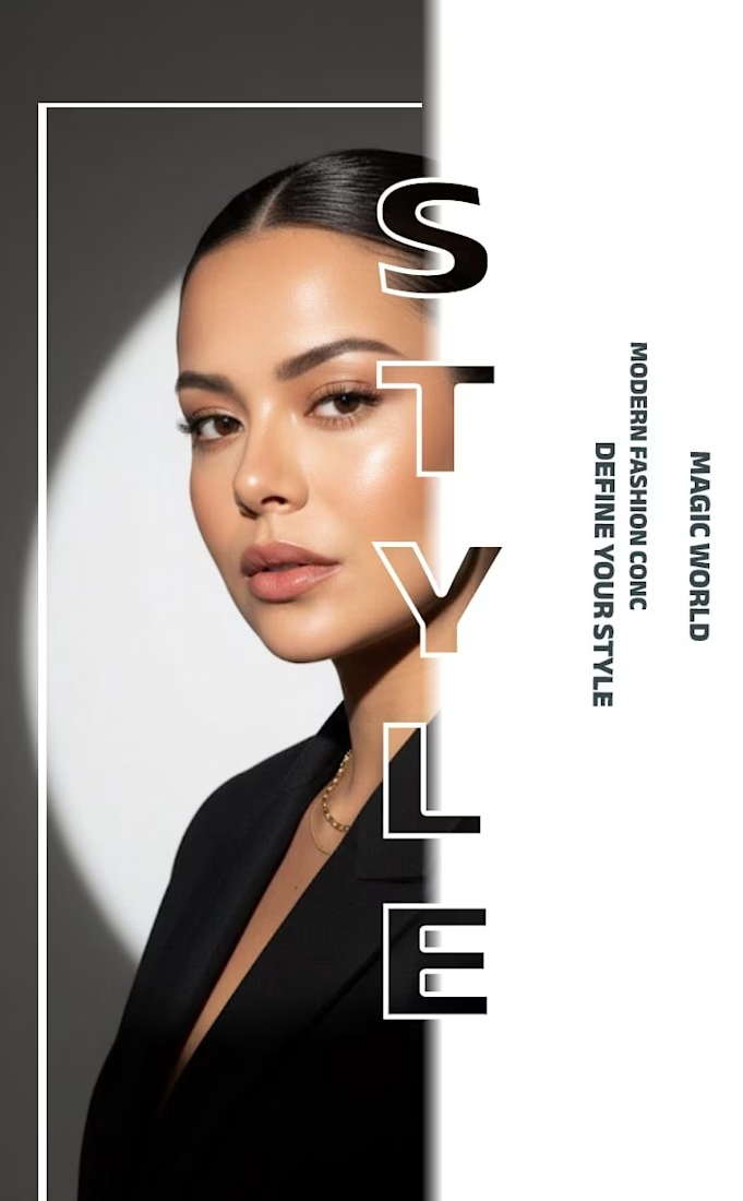
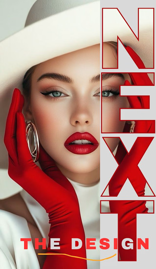
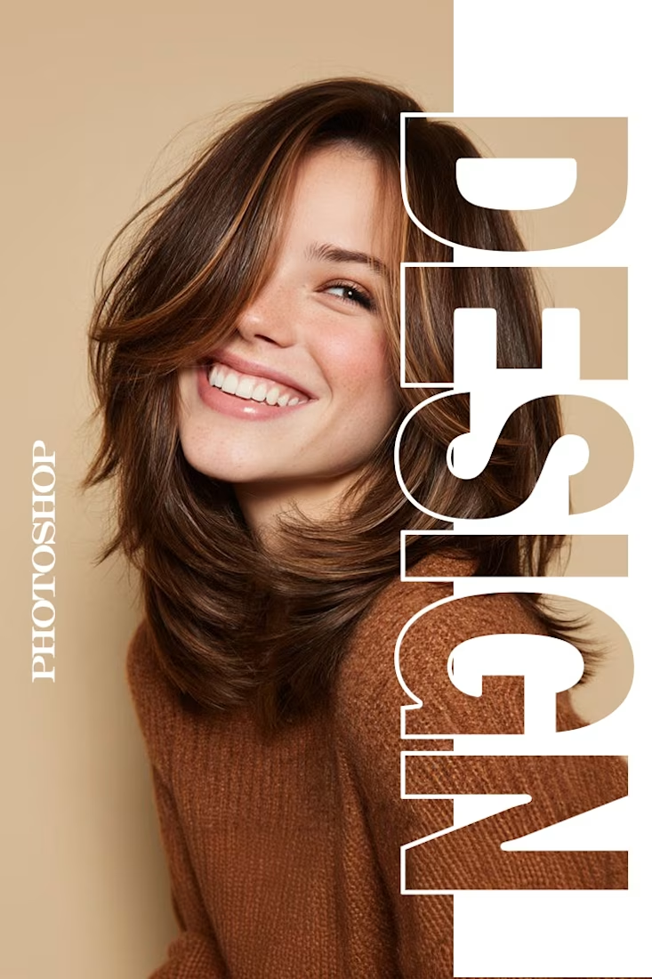
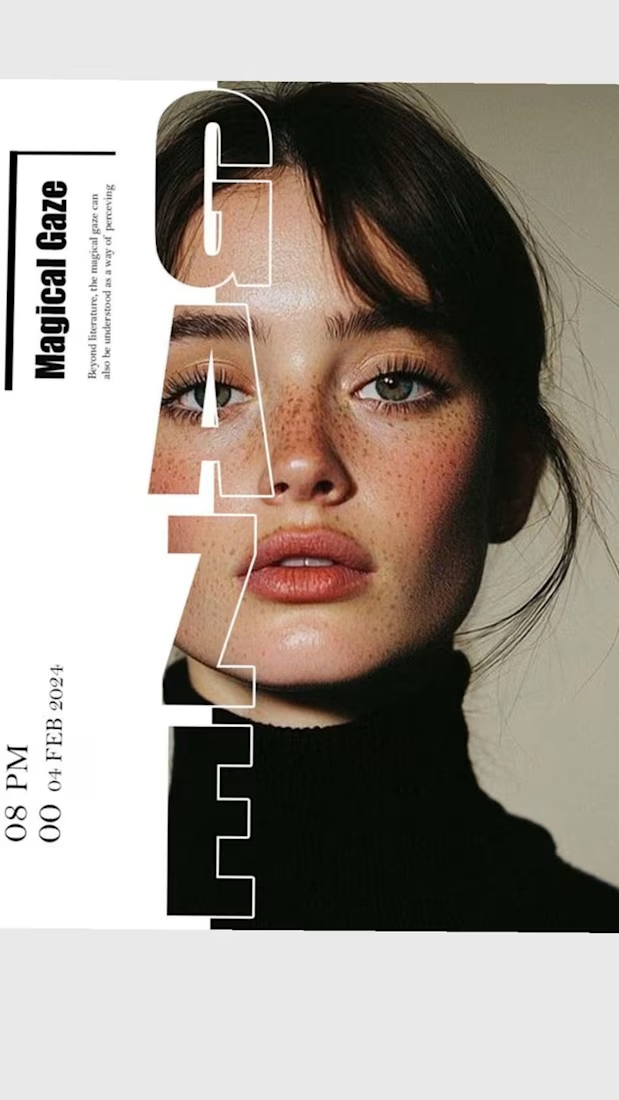

The way you let the bold type dominate the empty space really drives the luxury feel.

Graphic design

Typography on point! Really inspiring work.

Flowlane 2.0, a launch video for a concept ops automation tool. Ops that run themselves.
The dashboard UI comes apart into layers to show each feature: live metrics, self-building reports and AI that drafts for you. It was built in Remotion and finished in After Effects.


Building the scenes in Remotion and hand-keying the light sweeps in After Effects is an interesting split. When a client asks for a late copy or colour change, which side ends up costing you more time?