The network for creativity
Join 1.25M professional creatives like you
Connect with clients, get discovered, and run your business 100% commission-free
Creatives on Contra have earned over $150M and we are just getting started
Back to feedPost


Does good design still need human taste?
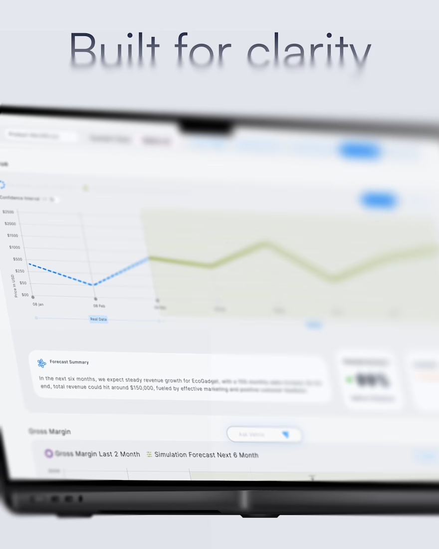
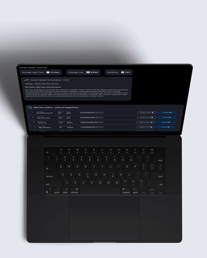
I was looking back at Anant Radio, a healthcare product we designed for radiologists and their teams.
Light mode for the front desk. Dark mode for the lab. Simple enough for a first time user, but deep enough for complex clinical workflows.
None of those decisions came from making something look polished. They came from understanding the people, context and work behind the screen.
AI can make us faster.
But who decides what feels right?
This project is almost two years old. Still feels fresh to me.
The network for creativity
Join 1.25M professional creatives like you
Connect with clients, get discovered, and run your business 100% commission-free
Creatives on Contra have earned over $150M and we are just getting started











Related posts

sentences
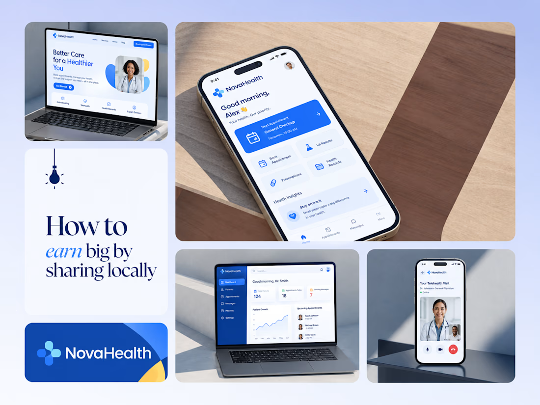
One brand, three screens: patient, doctor, and the video call between them.
NovaHealth is a healthcare brand and product system I designed from logo to apps. Healthcare software tends to feel either cold and clinical or too cluttered to open. I wanted something calm for a worried patient and quick for a doctor between appointments.
The logo breaks the classic medical cross into soft, rounded blocks in two blues, so it reads as “health” without feeling sterile.
The patient app opens with one thing: a solid blue card showing your next appointment. It’s the only fully saturated block on the screen, so nothing competes with it.
The doctor dashboard is built for a glance. Total patients, today’s appointments, and pending messages come first, in the same blue and rounded style as the patient app.
The telehealth screen has almost no UI. The doctor’s face fills the screen, with just three controls: mic, camera, and a red end-call button, the only red in the whole system.
One rule ties it together: blue means action, white space means calm, and yellow is a small spark of warmth.
Which screen should I break down next? 👇



Great medical brand design specially the phone app UI and top left laptop dashboard 🔥🔥🔥
great job Joshua ❤️🎉

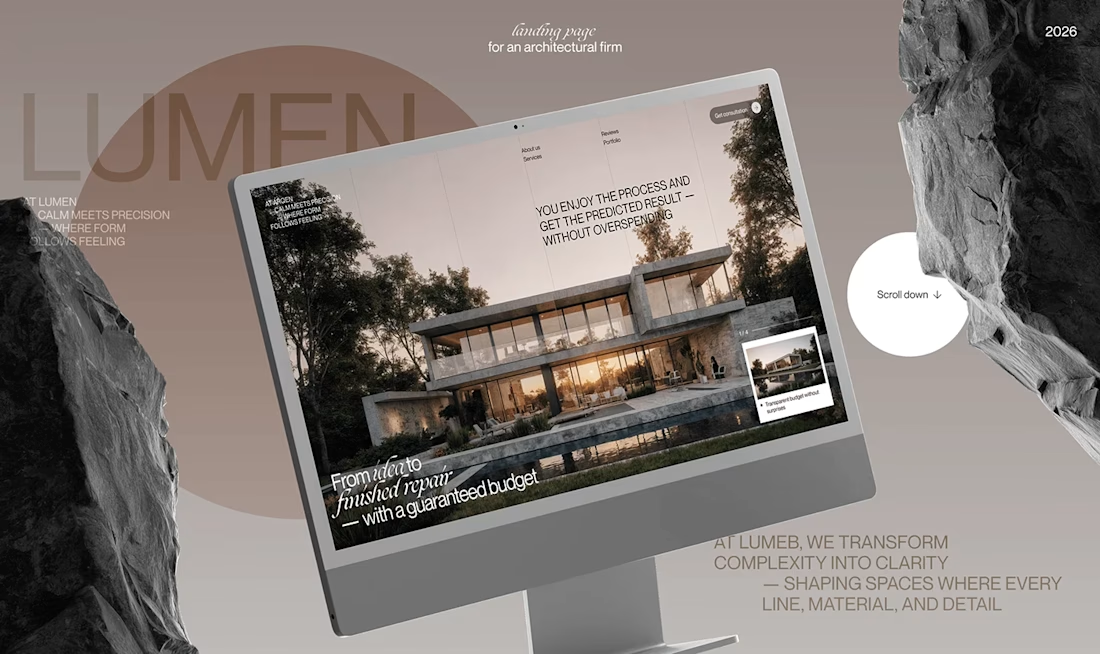
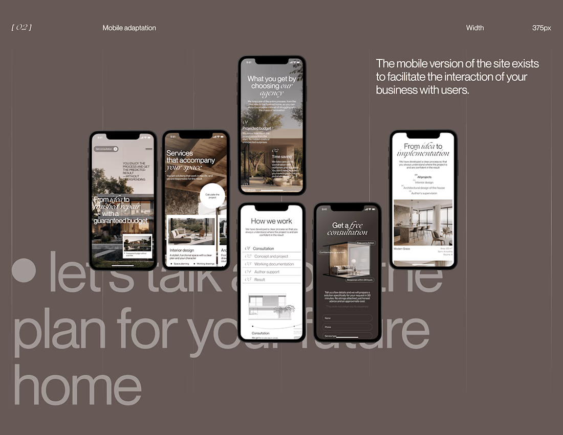
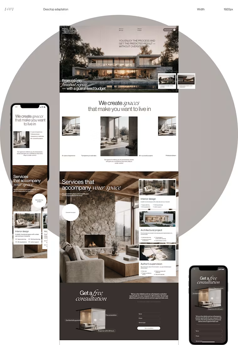
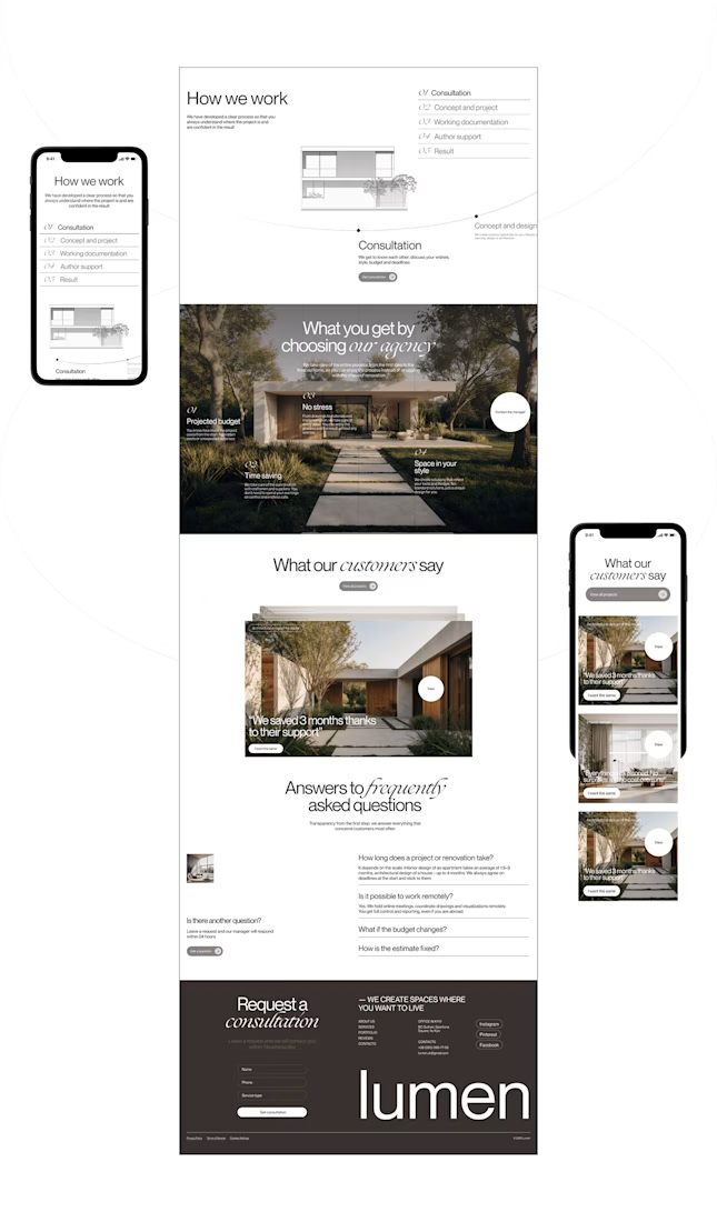
Lumen — UX/UI Design for a Premium Architecture Studio
Sometimes, the smallest details are what give a design its personality.
For Lumen, I found myself exploring how typography, architectural photography, colour, and layout could work together to tell a story before someone even starts reading.
I played with oversized text, warm brown tones, editorial layouts, and a mobile experience that carries the same visual character as the desktop design.
I especially enjoyed putting the mobile screens together. Seeing the different sections come to life on a smaller screen made the whole concept feel more complete.
It's always interesting to see how different creative decisions can change the way people experience a brand.
What's one design detail that can make you appreciate a website even before you've explored everything?
#WebDesign #CreativeDesign #UIUXDesign #Architecture


i love this soooo wellllll, i just said welll with 4 l's thats how good this is



Cream trailer is better because the cargo light creamy color has better contrast with an environment it and black truck feels dangerous🔥🔥🔥
Great job Vaskrsije🎉🎉🎉