The network for creativity
Join 1.25M professional creatives like you
Connect with clients, get discovered, and run your business 100% commission-free
Creatives on Contra have earned over $150M and we are just getting started


The network for creativity
Join 1.25M professional creatives like you
Connect with clients, get discovered, and run your business 100% commission-free
Creatives on Contra have earned over $150M and we are just getting started





Related posts

Just published a new case study for Jiva, a business automation agency.
I explored three different logo concepts based on the idea of step-by-step business growth, deliberately avoiding the usual symbols of money and arrows.
The chosen direction was the geometric sign of the circles in the circle by zoom, which is supported by an exquisite word mark, flexible variations of the logo, an icon, a favicon, a color palette and digital programs.
If you need a distinctive logo and corporate identity for your company, feel free to send me a message.

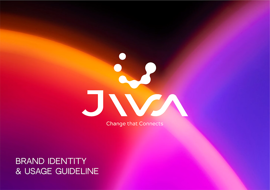
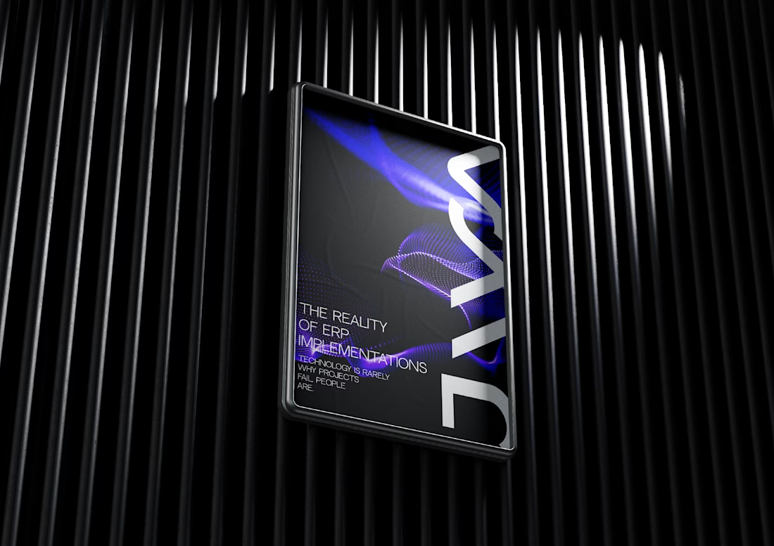
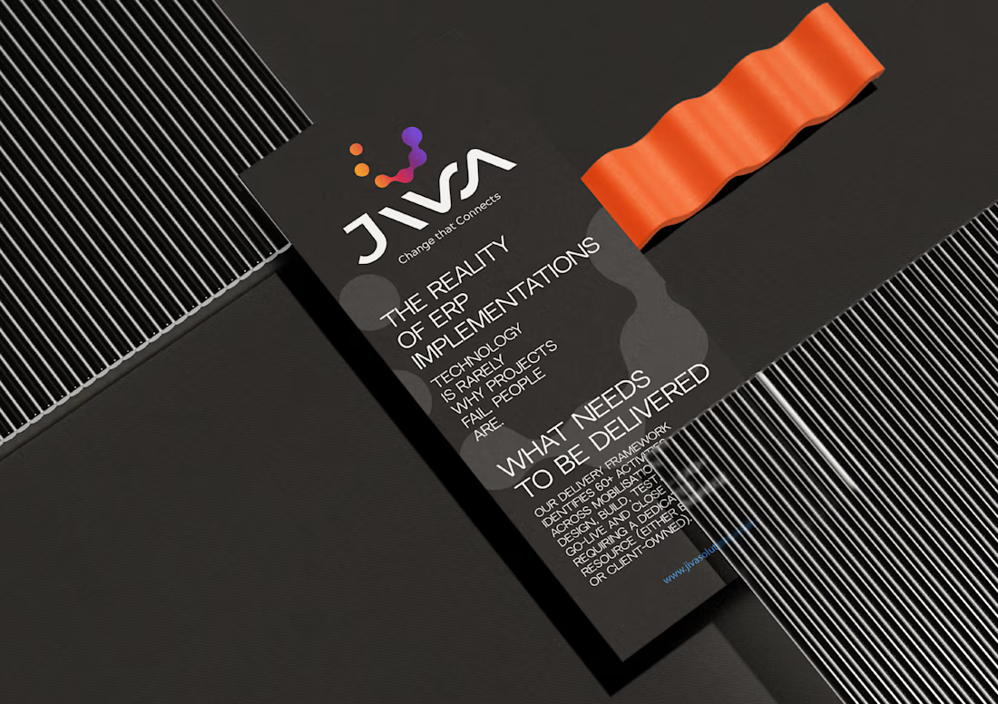
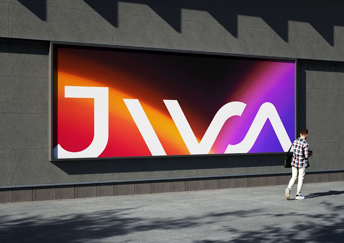

This logo do look distinctive. Nowadays every other brand designer is aiming for same minimal repetitive kinda logo. This is something fresh!

Branding work for WithNation
Love the motion, visual style and aesthetics on this one
The concept is to mix the power of creative prompting and allowing everyone to orchestrate their business from start to finish.
Build • Run • Market
The logo represents a shopping bag with the prompting input inside


MARLOW is a modern fashion and clothing brand identity built around individuality, everyday style, and self-expression.
The branding combines a custom rounded wordmark, bold M monogram, warm red tones, and minimalist typography to create a confident and recognizable fashion identity.
From logo design and brand guidelines to apparel graphics, clothing labels, hang tags, packaging, shopping bags, stationery, and advertising campaigns, MARLOW creates a cohesive visual experience across fashion and lifestyle applications.
Services: Brand Identity, Logo Design, Fashion Branding, Clothing Brand Design, Apparel Branding, Packaging Design, Visual Identity.

That rounded M monogram in warm red sounds like it carries the whole system. Fashion identities live or die on the small touchpoints, so going all the way down to hang tags and labels is exactly right. Which piece of the rollout was the trickiest to keep consistent, the packaging or the apparel graphics?