The network for creativity
Join 1.25M professional creatives like you
Connect with clients, get discovered, and run your business 100% commission-free
Creatives on Contra have earned over $150M and we are just getting started
Back to feedPost

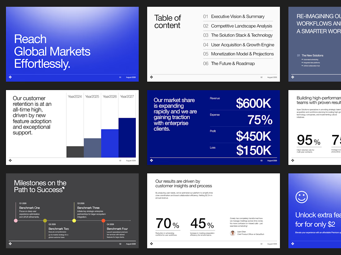
We designed an investor-focused Figma pitch deck built for global SaaS expansion, turning complex revenue metrics, market share data, and growth roadmaps into a sleek visual narrative.
Check out the full case study on Contra and let’s craft your next winning deck: https://contra.com/p/3sNWX7UE-saa-s-pitch-deck-design-for-global-expansion?r=airzon_agency 🚀
The network for creativity
Join 1.25M professional creatives like you
Connect with clients, get discovered, and run your business 100% commission-free
Creatives on Contra have earned over $150M and we are just getting started

Challenges
View all



Related posts


New DOVV site is live.
I scanned myself into a PS2 style 3D character and turned every badge into a sticker you can peel off.
Go play with it and tell me what you think 👀


Impressive Work


Should a flower shop ever go black and white?
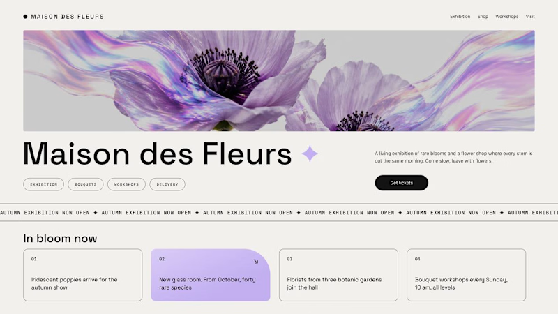
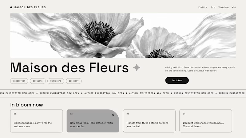
Same flower house, same layout. We only took the color out.
1. Full color. The iridescent petals do the selling: lilac, pink, a little shimmer. The photo is the brand, and every accent on the page borrows from it.
2. Monochrome. No color at all. Shape, texture and typography have to carry everything, and the page suddenly reads like a gallery catalogue.
Color sells the flower. Monochrome sells the exhibition.
Which one would get you through the door?
67 voted
91%
7 voted
9%
74 votes
Closed

The problem with monochrome is that, throughout computer history, it has conditioned users to associate gray and monochrome with being disabled, dysfunctional, or something to ignore and avoid.