The network for creativity
Join 1.25M professional creatives like you
Connect with clients, get discovered, and run your business 100% commission-free
Creatives on Contra have earned over $150M and we are just getting started
Back to feedPost

Walk into any pharmacy and the supplement aisle hits you like a wall of misplaced aggression: black packaging, neon fonts, names like ULTRA BEAST CORE FORMULA.
Our client Risely makes a daily vitality blend for people who want to sleep better and feel focused, not train for a cage fight. So we gave it a periwinkle bottle, icons that look more like art objects than warning labels, and a label that finally has room to breathe. Turns out all it took to stand out in that aisle was designing for the actual human buying it.
If your product has a personality that its packaging hasn't met yet, you know where to find us ✉️


The network for creativity
Join 1.25M professional creatives like you
Connect with clients, get discovered, and run your business 100% commission-free
Creatives on Contra have earned over $150M and we are just getting started
Trending
retrofuturism
Share your favorite designs from the past exploring the distant future. Or your own take on the aesthetic 🚀
halftone
Dots. Texture. Grain. Let's see your designs using the halftone technique.

Midjourney
Creatives are showing off what they're making with Midjourney.
colorgrade
Video editors sound off: How do you enhance the mood of your video in color grading?





Related posts


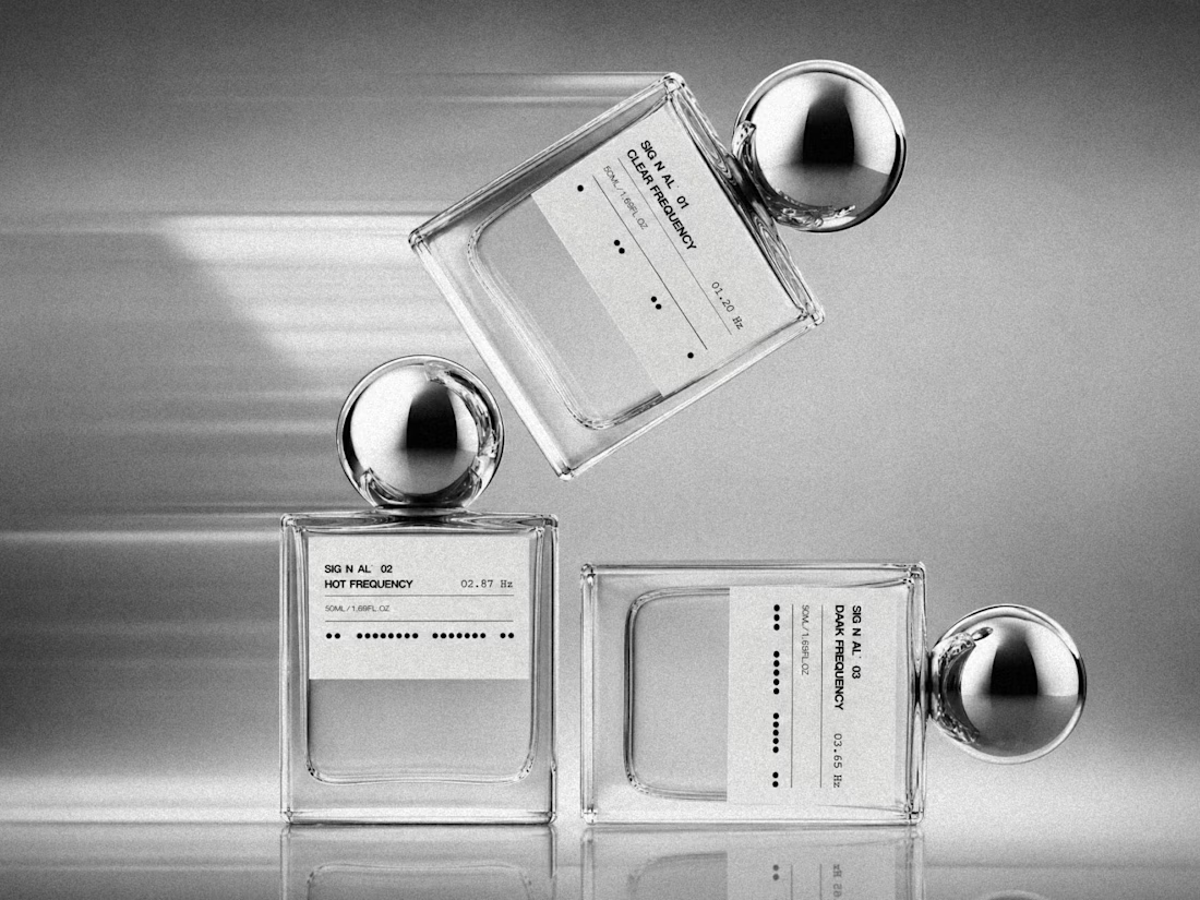
We’re excited to share a new brand identity we created for a perfume brand ✨
From the logo and bottle visuals to business cards, letterhead, perfume bags, and custom packaging - we crafted a cohesive identity designed to feel elegant, distinctive, and memorable.
Another project we’re proud to bring to life.


Super clean and subtle but still has a lot of personality!

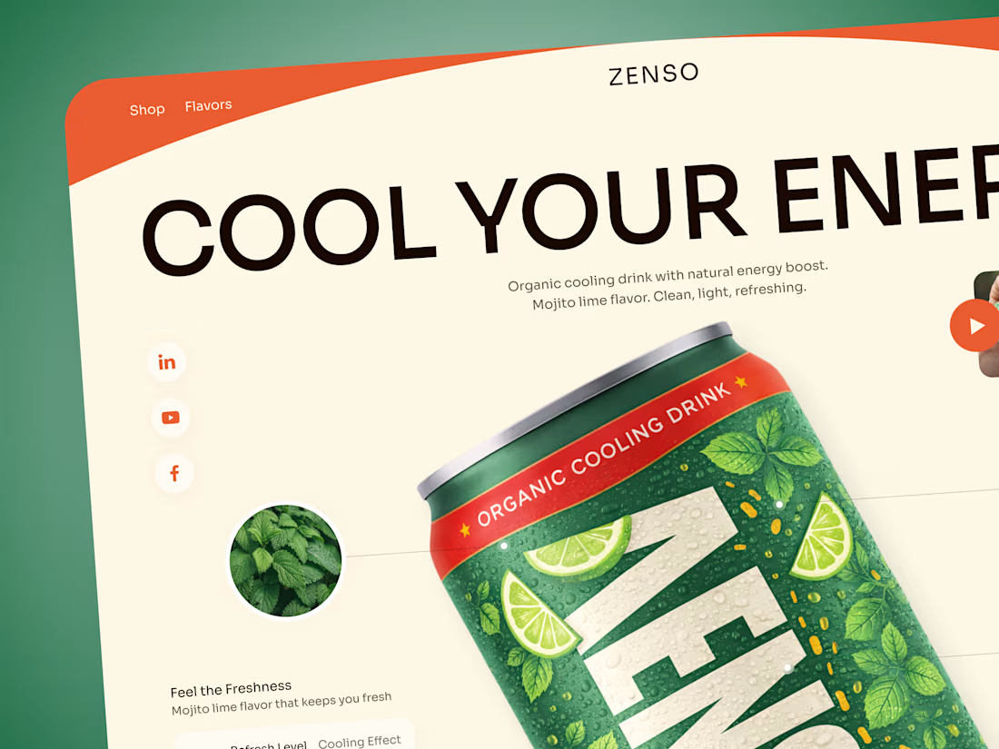
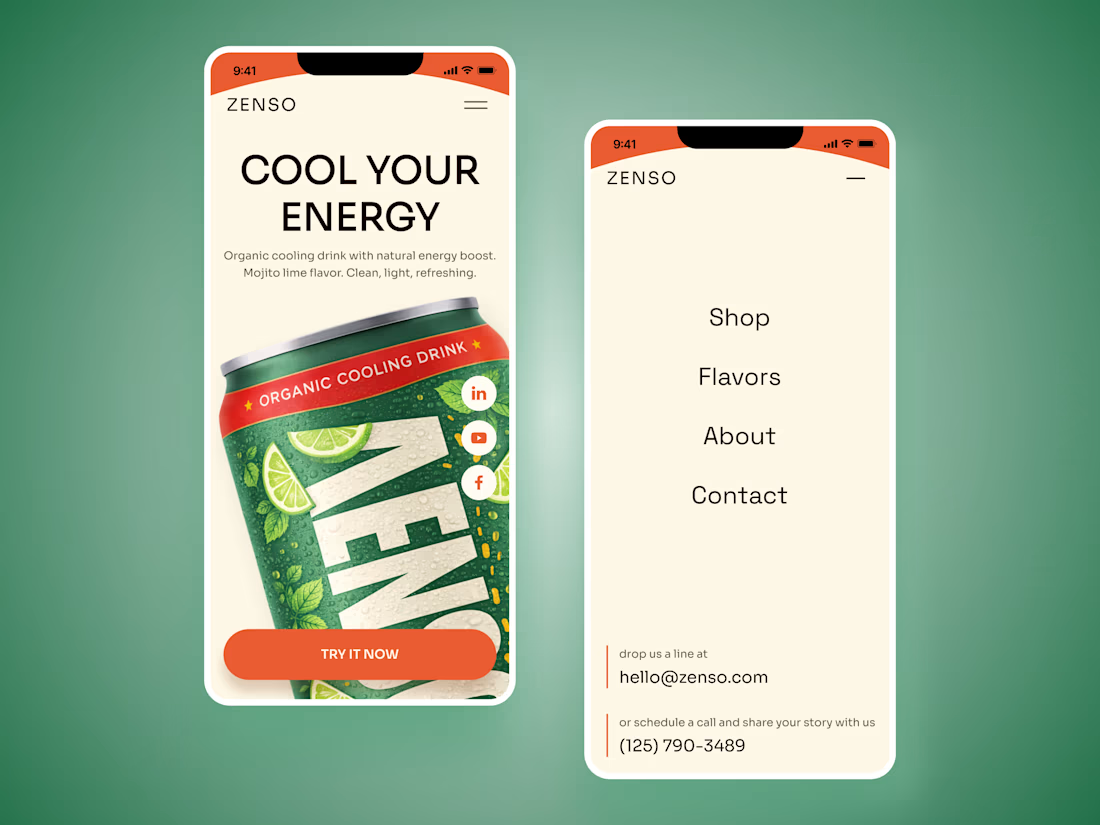
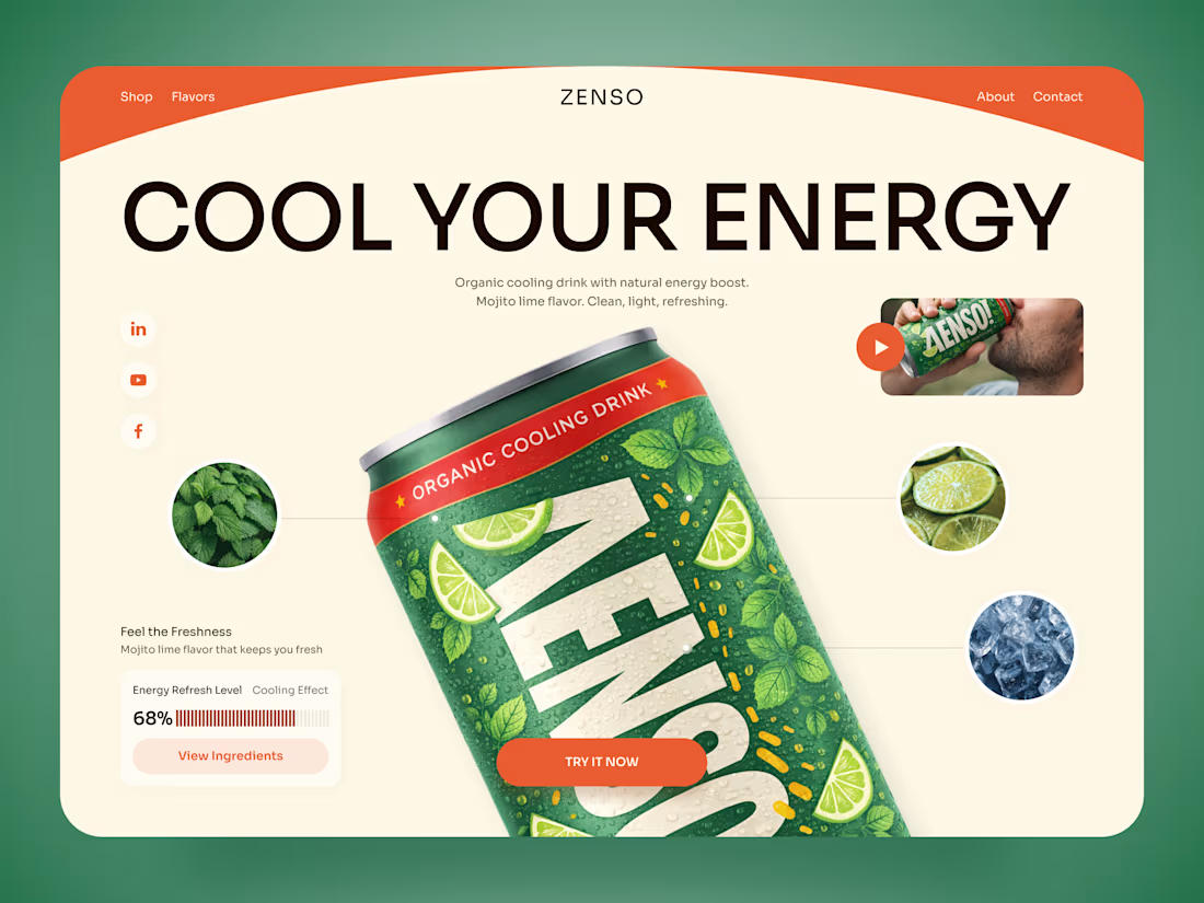
ZENSO — Organic Energy Drink Landing Page 🍋🌿
ZENSO is a bold landing page concept for an organic cooling drink that combines natural energy with a fresh, lifestyle-driven identity.
The goal was to make the product feel refreshing from the very first screen while giving the can a strong visual presence. The design combines oversized typography, organic colors, ingredient imagery, and playful composition to build a distinctive beverage experience.
Special attention was given to:
• a product-first hero that makes the ZENSO can the main visual focus;
• a fresh green, orange, and cream palette inspired by mojito lime, mint, and citrus 🍋;
• oversized typography that adds energy without competing with the product;
• ingredient close-ups that visually communicate flavor and freshness;
• supporting product details such as the cooling effect and energy refresh level;
• lifestyle imagery and video elements that make the brand feel more dynamic;
• a clear “Try It Now” CTA integrated naturally into the composition;
• responsive mobile layouts that preserve the oversized product presentation while keeping navigation simple 📱;
• a clean visual system that can scale across different flavors and future product launches.
The result is an energetic digital experience that turns a simple beverage into a memorable lifestyle product — fresh, playful, and easy to recognize.
Looking to create a bold digital experience for your beverage, food, or FMCG brand?
Let’s make your product impossible to scroll past ✨

The product-first hero with oversized type behind the can is the right call for FMCG: the pack does the branding work and the type just amplifies the energy. The piece I would build on is the scalable system for future flavors, since a citrus and a berry variant will want the...

Your brand is being judged before anyone reads a single word.
A strong visual identity creates recognition, builds credibility, and communicates value before you ever say a thing.
I don’t design logos just to make brands look good.
I build visual identities that position businesses, create distinction, and make brands impossible to confuse with everyone else.
A few identities I’ve worked on this year.
If you’re serious about building a brand that looks as valuable as the business behind it, let’s talk.
→ Available for select branding projects.

Good work!!