The network for creativity
Join 1.25M professional creatives like you
Connect with clients, get discovered, and run your business 100% commission-free
Creatives on Contra have earned over $150M and we are just getting started
Back to feedPost

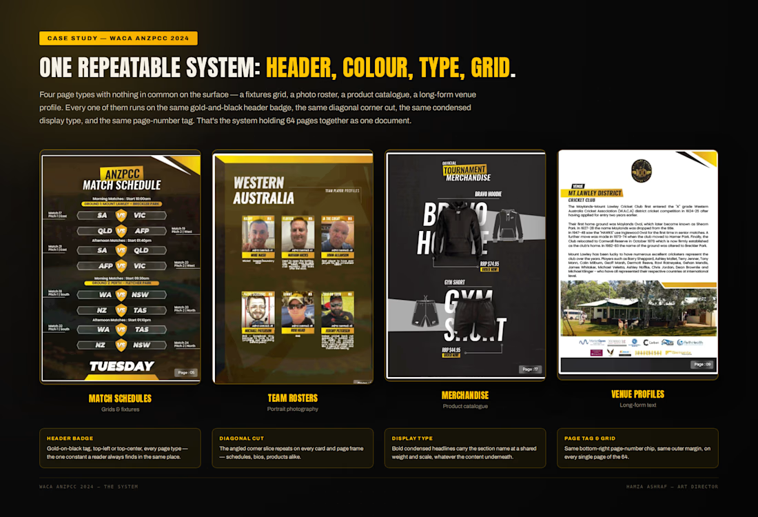
Match Fixtures -> Player Bios -> Merch Catalogue -> Venue Profiles.
Four completely different content shapes, one repeatable design system.
For the WACA 2024 Championships in Perth, we had 5 days to ship a 64-page interactive tournament guide across 13 linked sections.
By locking the gold-on-black header badge, diagonal card cuts, condensed display type, and outer grid first, a dense schedule table and a merchandise catalogue still read as one unified brand.
Full case study is live on my profile. Which page type do you find hardest to keep consistent in a big system?
https://contra.com/p/rX6UsX2N-waca-interactive-and-print-tournament-guide-built-in-a-week?referralExperimentNid=DEFAULT_REFERRAL_PROGRAM&referrerUsername=hamzash47

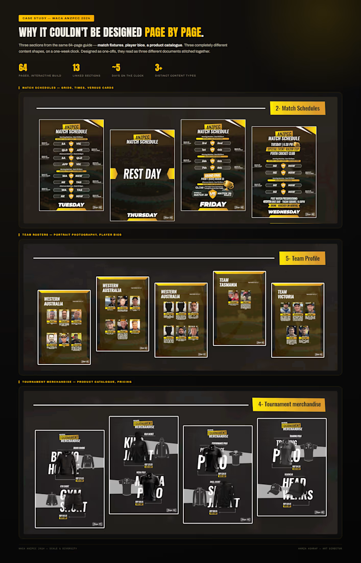


the merch catalogue always looks easiest then eats the most time. 64 pages in 5 days is wild
Haha man, only another designer knows the pain of fixing inconsistent garment cutouts and sizing options with no time left. It was rough, just glad we pulled it off!
The network for creativity
Join 1.25M professional creatives like you
Connect with clients, get discovered, and run your business 100% commission-free
Creatives on Contra have earned over $150M and we are just getting started

Challenges
View all


Related posts

What if construction felt as clear as the space it creates?
For Arqētia, we built a visual identity around one of the industry's most important client needs: transparency. A direct response to the uncertainty often associated with construction, from unclear processes and budgets to timelines and decision-making.
The concept makes transparency tangible, translating it into a visual system that feels open, structured and precise.
check it out
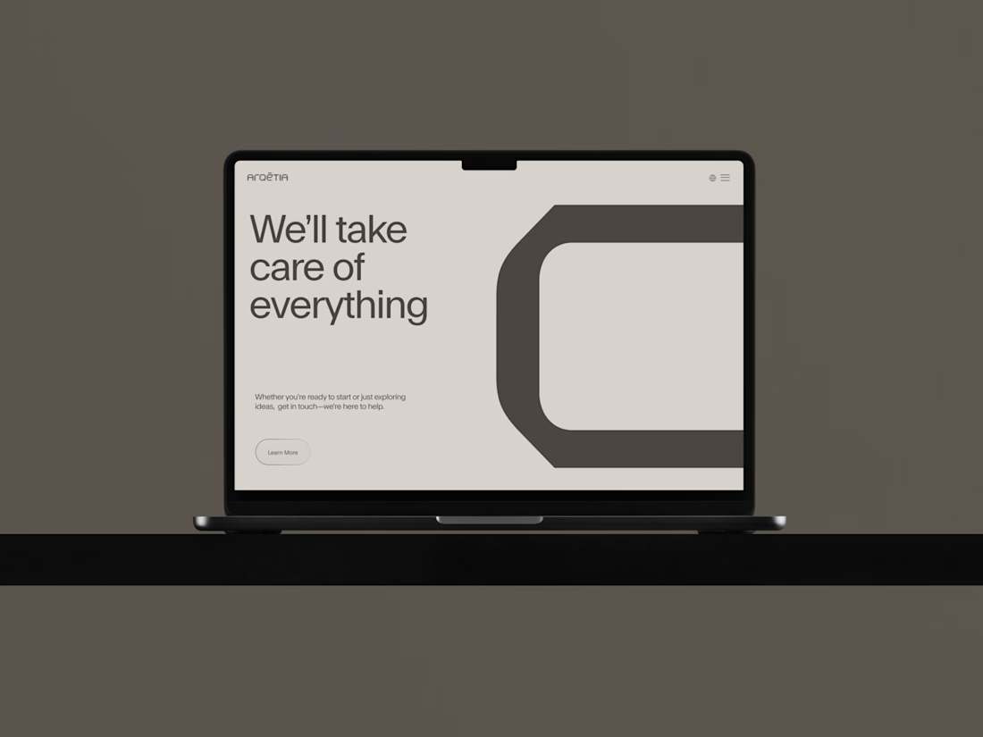




Very clean identity work


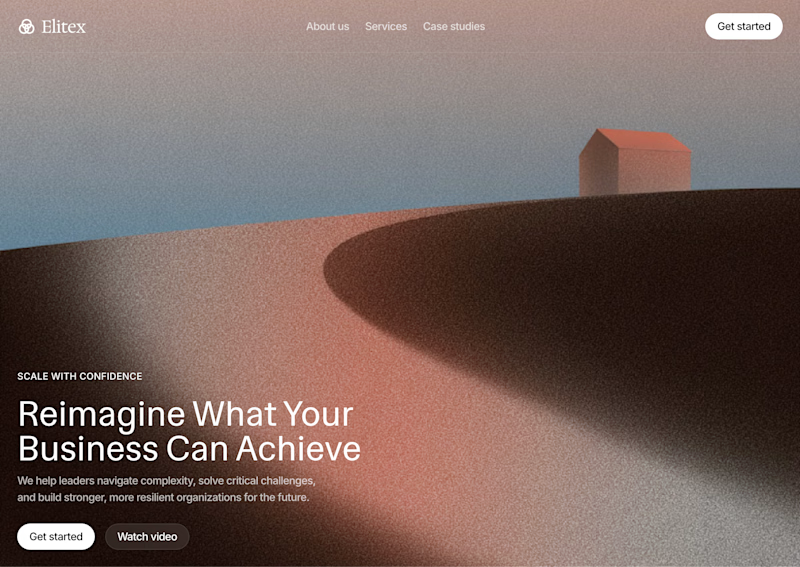


A feels more professional ❤️

A random selection from the recently launched Gryd – property data serving insurers, lenders, real estate, contractors, and researchers. Five audiences, one page. The hard part was keeping each path distinct without the page splitting into five micro-sites.

Great work Nina