The network for creativity
Join 1.25M professional creatives like you
Connect with clients, get discovered, and run your business 100% commission-free
Creatives on Contra have earned over $150M and we are just getting started
Back to feedPost

Wallet card component ui designed in flutter.
The network for creativity
Join 1.25M professional creatives like you
Connect with clients, get discovered, and run your business 100% commission-free
Creatives on Contra have earned over $150M and we are just getting started




Related posts

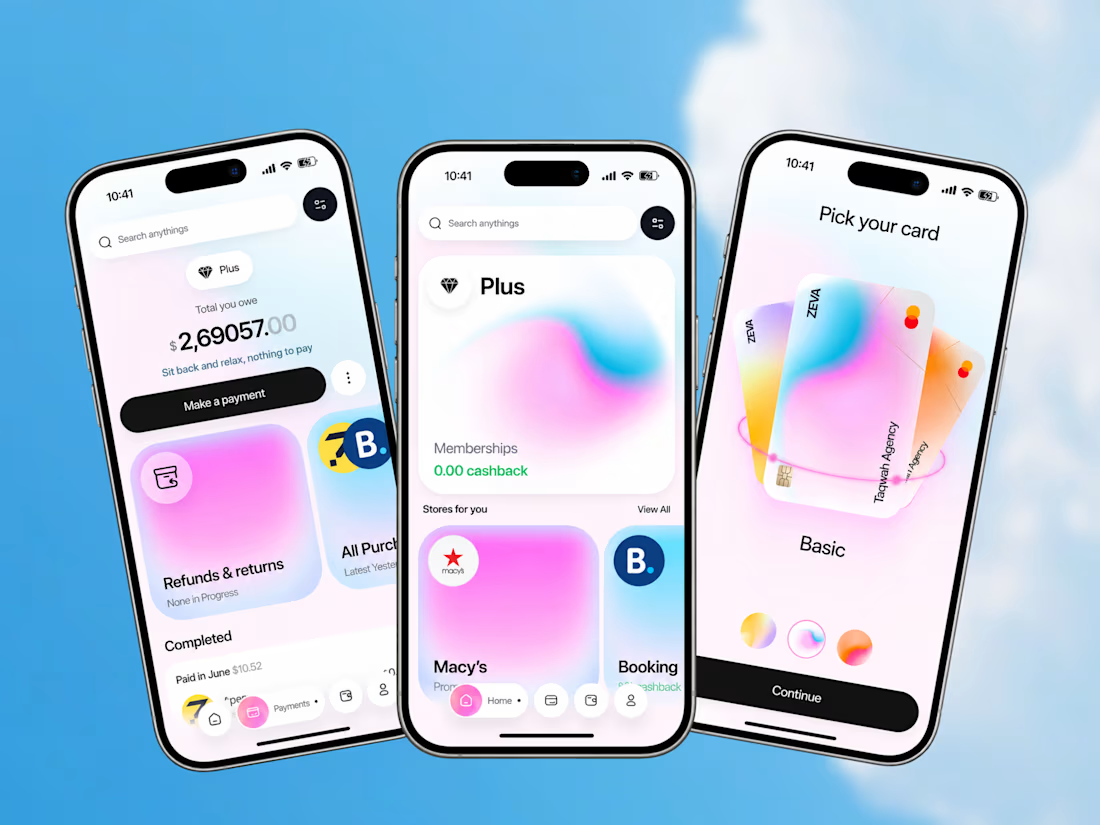
ZEVA - A Fintech Experience Designed Around Everyday Money
Most finance apps focus heavily on transactions.
ZEVA explores what happens when financial management becomes part of a broader everyday experience.
The product combines:
• Payment and purchase management
• Outstanding payment visibility
• Refund and return tracking
• Shopping and selected stores
• Cashback benefits
• Card selection
• Personalized card customization
The design challenge was to bring these different behaviors together without making the experience feel overloaded.
The result is a clean, premium mobile interface where financial management, rewards, shopping, and personalization work as parts of one product experience.
Good fintech UX isn’t about adding more features. It’s about making complex financial actions feel easier to understand.
Building a fintech app, payment platform, banking product, or financial dashboard?
Taqwah can help you transform your product idea into a polished, scalable UI/UX experience - from product structure and user flows to high-fidelity interface design.
Start your next product design project with us.



This is such a clever way to turn familiar client feedback into a visual language. The concept and typography make the message really memorable. 👏


Are clients always right? 😀
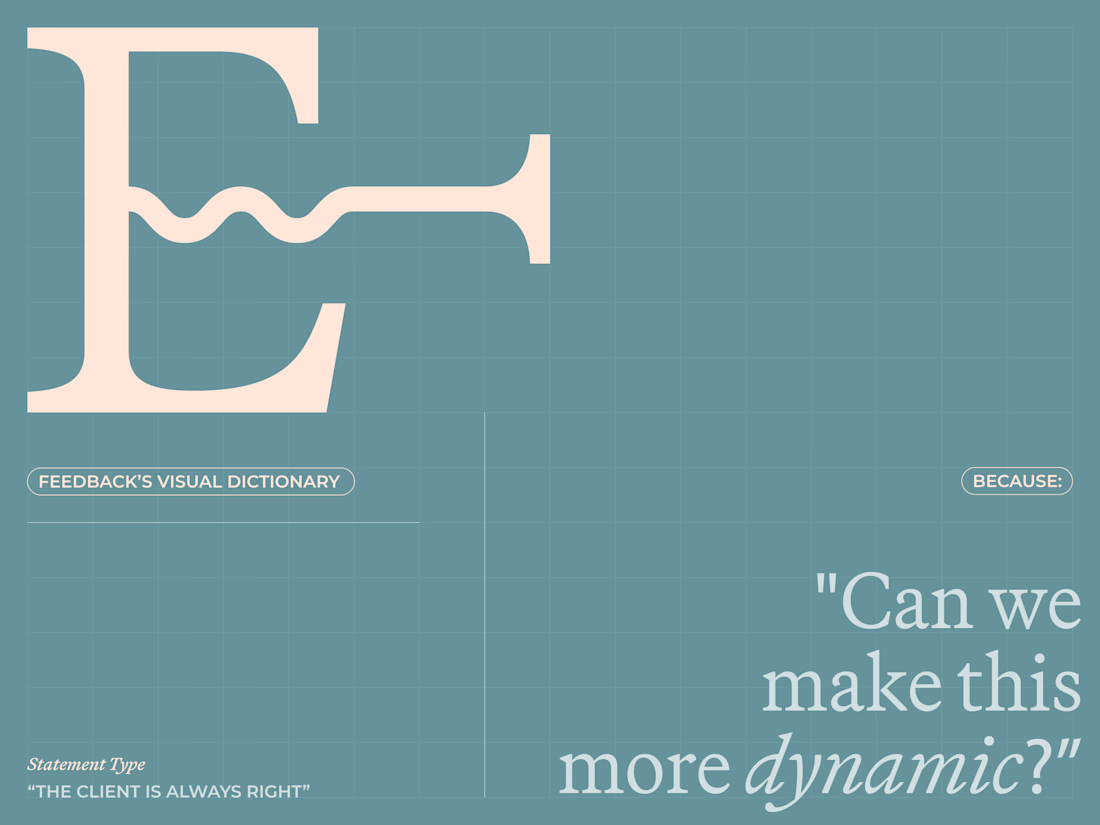
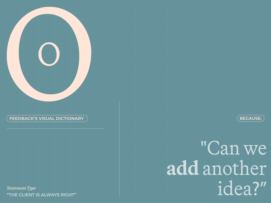
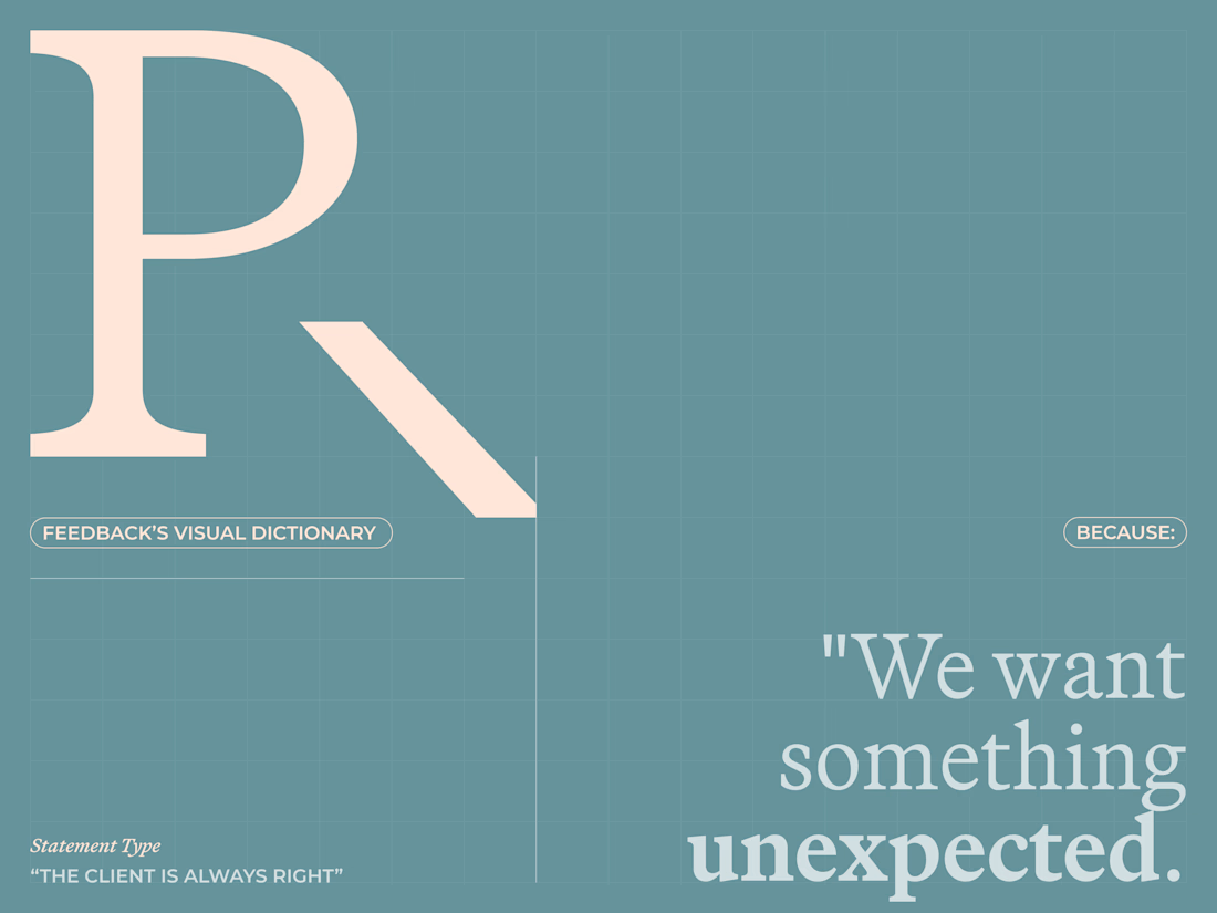
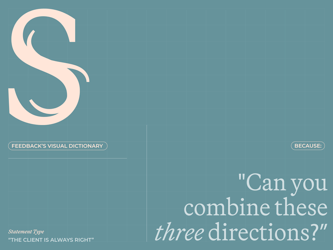
I created a lettering system where every letterform represents one of the things designers routinely hear from clients.
The typeface becomes a visual dictionary of bad creative feedback, that proves the statement wrong.
Give me your worst client...

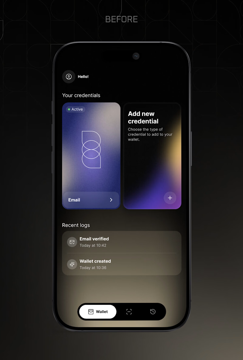
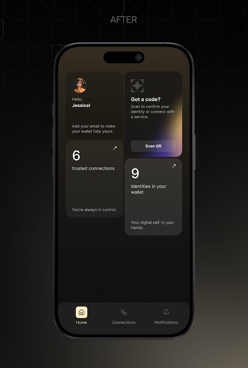
Two home screens for the same digital identity wallet, before and after the alongID brand styleguide.
The old one showed your actual credentials. You saw the card, you tapped it, done. It also showed a log of what just happened.
The new one replaced the cards with counts, 9 identities and 6 trusted connections, and moved Scan QR to the top, because scanning a code is what people open this app to do.
That is the real trade, and I still argue with myself about it. Cards you can touch, or numbers plus the primary action first.
You are opening this app for the tenth time this month. Which home screen do you want?
Vote below. I will post the reasoning behind the decision either way.
11 voted
92%
1 voted
8%
12 votes
Closed

The new version does a better job of prioritizing the main job people open the app for. Scan QR is immediately visible, the hierarchy is cleaner, and the dashboard gives a quick sense of what exists in the wallet.
But the old version has one UX advantage I would not completely...