The network for creativity
Join 1.25M professional creatives like you
Connect with clients, get discovered, and run your business 100% commission-free
Creatives on Contra have earned over $150M and we are just getting started
Back to feedPost
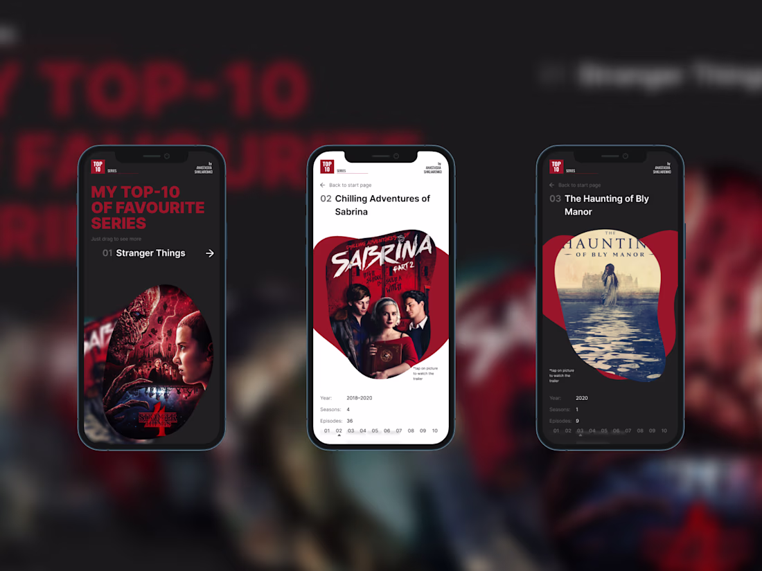
While going through my old Figma projects, I found something I created over four years ago, back when I was just starting to learn the tool. Looking at it now felt like revisiting a completely different stage of my design journey, so I decided to rethink and rebuild it using everything I’ve learned since then.
The original version was a single long scrollable frame with almost no structure or interaction. The redesign introduces a more thoughtful system with clearer hierarchy, improved navigation, and interactive behavior. I also created two versions — one optimized for desktop and tablets, and another for mobile. From the original concept, I kept only the color palette and the “bubble” elements as a small visual reference.
This concept can work as a template for presentations, a modular section of a website, or a structured layout for showcasing content such as ratings, collections, featured items or even to be adapted into an interactive menu.
The mobile prototype can be explored here
The desktop prototype can be explored here
Revisiting old work is the best way to see growth, and this redesign is a perfect example. Great eye for hierarchy and interaction design! 🚀
There's something special about revisiting old projects.
Not because they were perfect, but because they remind us how much we've learned along the way. Seeing your own progress over several years is one of the most rewarding parts of the design journey ✨
The network for creativity
Join 1.25M professional creatives like you
Connect with clients, get discovered, and run your business 100% commission-free
Creatives on Contra have earned over $150M and we are just getting started
Related posts
Zero experience in the UI design industry.
But creativity, imagination, AI, and @Wonder made it possible.
🔥 Introducing "TourMe"
🧠 The idea:
A website for people who love to travel, explore, and discover different countries.
🙌 Problem:
People often have to jump between multiple websites to find travel information about a country they want to visit.
😊 Solution:
A website with multiple features for different countries:
• Weather
• Currency
• Best places to visit
• Popular restaurants
• Traditional foods
• Hotels and places to stay
• Activities
• sim cards
• and many more
💯 WORKFLOW:
• Explained my idea in ChatGPT and generated a prompt
• Used Wonder Chat to create UI concepts and website designs
• Refined everything manually using Wonder's tools and AI features
• Used Shader, Wonder Chat, Properties, and other tools
• Used Figma templates as references
• Explored different Wonder features and workflows
• Generated images using Wonder Chat
• Used Opus and Fable for generation
🙌 Others:
• Uploaded webpage screenshots and used Wonder Chat to recreate similar layouts
• Used Pinterest for inspiration and images
🎉 Wonder MCP:
• Connected Wonder MCP with Claude
• Claude helped create parts of the website
• Used GitHub to publish the website
TourMe Website:
https://aymdaking.github.io/TourMe1122/
Wonder File (Check page 1 and Page 2):
https://app.wonder.so/angelo-pacaanas/files/019f21e1-b614-7ae0-96ce-16e3fb4f1b80
🧠 UNEXPECTED:
• I didn't expect copying designs from Figma to Wonder to be so easy
• There are many Shader modes to choose from
• Prompt-to-UI worked even without UI design experience
• Wonder MCP worked smoothly with Claude
• Wonder Chat is more than a UI generator—it also helps answer questions and guide ideas
• Multiple image generation models are available (my favorite is Nano Banana)
• Easy to move, edit, and rearrange elements
• Lots of useful tools that are simple to learn and use
Interface cards for a recent product design project, what would be the best direction? Dark Mode or Light Mode? ⚡️
69 voted
68%
32 voted
32%
101 votes
Closed
Both look great, but i will go for the dark mode
Cool!
Trending
Claude
Claude has entered the design space. How are you using Claude Design?
Contra University
Learn from expert creatives how to earn more using next-gen AI tools.
fifaworldcup2026
The World Cup is here and the whole world's watching. How are you designing for the world stage?
creativeaiflow
Creative AI workflows are evolving. What tools do you use, and what are their strengths and weaknesses?
freelancerlife
Freelancer life is wins, pivots, and everything in between. What’s yours right now?