The network for creativity
Join 1.25M professional creatives like you
Connect with clients, get discovered, and run your business 100% commission-free
Creatives on Contra have earned over $150M and we are just getting started
Back to feedPost

The 3-Step Scope Framework That Stopped Scope Creep & Boosted Project Values
When I started freelance web design and development, scope creep was the silent killer of profitability. Projects scheduled for two weeks turned into two-month sagas, and additional requests came in without budget adjustments.
Here is how I redesigned my project workflow to protect boundaries while delivering higher value for clients:
Deliverable-Based Scoping (Not Hourly): Instead of listing hours, every proposal outlines exact outputs (e.g., custom animations, responsive layouts, specific page counts). If it's not on the list, it’s a phase-two add-on.
Asynchronous Client Reviews: To keep momentum high, I replace long status meetings with loom walk-throughs and clear review deadlines. Clients love the efficiency, and it speeds up delivery timelines by 40%.
Built-in Buffer & Optimization Sprints: I allocate the final 15% of every contract purely for testing, performance optimization, and handoff docs. Handoffs feel seamless, and clients get a fully polished asset ready to convert.
Standardizing this process not only improved client satisfaction but also double my average project value.
What’s the single biggest operational change you’ve made in your freelancing process this year? Drop your thoughts below! 👇
The network for creativity
Join 1.25M professional creatives like you
Connect with clients, get discovered, and run your business 100% commission-free
Creatives on Contra have earned over $150M and we are just getting started



Related posts

Zencastr came to us with a complex mix: they hosted their homepage on a custom server, blog on a separate platform and the rest of the pages on Webflow.
They had 3 days before the launch to tie it all together. This is their review:


Three platforms behind one domain in three days is a real test. I'd guess the reverse proxy and keeping the nav and footer identical across all three took more care than any of the page building. Did you match the shared header in Webflow or pull it from one source?

My husband and I run a small two-person studio, working together on Framer and Webflow projects.
Alongside our individual portfolios, we’re also bringing our shared projects together into case studies. There’s a bit of catching up to do, so we’ll be sharing more of that work here as we go.
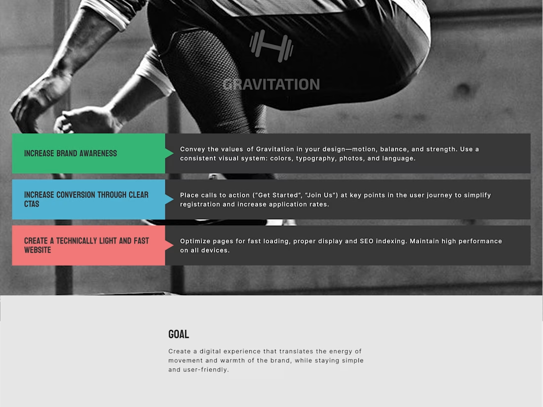
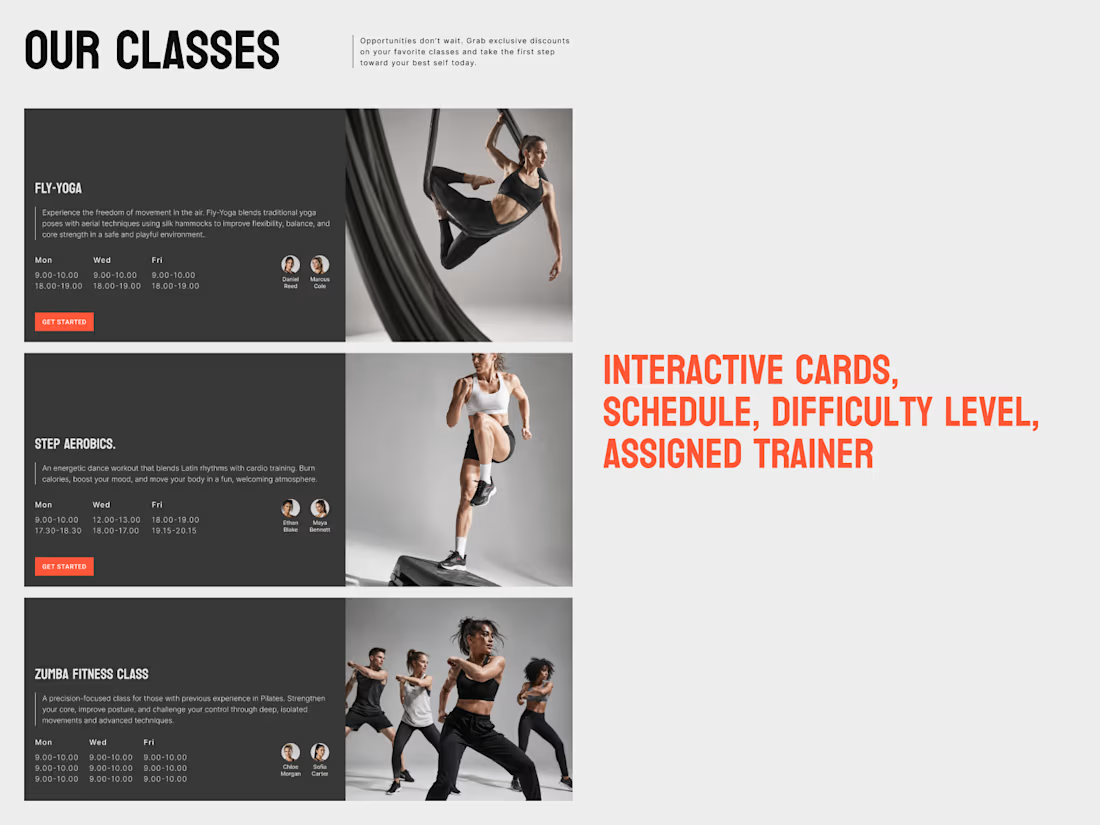
Here’s one of them: Gravitation, a fitness studio website concept.

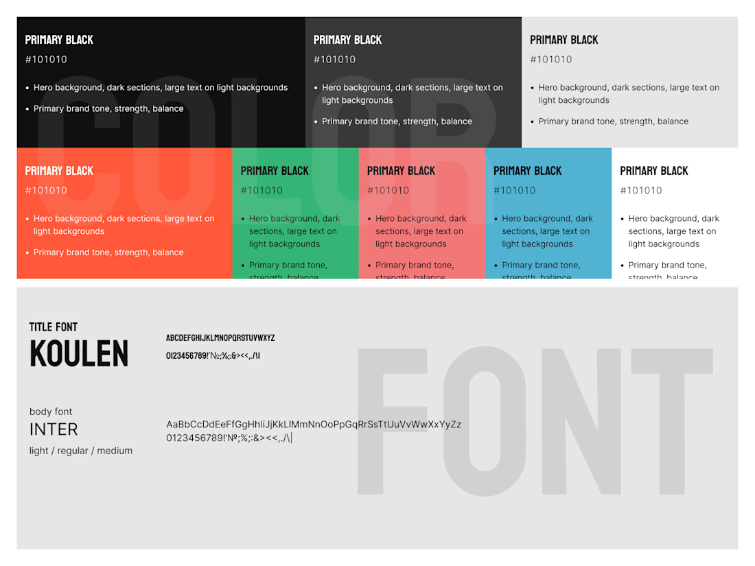
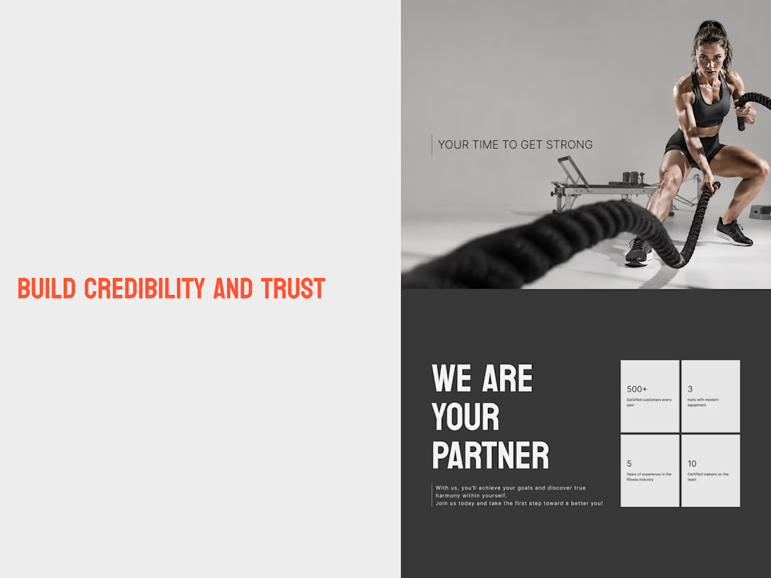
Gravitation — Fitness Studio Website Design
A bold, modern website concept for a fitness studio, designed to communicate energy, movement, and strength while keeping the user experience clear and intuitive.
The project focuses on three key goals:
Brand identity: A distinctive...
Love that you're turning the shared work into proper case studies. Writing them up is the part most small studios never get round to. How do you two split a project: one designs and one builds, or do you both do a bit of everything?

Watch this website build itself.
The Kirkpatrick Bank homepage, replayed in about 9 seconds from the live site: wireframe, layout, content, live.
Kirkpatrick Bank is a privately owned bank that wanted a website as modern as its banking. I built it in Webflow from the approved design, page by page.
• Personal and business banking, home loans and investments, easy to compare
• Separate personal and business login entry points
• Webflow CMS for helpful videos, posts and mortgage lender profiles
What do you look for first on a bank's website?
Follow for more videos: instagram.com/sellwrightstudio · youtube.com/@sellwrightstudio

This is a great example of how thoughtful design can make digital products more engaging and enjoyable.