The network for creativity
Join 1.25M professional creatives like you
Connect with clients, get discovered, and run your business 100% commission-free
Creatives on Contra have earned over $150M and we are just getting started
Back to feedPost
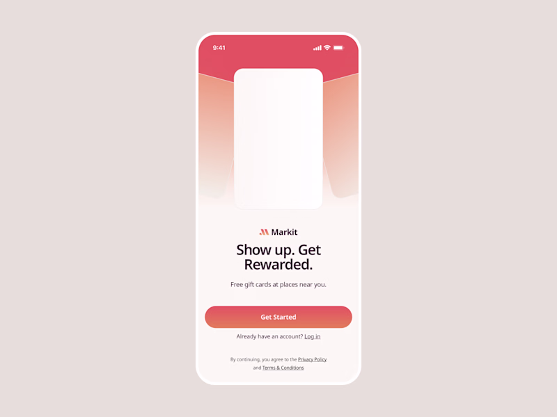
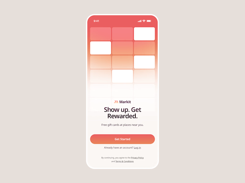
Taste Test
Playing around with a couple of different directions for the welcome screen for Markit.
Which layout you do you prefer? A few gift cards shuffling in an array, or a grid of gift cards that are randomly highlighted?
Waiting on client approval before placing any actual gift cards / brand logos...
Would love to hear your thoughts!
3 votes
Ends in 1d
I voted for the grid. The array just feels like there's too much visual emphasis on one card at a time. The grid makes it feel more like the main product is the variety of cards, rather than just the cards themselves. I'm not sure if that makes sense, it probably made more sense in my head hahaha
Thanks for the in-depth feedback Taylor! That context makes a lot of sense
You're so welcome! I always try to explain my reasoning when I participate in these. I feel like context & perspective is important when making these decisions haha!
The network for creativity
Join 1.25M professional creatives like you
Connect with clients, get discovered, and run your business 100% commission-free
Creatives on Contra have earned over $150M and we are just getting started
Related posts
A throwback to when I designed the new Onefootball website! It was a honor to be able to work with the brand designed by DesignStudio!
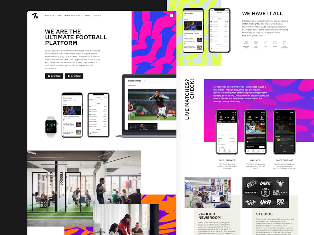
Great work! The bold colors and layout really capture the energy of football while keeping the interface clean and easy to navigate. Awesome project
Logo explorations for a Korean pop-up store 🇰🇷🧋
Stunning!
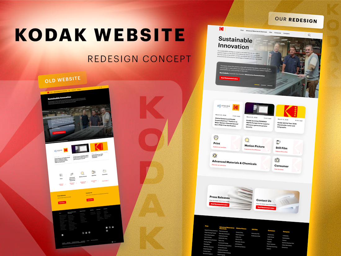
🔍 We explored how the Kodak website could look with a more modern interface while keeping the brand recognizable.
The goal of this concept redesign was not to reinvent the brand, but to refine the experience and make the interface feel lighter, clearer, and more contemporary.
In this concept we focused on:
• improving visual hierarchy 📐
•simplifying the card layout and navigation blocks
• adding more whitespace for better readability ✨
• introducing softer UI elements and cleaner structure
At the same time, it was important to keep Kodak’s strong visual identity – especially the iconic color palette 🎞️
This is a concept redesign created as a design exploration of how the website could evolve today.
💬 What do you think – new version works better?
good
Challenges
View allFuser Co-create
$5K6h 29m left344 participants
Morphic Workflows
$10K3d left271 participants
Zo Computer Challenge
$10K3d left561 participants
Anything Ship & Sell Remixathon
$10K10d left187 participants
Impossible UI with Rive
$10K10d left121 participants
Runway $100k Big Pitch Challenge
$100K10d left193 participants
Trending
Runway
AI video generation is exploding. What are you dreaming up in Runway?
Contra University
Learn from expert creatives how to earn more using next-gen AI tools.
creativeaiflow
Creative AI workflows are evolving. What tools do you use, and what are their strengths and weaknesses?
portfolioreview
The best portfolios tell a story, not just show a grid. Share yours for feedback.
freelancerlife
Freelancer life is wins, pivots, and everything in between. What’s yours right now?