The network for creativity
Join 1.25M professional creatives like you
Connect with clients, get discovered, and run your business 100% commission-free
Creatives on Contra have earned over $150M and we are just getting started
Back to feedPost
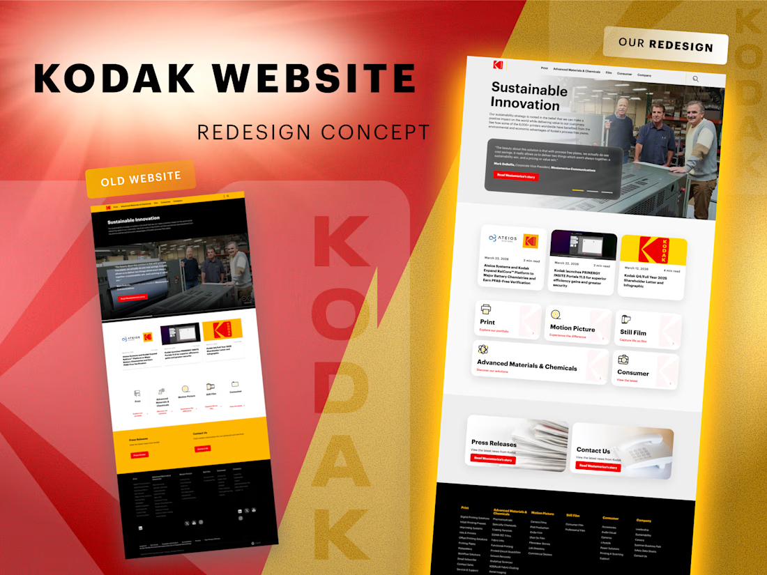
🔍 We explored how the Kodak website could look with a more modern interface while keeping the brand recognizable.
The goal of this concept redesign was not to reinvent the brand, but to refine the experience and make the interface feel lighter, clearer, and more contemporary.
In this concept we focused on:
• improving visual hierarchy 📐
•simplifying the card layout and navigation blocks
• adding more whitespace for better readability ✨
• introducing softer UI elements and cleaner structure
At the same time, it was important to keep Kodak’s strong visual identity – especially the iconic color palette 🎞️
This is a concept redesign created as a design exploration of how the website could evolve today.
💬 What do you think – new version works better?
good
Really nice balance between modernization and brand recognition. The interface feels much cleaner while still keeping Kodak’s strong visual identity intact. Great concept!
Looks amazing!
I like it
Awesome!
The network for creativity
Join 1.25M professional creatives like you
Connect with clients, get discovered, and run your business 100% commission-free
Creatives on Contra have earned over $150M and we are just getting started
Related posts
We rebranded and redesigned 3-11 Cloud Consulting, built their website in #Framer, clarified service positioning, and created a cohesive UI system to reflect credibility and scale.
3-11 Cloud Consulting helps enterprise teams modernize operations across NetSuite, Salesforce, and AI.
Flawless 🔥
I like how Framer lets you execute with your creativity without dealing with code stuff!
This is the standard. 🫵🏽 Built. Done. Delivered. 🚀
Fitness meets function. 💪🏽 Just delivered this sport training app UI for a client and every screen hits different. Clean. Bold.
Built to perform, just like the athletes using it.
Bold and high-performance.
Trending
Runway
AI video generation is exploding. What are you dreaming up in Runway?
Contra University
Learn from expert creatives how to earn more using next-gen AI tools.
creativeaiflow
Creative AI workflows are evolving. What tools do you use, and what are their strengths and weaknesses?
portfolioreview
The best portfolios tell a story, not just show a grid. Share yours for feedback.
freelancerlife
Freelancer life is wins, pivots, and everything in between. What’s yours right now?